Alright, let’s chat bedrooms. You know that feeling when you flop onto your bed after a day, and instead of “ahhh,” it’s more like “meh”? Often, the culprit isn’t just your schedule. It’s the vibe of the room itself.
Color is crazy powerful for setting a mood, especially in your sleep sanctuary. Forget boring beige (unless it’s magic beige, which we’ll get to!).
I’ve obsessed over paint swatches and lived through enough “oops, that looks like a hospital” moments to share these 16 seriously calming palettes.
Ready to ditch the stress and paint your way to peace? Let’s go!
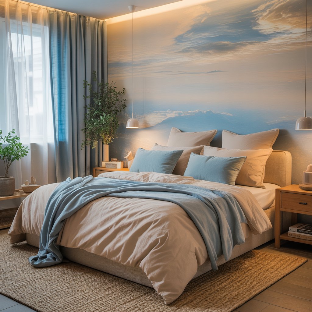
1. Cloudy Skies & Driftwood
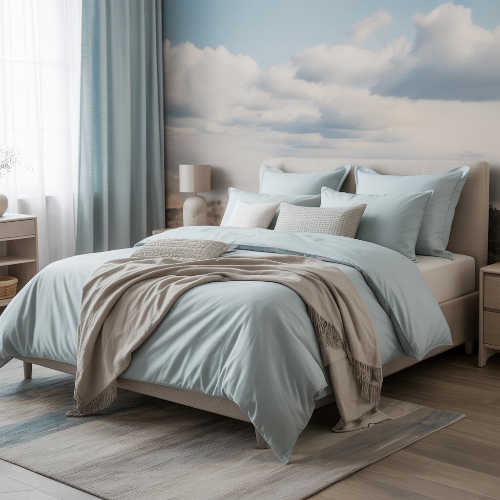
Soft, hazy blues meet warm, weathered wood tones. Think barely-there sky blue walls and rich, gray-brown wood accents or furniture.
Why It Soothes
- Blue = instant chill, like looking at a gentle sky.
- Warm wood grounds the coolness, preventing that sterile feel.
- Feels airy and spacious, even in smaller rooms.
- Naturally evokes coastal calm without the kitsch.
Personal Take
My guest room rocks this. People literally sigh when they walk in. Pair with crisp white linens – chef’s kiss.
2. Deep Forest & Cream
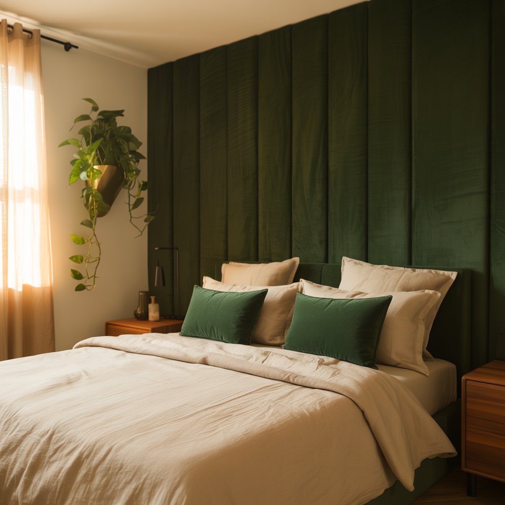
Go moody with an enveloping deep green (think pine forest at dusk) paired with creamy, almost ivory, whites.
How to Make It Work
- Use the deep green on an accent wall or all walls if you have good natural light.
- Cream on trim, ceiling, and bedding softens the drama beautifully.
- Add texture with jute rugs and linen throws.
- Feels cocoon-like and deeply restful.
Pro Tip
Test your green in the actual room light! Some deep greens can read black at night. Ask me how I know…
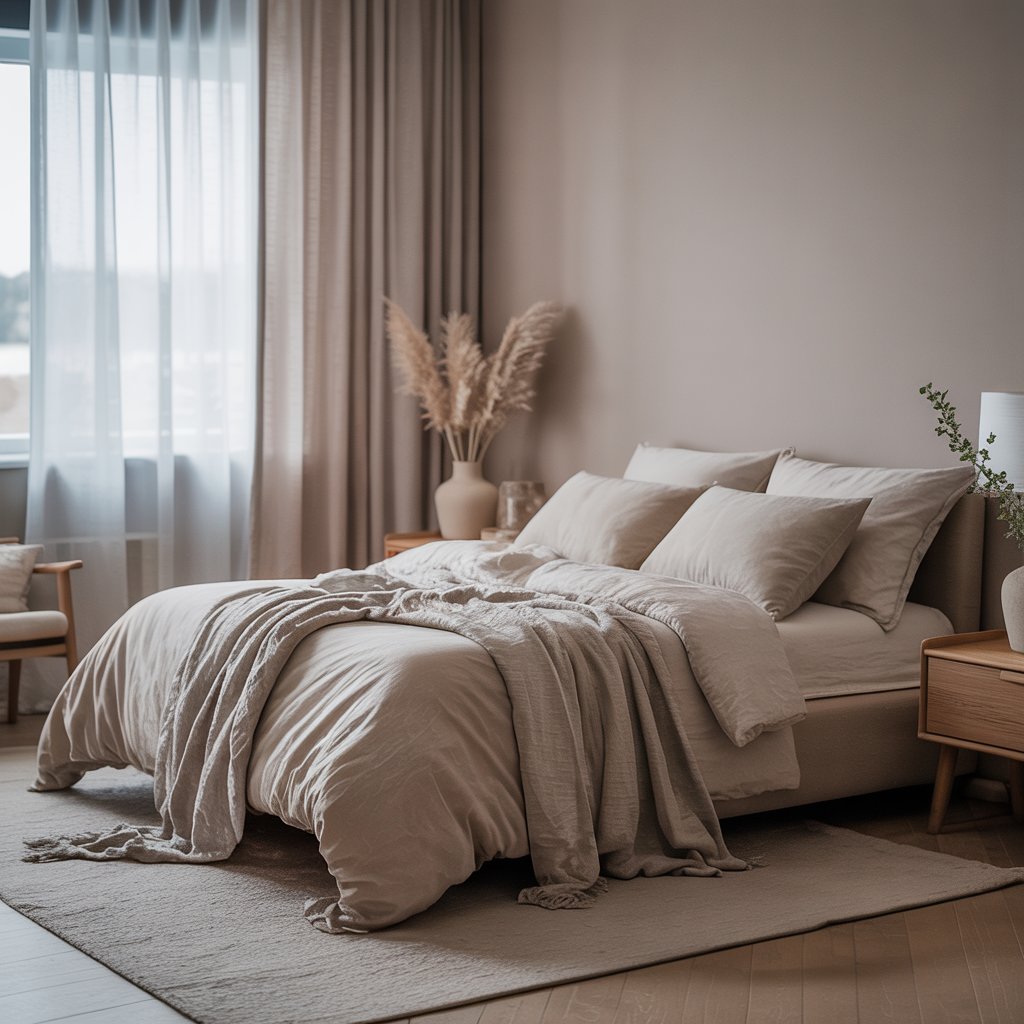
3. Warm Taupe Hug
Forget cold greys. Warm taupe is like a cozy hug for your walls. Think greige with a definite warm, earthy undertone.
Why It’s a Must-Try
- Ultra-versatile neutral that plays well with almost any accent color.
- Instantly makes a room feel grounded and serene.
- Way more interesting than plain beige, less stark than white.
- Perfect backdrop for layering textures (wool, velvet, wood).
Story Time
This was my “safe” choice in my last place. Zero regrets. It made the room feel instantly put-together and peaceful.
4. Lavender Mist & Slate
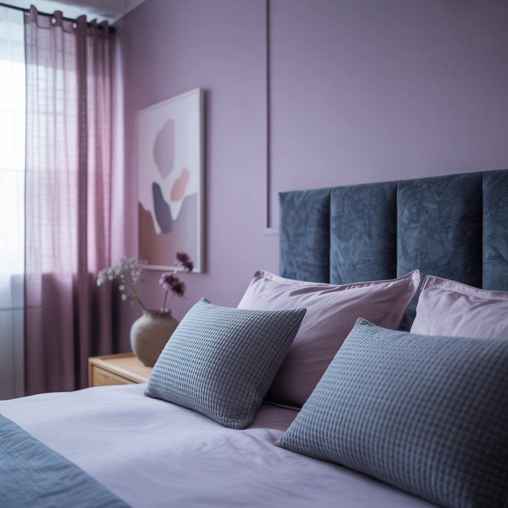
Soft, dusty lavender (not kiddie purple!) paired with cool, sophisticated slate grey.
Why It Works
- Lavender has inherent calming properties (seriously, science-ish backs this!).
- Slate grey adds depth and modern elegance, balancing the softness.
- Creates a serene, slightly romantic vibe without being girly.
- Feels fresh and unique.
Downside
Finding the right lavender is key. Too pink? Too purple? Sample like your sanity depends on it (it kinda does).
5. Sun-Baked Terracotta & White Sand
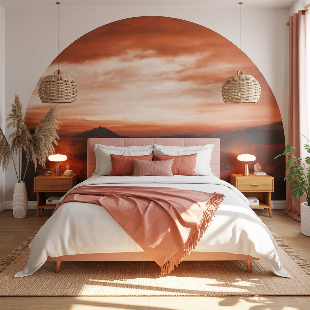
Earthy terracotta softened by warm, sandy neutrals. Think Mediterranean villa meets desert retreat.
How to Nail the Calm
- Use terracotta sparingly – maybe an accent wall, bedding, or pottery.
- Let the sandy white dominate walls and larger pieces.
- Warmth promotes relaxation, unlike some cooler palettes.
- Add natural textures: rattan, seagrass, clay.
Pro Move
Pair with black iron accents for a tiny bit of edge. Stops it feeling too “tuscan kitchen.”
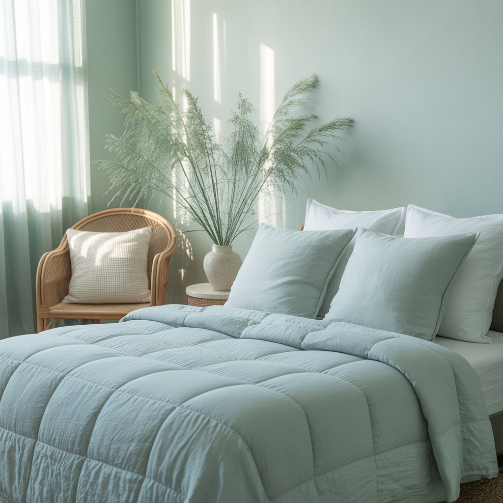
6. Misty Green & Linen White
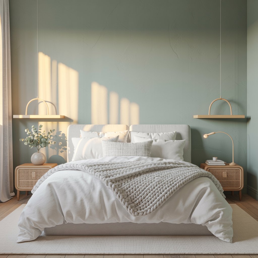
The gentlest sage or seafoam greens paired with pure, soft linen white.
Why It’s Pure Zen
- Green connects us to nature = instant calm.
- These muted tones are soft on the eyes, perfect for unwinding.
- Feels clean, fresh, and effortlessly tranquil.
- Works in any style, from modern farmhouse to coastal.
Personal Fave
This is my current bedroom vibe. It’s like sleeping in a peaceful meadow (minus the bugs, thankfully).
7. Charcoal & Blush
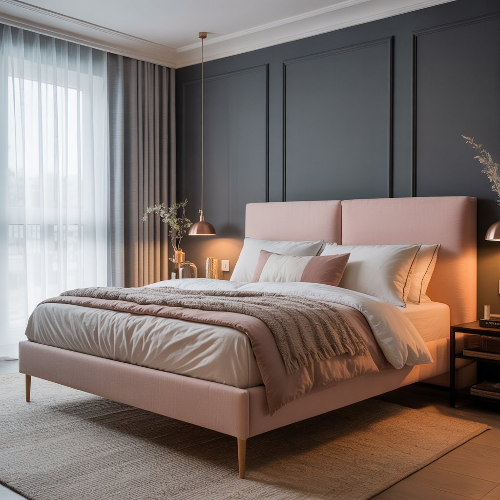
Deep, inky charcoal balanced by the softest whisper of blush pink.
Surprisingly Calming Because…
- The deep charcoal feels enveloping and secure.
- Blush adds just enough warmth and softness to counter the dark.
- Ultra-sophisticated and seriously cozy.
- Feels modern and luxurious.
Pro Tip
Lighting is crucial here! Warm-toned lamps and maybe even some subtle fairy lights prevent it from feeling like a cave.
8. Oatmeal & Sky
Warm, comforting oatmeal walls (like your coziest sweater) with accents of the softest baby blue.
Why It Works Wonders
- Oatmeal is the ultimate warm neutral – comforting and welcoming.
- Tiny pops of sky blue add a breath of fresh air.
- Feels sunny and optimistic, even on grey days.
- Super easy and affordable to achieve.
Personal Take
Perfect for renters or commitment-phobes! Easy accents make all the difference.
9. Monochromatic Greige
Dive deep into shades of greige – from lighter walls to slightly darker trim to deep taupey bedding.
How to Avoid Boring
- Play with texture! Think boucle pillows, nubby throws, smooth wood, matte ceramics.
- Layering similar tones creates incredible depth and serenity.
- Add a single, subtle metallic like brushed brass for a touch of luxe.
- Keep it feeling intentional, not accidental.
Pro Move
Sample at least 3 shades in the same greige family. The variation is subtle but magic.
10. Dusky Blue & Warm Brass
Muted, grey-blue walls (think faded denim) warmed up by rich brass accents and light wood.
Why It’s a Winner
- The blue is calm, the brass adds sophisticated warmth.
- Feels both classic and contemporary.
- Brass fixtures (lights, hardware) become jewelry for the room.
- Light wood (like oak or ash) keeps it airy.
Story Time
Swapped out my boring chrome knobs for brass in my dusky blue room. Game. Changer. Instant cozy elegance.
11. Soft Clay & Olive
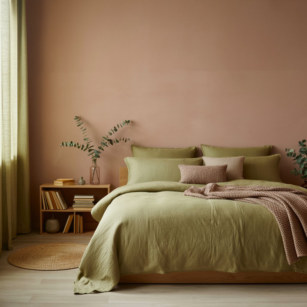
Earthy, muted terracotta (softer than #5) paired with a sophisticated, grey-green olive.
Why It’s Grounding
- Both colors are deeply connected to the earth – super stabilizing.
- Creates a warm, inviting, and slightly exotic calm.
- Feels organic and restful.
- Less expected than blue/green combos.
Downside
Can lean a bit “70s” if you’re not careful. Keep furniture lines clean and modern.
12. Pale Butter & Slub Linen
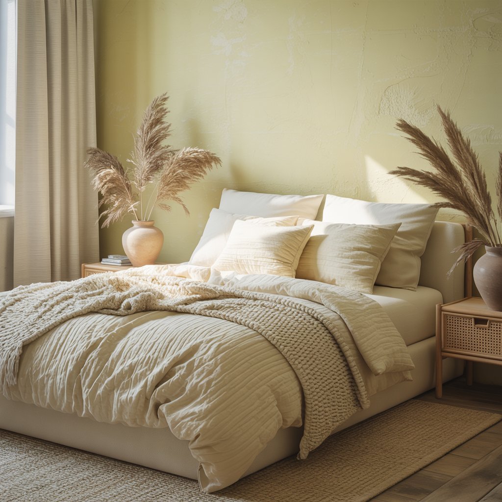
The softest, warm yellow (think buttercream frosting) paired with natural, undyed linen textures.
How to Keep it Serene, Not Sickly
- Choose a yellow with strong grey or beige undertones – avoid anything neon or primary!
- Let linen (bedding, curtains) provide texture in creams, oatmeals, and soft greys.
- Feels sunny, welcoming, and gently uplifting.
- Perfect for north-facing rooms needing warmth.
Pro Tip
Add a tiny touch of black (frame, lamp base) to anchor it and add sophistication.
13. Inky Navy & Cream
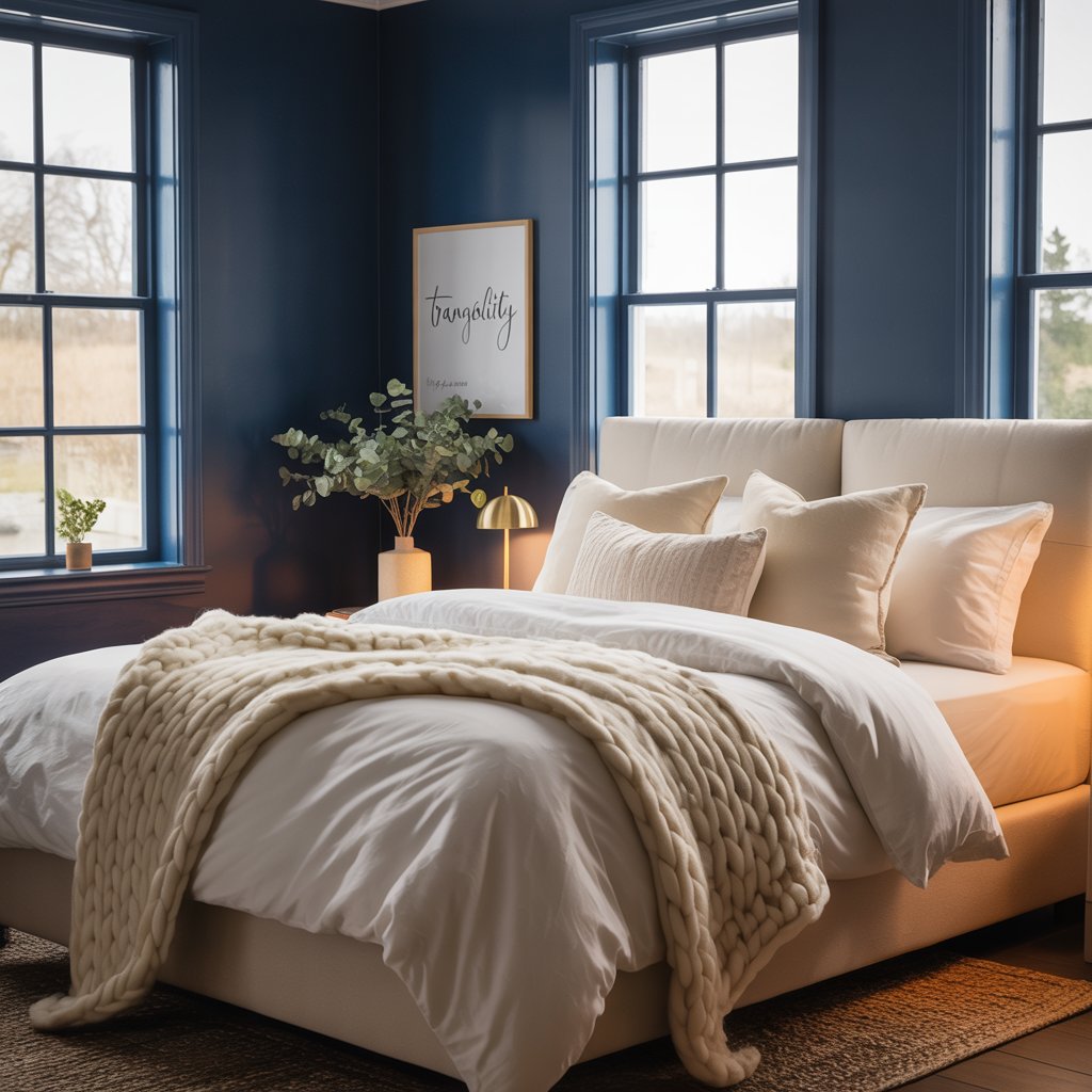
Deep, luxurious navy (almost black but not quite) with generous doses of rich cream.
Surprisingly Sleep-Inducing Because…
- Deep, dark hues are incredibly restful and cocooning.
- Cream provides the essential contrast, keeping it bright enough.
- Feels sophisticated, luxurious, and hotel-room serene.
- Works brilliantly for creating a defined, intimate space.
Personal Fave
Did this in a bedroom with high ceilings. The coziness factor was unreal. Like sleeping in a luxurious cave.
14. Muted Mauve & Grey-Taupe
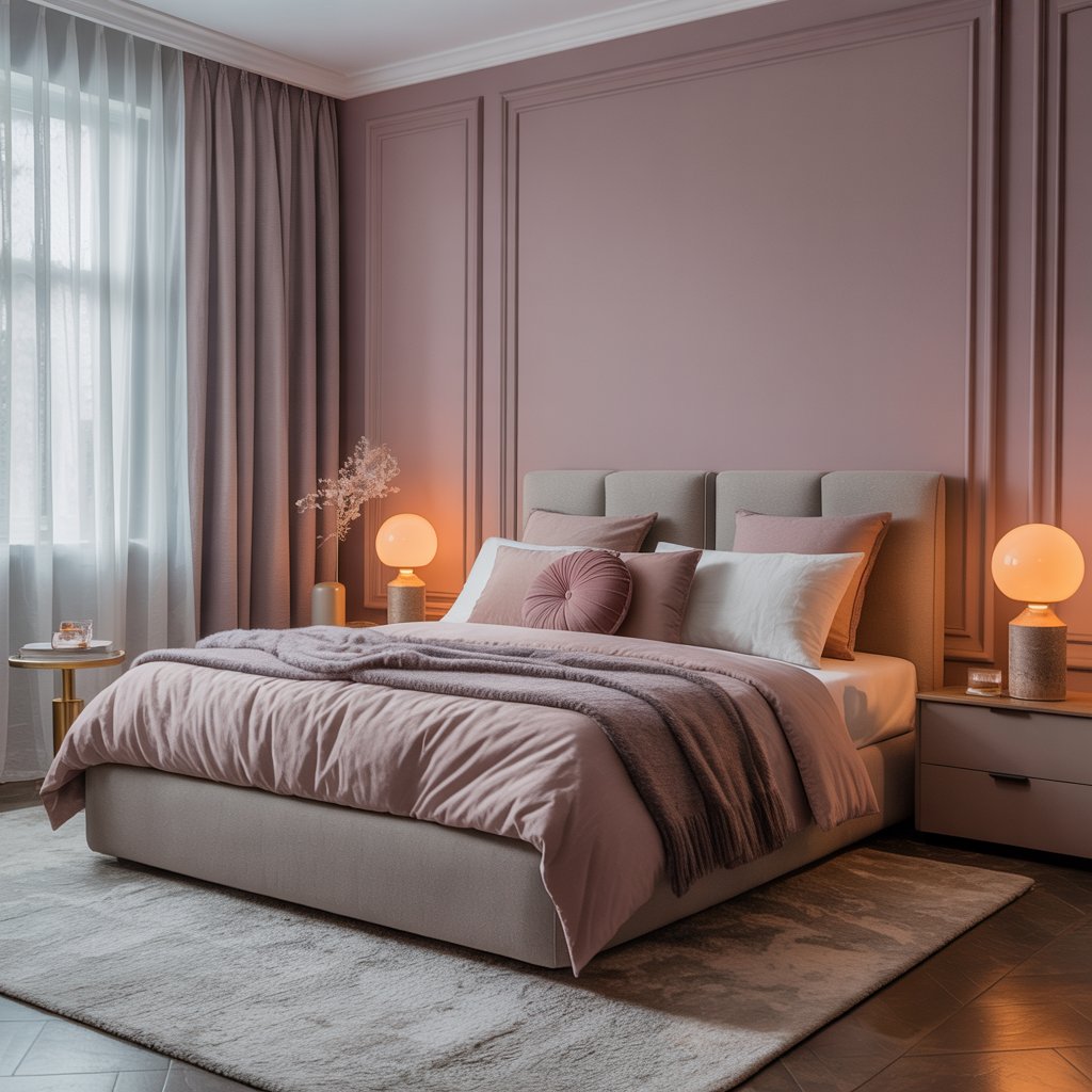
Dusty, rose-toned mauve meets a complex grey with warm taupe undertones.
Why It’s a Must-Try
- Mauve is inherently calming and a bit romantic.
- Grey-taupe adds sophistication and neutralizes any potential sweetness overload.
- Feels elegant, gentle, and uniquely peaceful.
- A fantastic alternative to standard blues or greens.
Pro Move
Add bedding in both colors – maybe mauve sheets with a grey-taupe duvet cover. So chic.
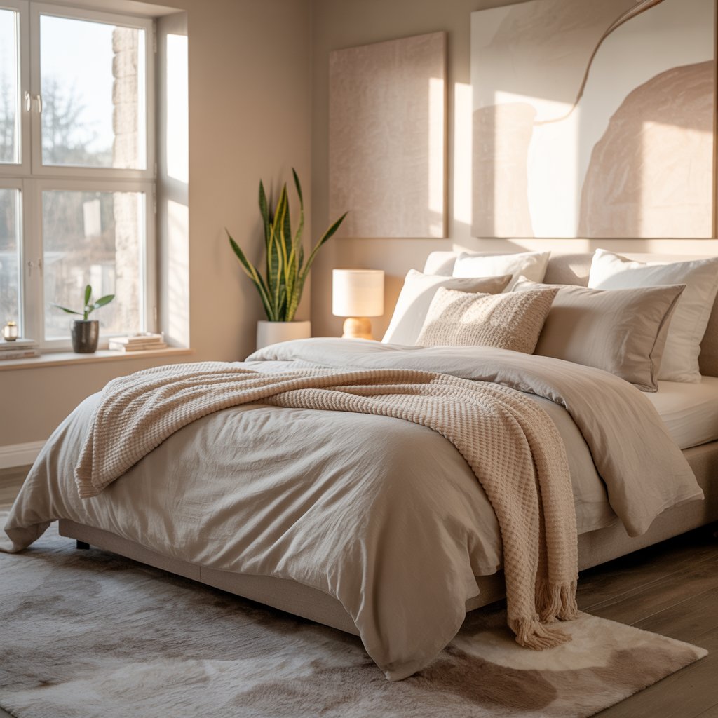
15. Warm White & Natural Everything
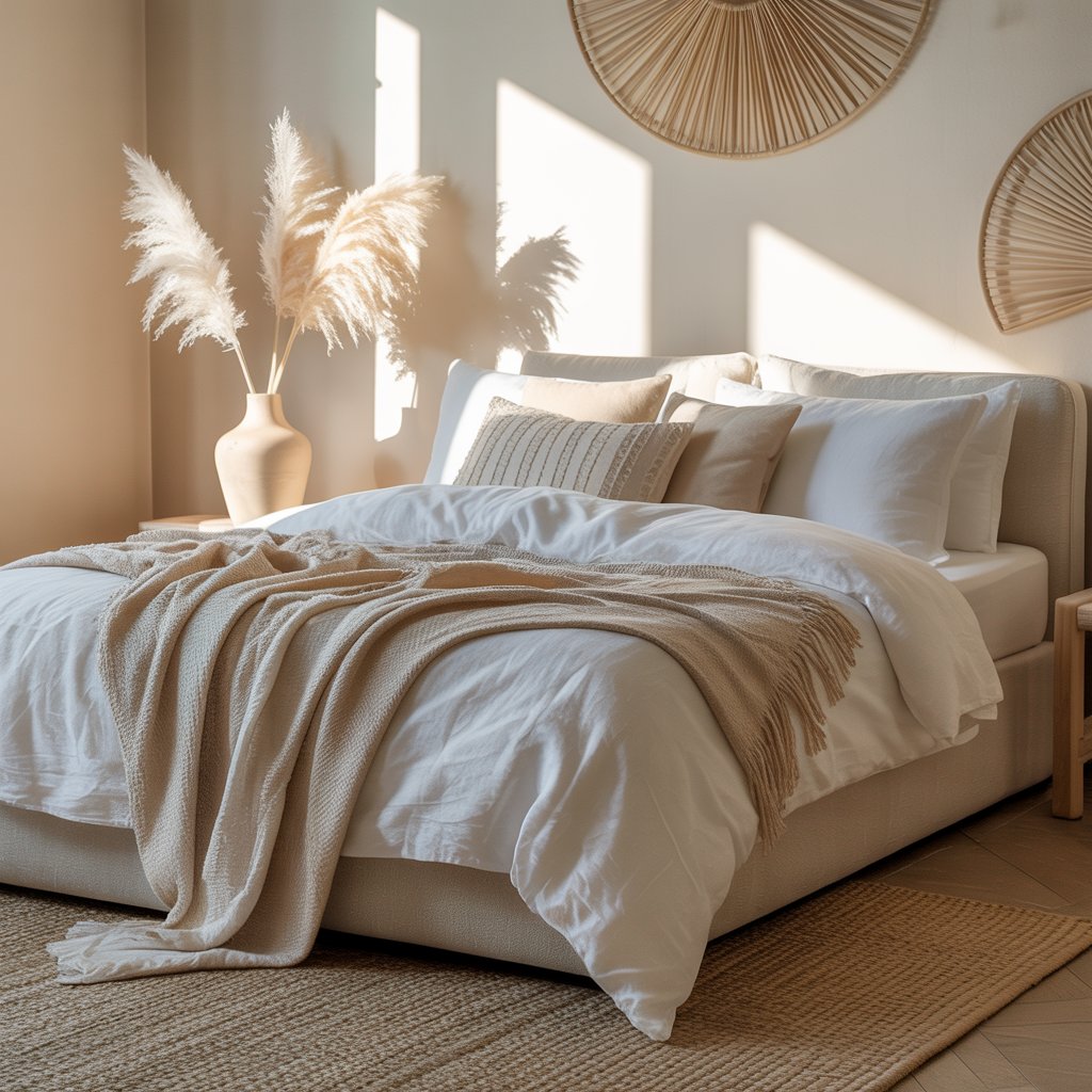
Not just any white! Choose a white with warm undertones (creamy, not icy). Then layer in loads of natural textures: wood, rattan, stone, linen, wool.
How to Avoid Sterile
- Texture is NON-NEGOTIABLE. This is where the warmth and calm come from.
- Mix woods (lighter and darker), different weaves, matte finishes.
- Add a plant or two (real or very convincing fake!).
- Feels clean, spacious, organically calming, and minimalist-chic.
Personal Take
This is ultimate “clean girl” bedroom energy. So peaceful and easy on the eyes. IMO, it never goes out of style.
16. Sea Glass Trio
Imagine collected sea glass: soft aqua, muted seafoam green, and pale sandy beige. Use all three in varying proportions.
Why It Works
- Directly channels the calming energy of the ocean shore.
- The blend of analogous colors (next to each other on the color wheel) is inherently harmonious.
- Feels fresh, light, and effortlessly serene.
- Perfect for creating a relaxed, coastal vibe without anchors or starfish overload.
Pro Tip
Paint walls the palest sandy beige, use aqua in bedding, and add seafoam with a throw or art. Easy peasy.
Wrapping Up
Phew! Sixteen paths to a bedroom that actually feels like the peaceful retreat it should be. Who knew picking paint could feel almost therapeutic? (Okay, maybe not the sampling-on-the-wall part).
The golden rule? Choose colors that genuinely make you exhale. Don’t just follow trends blindly..
Test those samples like your sleep depends on it (it kinda does!). See them in your actual light, day and night. And remember, it’s not just the walls. Its also the Bedding, rugs, curtains, even that weirdly shaped vase you love. They all play a part in the color symphony.
So, which palette is whispering your name? Time to grab some swatches, maybe a paint roller (or call a pro, no shame!), and start building your own perfect, peaceful haven. Sweet, colorful dreams!