Alright, let’s be real for a sec. Choosing paint for a boy’s room often feels like picking between “Blue number 1” and “Blue number 2 (but slightly darker).” Yawn. Been there, painted that.
But what if we ditched the boring and went for shades that actually ignite imagination, fuel adventures, and look seriously cool?
Forget just “decorating”, let’s build a launchpad for creativity and pure fun. Ready to explore some seriously awesome color magic for boys’ bedrooms? Buckle up!
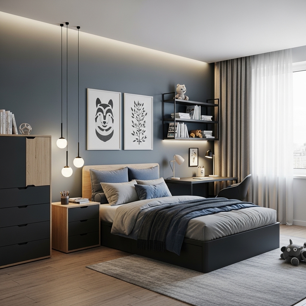
1. Cosmic Navy (Not Your Average Blue!)
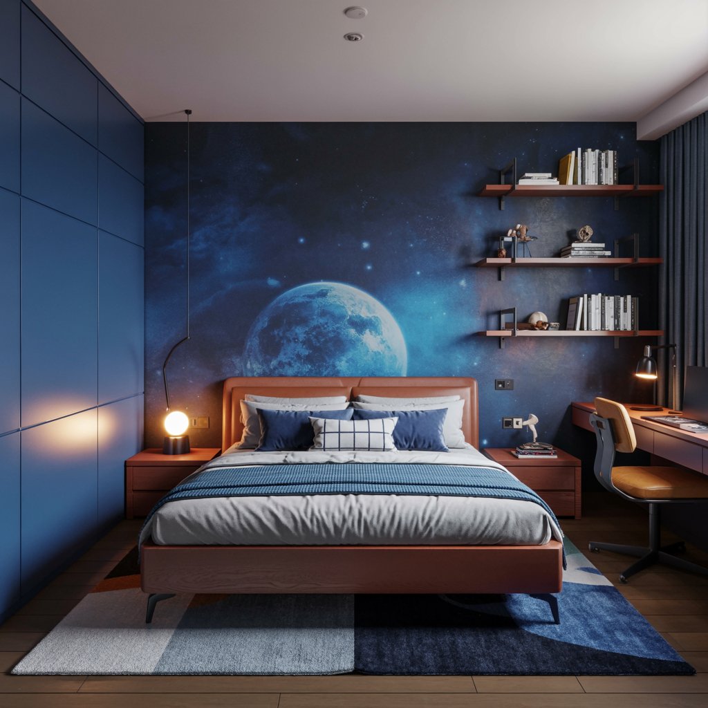
Forget baby blue. Think deep, mysterious cosmic navy. It’s sophisticated enough for older kids but still whispers adventure. Perfect for glow-in-the-dark stars or a sleek modern vibe.
Why it sparks imagination:
- Instantly creates a calm, focused atmosphere for building or reading.
- Acts like the ultimate backdrop for pops of bright color (think neon orange, electric green, sunny yellow).
- Feels like outer space, deep sea diving, or a midnight adventure – instant story starter!
Pro Tip: Pair it with metallic silver accents (lamps, hardware) for a futuristic feel. Matte finish amps up the cozy, eggshell gives a cleaner look. FYI, matte hides wall imperfections better!
2. Energetic Chartreuse (The “Whoa!” Factor)
Okay, hear me out. Chartreuse (that zingy yellow-green) isn’t for the faint of heart, but BOY does it pack a punch. It screams energy and fresh ideas. Seriously underrated IMO.
How to rock it without overwhelming:
- Use it on one accent wall behind the bed or desk for major impact.
- Pair with rich charcoal grey or crisp white to balance the zing.
- Perfect for a creative zone – art corner, Lego station, reading nook.
- Makes natural wood tones and plants look amazing.
Story Time: Used this in a client’s study nook. Kid went from “meh” about homework to actually volunteering to sit there. Coincidence? I think not! Just… maybe avoid all four walls unless you’re raising a tiny superhero.
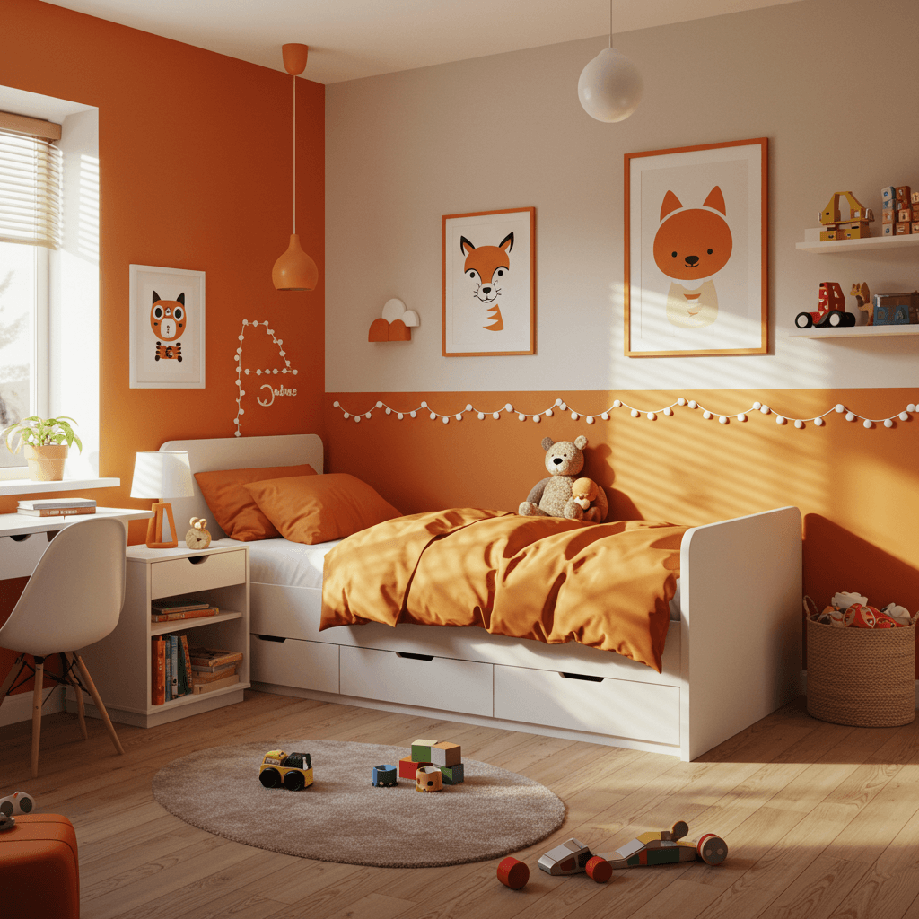
3. Adventure-Ready Terracotta
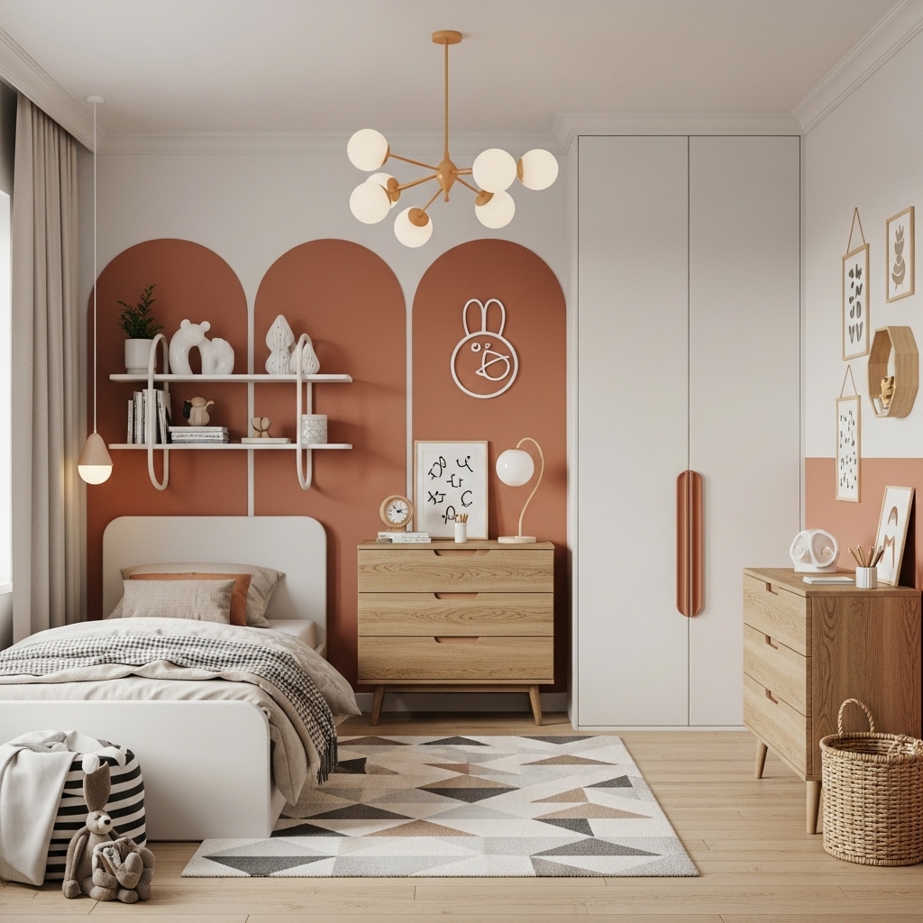
Move over, beige! Warm, earthy terracotta brings desert sunsets, canyon walls, and ancient pottery vibes. It’s unexpectedly cozy and super inviting.
Why it’s a must-try:
- Creates a grounded, warm, and safe feeling space.
- Looks incredible with navy, teal, olive green, and mustard yellow.
- Perfect for nature-inspired themes (desert, jungle, safari) or global adventures.
- Much more unique and vibrant than standard browns or tans.
4. Bold Racing Green
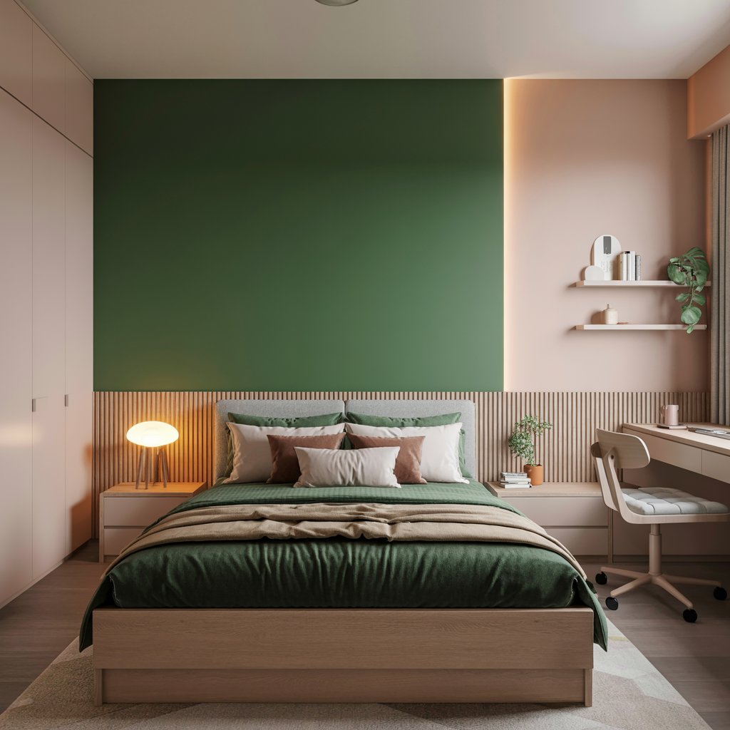
Deep, luxurious, and just a little bit rebellious. Racing green feels sporty, sophisticated, and totally cool. Think vintage cars, lush forests, or secret agent HQ.
How to make it work:
- Crisp white trim is non-negotiable for definition and freshness.
- Add warm wood furniture and brass or gold accents for a luxe touch.
- Red or orange accents (pillows, art) create an amazing, energetic contrast.
- Works brilliantly in both traditional and modern room setups.
Pro Move: Use a high-quality paint with depth – a flat or matte finish makes it feel extra rich and cozy. Avoid anything too shiny.
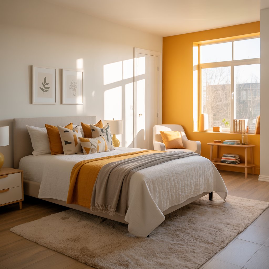
5. Zesty Tangerine (Sunshine in a Can)
Need instant cheer and energy? Tangerine is pure, unadulterated sunshine. It’s playful, optimistic, and guaranteed to banish gloom. Who says boys’ rooms can’t be joyful?
Why it sparks fun:
- Instant mood booster – seriously, try frowning in an orange room!
- Stimulates creativity and social interaction (great for shared rooms!).
- Pairs surprisingly well with blues, greys, and even deep purples.
- Makes primary colors and bold patterns pop like crazy.
Downside: Can be intense. Stick to one wall or large furniture pieces unless your kid has truly boundless energy (bless you). Balance is key!
6. Moody Teal (Deep & Dreamy)
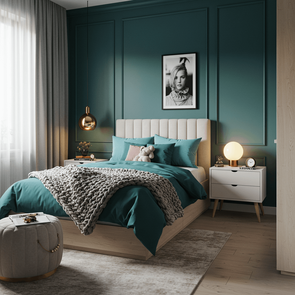
Teal’s magic is its duality – calming blue meets vibrant green. A deeper, moodier teal feels rich, enveloping, and deeply creative. Perfect for thinkers and dreamers.
Why it works:
- Fosters focus and calm while still feeling vibrant and interesting.
- Pairs beautifully with warm metallics (gold, copper), burnt orange, and blush pink (yes, really!).
- Feels sophisticated without being stuffy – grows well with a kid.
- Great for underwater themes, sci-fi, or just a cool, collected vibe.
Personal Take: This is my go-to for kids who need a peaceful retreat but still want personality. Layer in texture with fuzzy rugs and woven baskets.
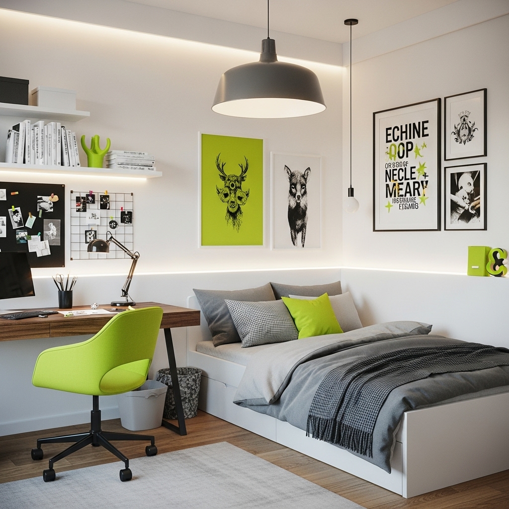
7. Electric Lime Punch
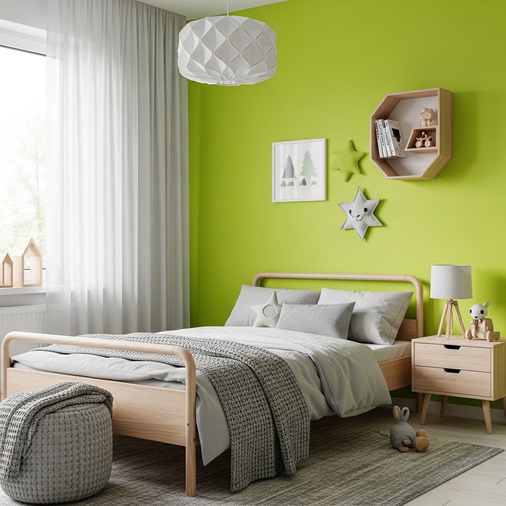
Chartreuse’s bolder, brighter cousin! Electric lime is pure, unapologetic fun. It’s energetic, modern, and screams “playtime!” Use it strategically.
How to nail the look:
- Best as an accent color – think desk, bookshelves, door, or a single stripe.
- Contrast with black, white, or dark grey for maximum impact and a graphic feel.
- Awesome in a minimalist room to add a huge burst of life.
- Instant “fun zone” marker – paint the inside of a closet or play nook!
Pro Tip: Sample this one BIG TIME. Lighting changes it drastically. It can look neon or more herbal depending on the space. Test before you commit!
8. Sophisticated Slate Grey
Hold up! Grey isn’t boring; it’s the ultimate sophisticated backdrop. Slate grey, especially with subtle blue or green undertones, is cool, calm, and collected.
Why it’s next-level:
- Lets bedding, art, toys, and collections REALLY shine as the stars.
- Creates a modern, sleek, almost “studio” feel that kids love as they get older.
- Pairs with literally ANY accent color – yellow, red, blue, green, pink, orange… you name it.
9. Sunny Mustard Yellow
Warmer and richer than a primary yellow, mustard adds instant warmth, cheer, and a retro-modern vibe. It’s cozy but still vibrant.
How to use it for maximum fun:
- Works wonders on furniture (bed frame, dresser) against white or grey walls.
- Amazing accent wall color, especially in north-facing rooms needing light.
- Pairs perfectly with navy, forest green, burgundy, and teal.
- Great for sports themes, retro spaces, or just adding sunshine.
Story Time: Painted an old wooden desk mustard yellow for a kid. Suddenly, homework didn’t seem quite so bad. Color psychology is real, folks!
10. Retro-Vibe Avocado Green
Nostalgic but fresh! A mid-tone avocado green (think 70s fridge, but cooler) is surprisingly versatile and full of character. It’s earthy with a kick.
Why it sparks creativity:
- Unique and unexpected – stands out from the usual blues and greens.
- Pairs amazingly with wood tones, burnt orange, mustard, and cream.
- Perfect for nature themes, retro spaces, or fostering a “maker” vibe.
- Feels both cozy and energizing at the same time.
Pro Move: Lean into the retro feel with some funky geometric patterns in bedding or a rug. Or keep it modern with clean lines and black accents.
11. Dreamy Lavender (Yes, Really!)
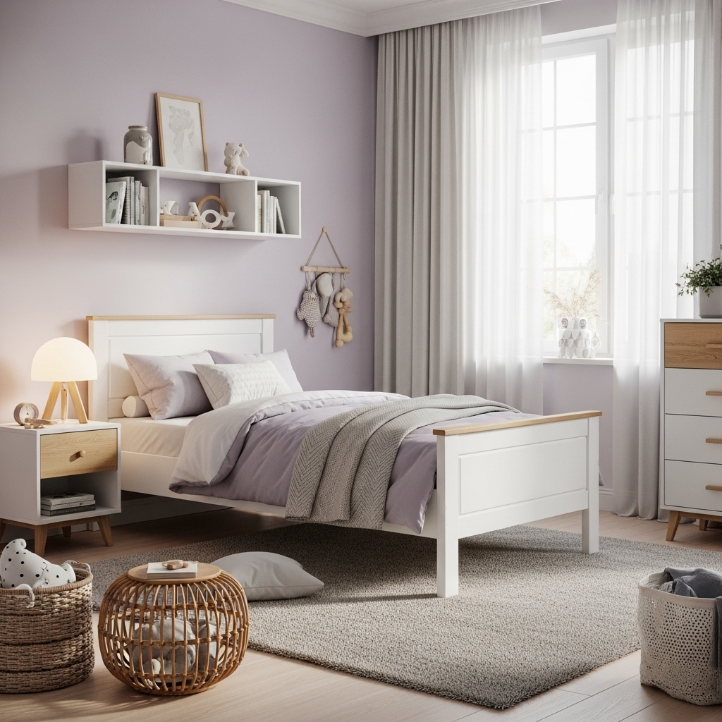
Challenge accepted! Soft, hazy lavender isn’t just “girly.” It’s calming, promotes rest, and sparks gentle imagination – perfect for dreamers, readers, or kids who need a peaceful space.
How to make it feel boy-approved:
- Choose a greyed-out, muted lavender – avoid anything too candy-pinkish.
- Pair with strong, masculine accents: Charcoal grey, black, navy, deep green, or wood.
- Use in patterns (stripes, geometrics) alongside darker colors.
- Great for cloud themes, space (dusk vibes), or a serene sanctuary.
Personal Take: Used a dusty lavender on a ceiling with deep navy walls. The kid loved the “night sky getting lighter” effect. Mind blown.
12. Rich Burgundy (Unexpectedly Awesome)
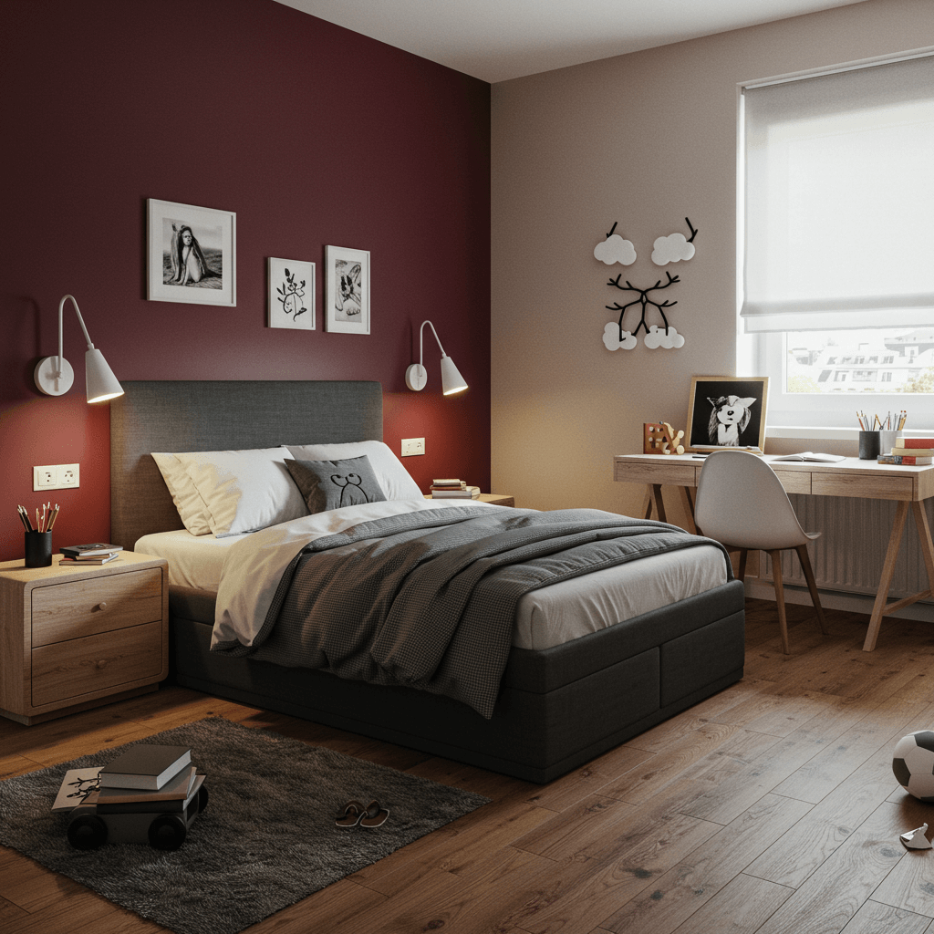
Deep, luxurious burgundy? In a kid’s room? Absolutely. It’s bold, cozy, and feels like a rich library, a cozy den, or a superhero’s secret base.
Why it’s a must-try for the brave:
- Creates an incredibly warm and enveloping atmosphere.
- Looks stunning with gold, brass, forest green, navy, and mustard yellow.
- Perfect for a feature wall or even painted ceiling for serious drama.
- Feels mature and unique, fostering a sense of importance.
Downside: It is dark. Amplify lighting (overhead + task lamps) and balance with lighter elements (white trim, light rug, bedding). Best for rooms with decent natural light.
13. Refreshing Mint Green (Cool & Collected)
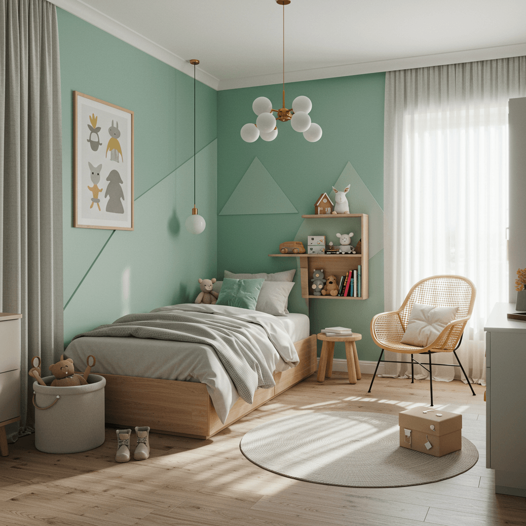
Not pastel, not neon – a crisp, clean mint green. It’s refreshing, calming, and works from toddlerhood to teens. Think cool ocean waves or fresh spring leaves.
How to keep it fun:
- Avoid going too “baby nursery” by pairing with bold black accents, navy, or charcoal.
- Add pops of brighter colors – coral, tangerine, or bright yellow.
- Perfect for beach themes, sports (golf, tennis?), or a clean, modern look.
- Makes a small room feel brighter and more open.
Pro Tip: Use it on built-ins or trim for a fresh, unexpected twist against white or grey walls. Instant upgrade!
14. Glowing Coral (Warm & Welcoming)
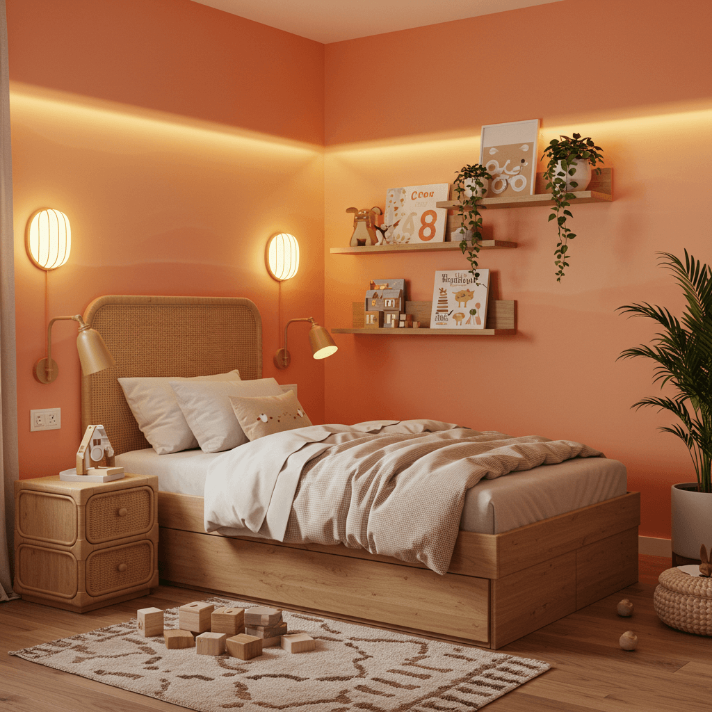
Straddling pink and orange, coral is warm, inviting, and full of positive energy. It’s friendly, vibrant, and far more versatile than you think.
Why it sparks joy & creativity:
- Promotes feelings of happiness and optimism.
- Pairs beautifully with teal, navy, grey, white, and warm woods.
- Works for tropical themes, artistic spaces, or just a super cheerful room.
- Less intense than straight orange, more unique than standard pink.
Personal Fave: Saw a boy’s room with coral walls, navy bedding, and loads of plants. It looked like a cool, modern jungle oasis. Zero regrets!
Wrap Up
Ditching the predictable opens up a whole universe of seriously cool possibilities for a boy’s room.
From the grounded warmth of terracotta to the electric buzz of lime, the sophisticated depth of racing green to the surprisingly serene vibe of lavender, there’s a next-level color out there waiting to spark your kid’s unique brand of awesome.
Remember the golden rules: Don’t fear bold accents, embrace personality over stereotypes, balance intense colors with neutrals, and LET THE KID HAVE A SAY (within reason, obviously… we vetoed the all-black phase, remember?). The best room reflects them and fuels their imagination.
So, get to sampling, and have fun transforming that space into a true creativity lair. What color adventure will you start first? Let me know in the comments.