Are you staring at your living room walls and wondering if “builder beige” is really your soulmate? Yeah, I’ve been there too. Choosing colors can feel paralyzing. What if it looks awful? What if it dates faster than last year’s meme?
Chill. I’ve been there, painted that (sometimes twice!). Forget boring safe bets. Today, we’re diving into 16 combos so good, you’ll kick yourself for not trying them sooner.
Trust me, your living room deserves this glow-up. Ready to banish the bland? Lets get started.
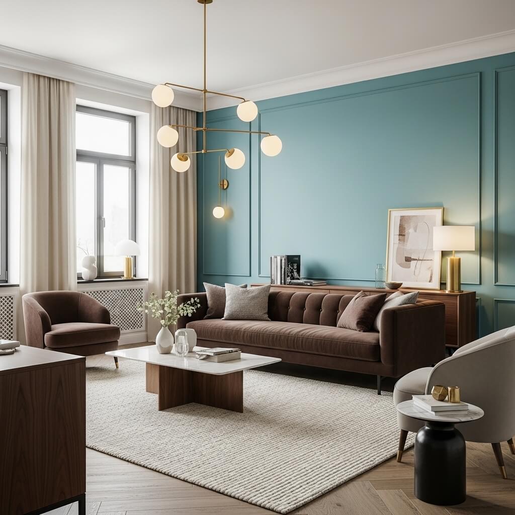
1. Deep Teal + Burnt Orange + Natural Wood
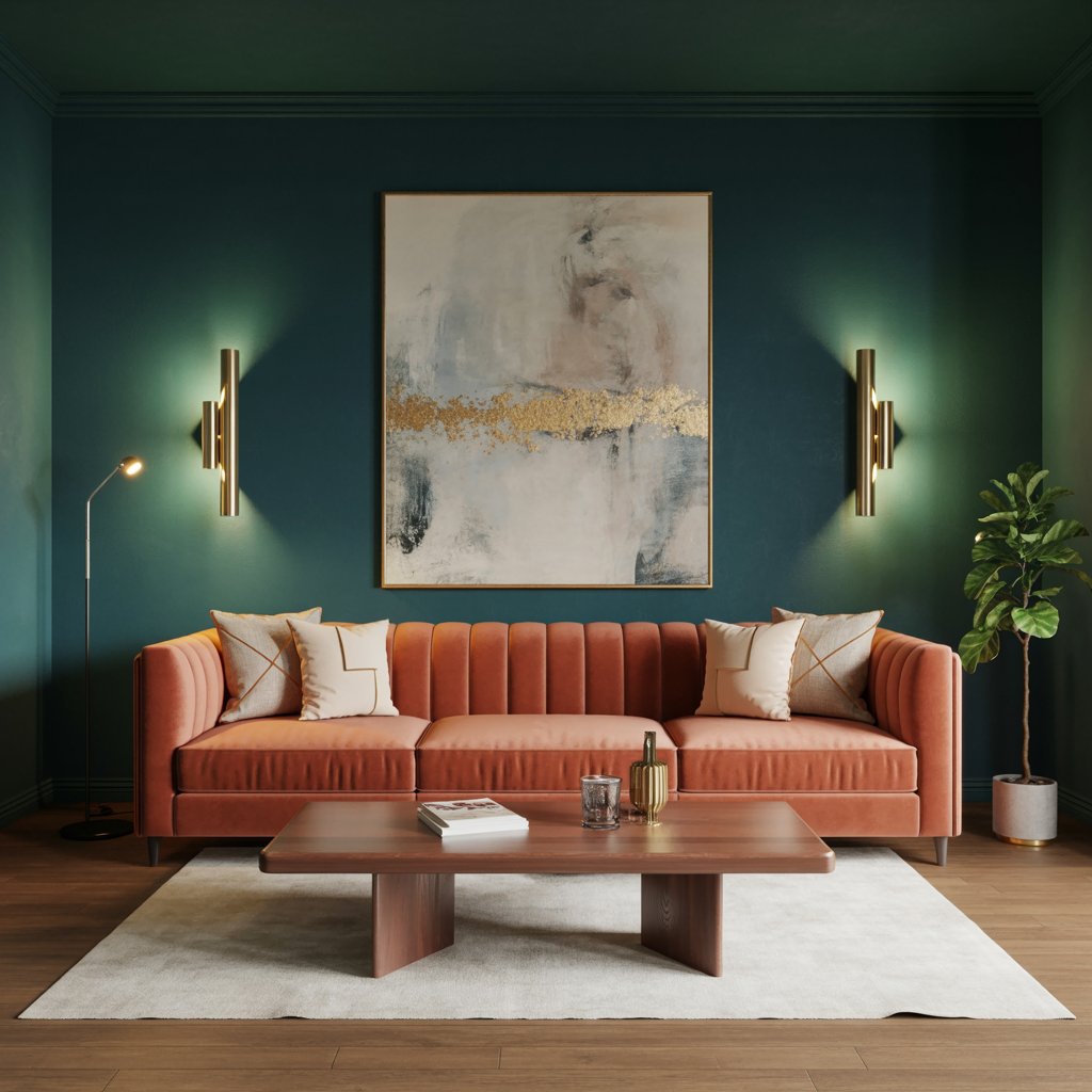
This combo screams sophisticated warmth. Think moody lagoon meets desert sunset, grounded by rich wood tones. It’s vibrant but balanced, cozy yet undeniably chic.
Why it slays:
- Teal provides a luxurious, enveloping base.
- Burnt orange injects energetic warmth without being overwhelming.
- Natural wood (floor, furniture, beams) adds essential earthy texture.
- Feels both modern and timeless – a rare feat!
Personal Take: My friend’s den uses this, and honestly? It’s the room everyone gravitates towards. Feels like a warm hug, but make it fashion.
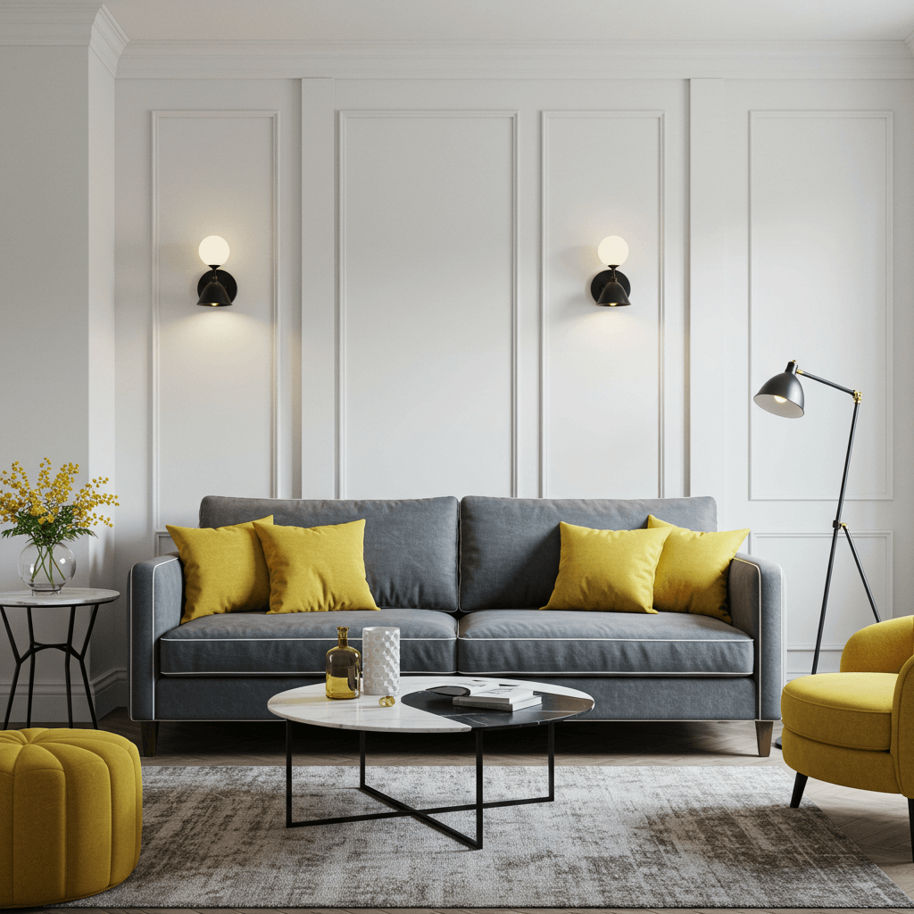
2. Warm White + Charcoal + Mustard Yellow
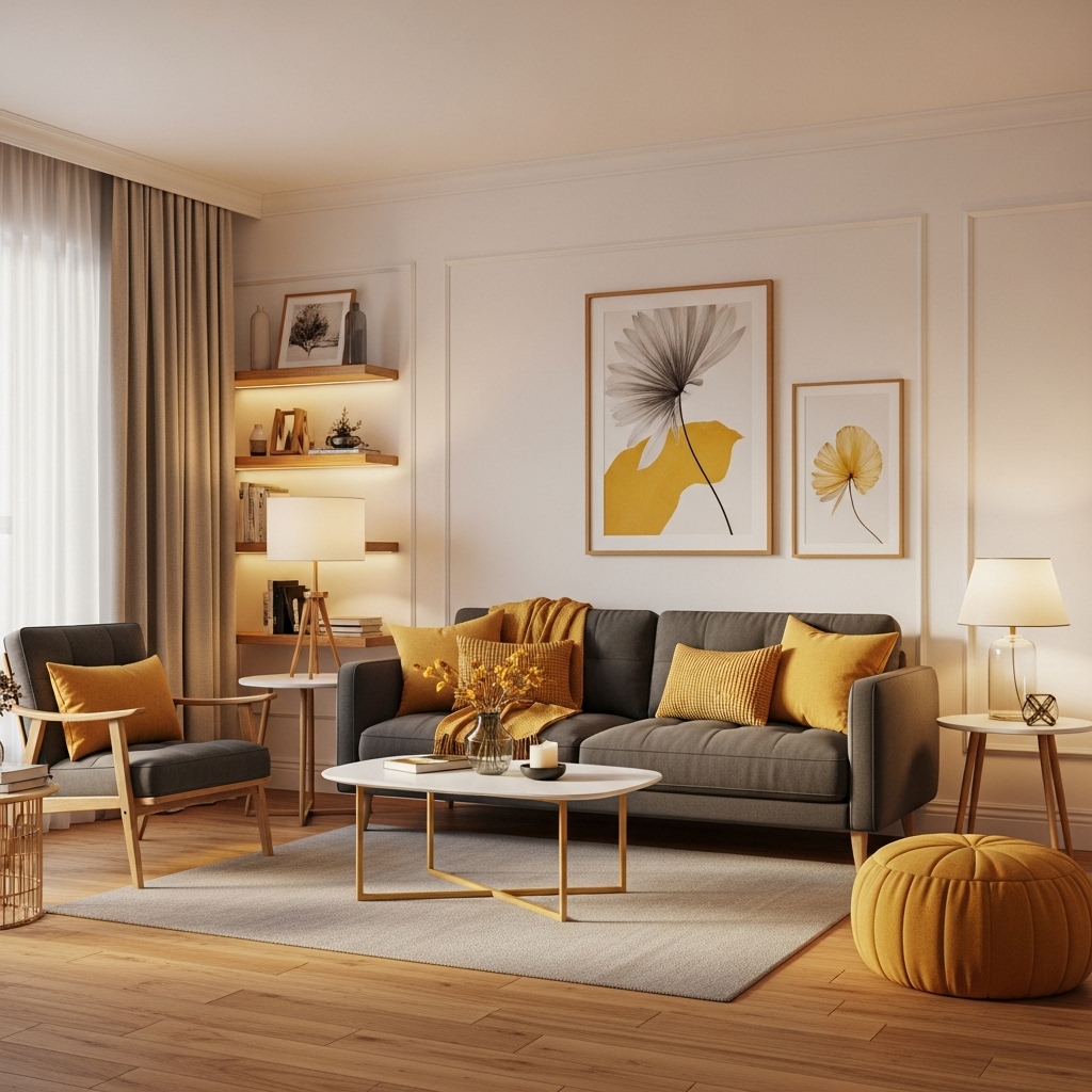
Clean, crisp, and just a dash of playful. This is minimalist with personality. The warm white keeps it airy, charcoal adds depth, and mustard pops like sunshine.
How to ace it:
- Use warm white (think creamy, not sterile) on most walls.
- Charcoal on an accent wall or key furniture pieces (sofa?).
- Mustard in accents – throw pillows, a single armchair, or art.
- Pro Tip: Metallics like brass or gold look stunning with mustard against charcoal. Instant luxe.
3. Blush Pink + Navy Blue + Brass Accents
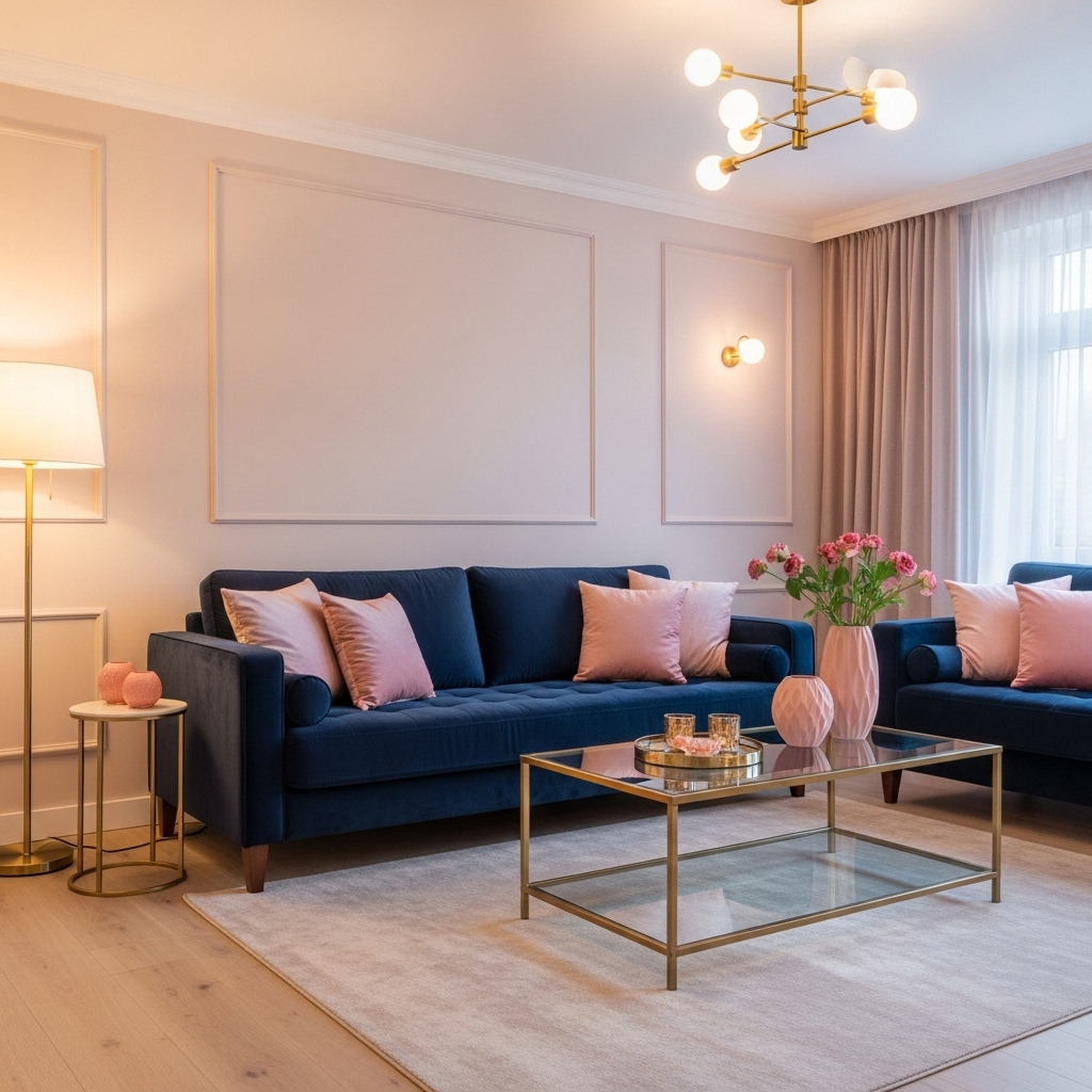
Don’t dismiss pink! This isn’t nursery territory. Blush is soft and sophisticated, navy is grounding and classic, and brass? Pure magic dust.
Why it’s a must-try:
- Creates a surprisingly elegant and calming atmosphere.
- Navy balances the softness of blush perfectly.
- Brass accents (light fixtures, frames, legs) add glamorous warmth.
- Works beautifully in both traditional and modern spaces.
Story Time: I was skeptical about pink walls until I saw this combo in a chic apartment. Sold instantly. It’s like coastal grandma meets modern muse.
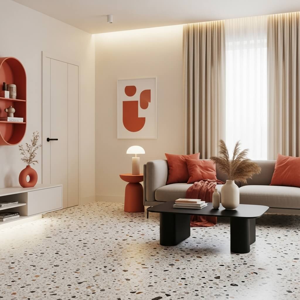
4. Olive Green + Terracotta + Cream
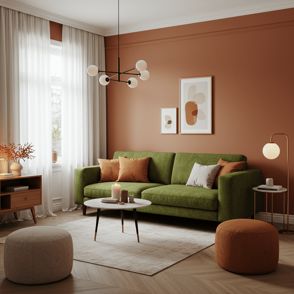
Earth mama vibes, but make it elevated. Olive green is rich and restful, terracotta brings Mediterranean warmth, and cream keeps it light and breezy.
How to nail the earthy luxe:
- Olive on walls or a large sectional.
- Terracotta in rugs, pots, or a statement chair.
- Cream for curtains, plush rugs, and trim.
- Layer textures like linen, jute, and clay for max effect.
Pro Move: Add black metal accents (picture frames, lamp bases) for a touch of modern edge against all that earthy goodness.
5. Jet Black + Bright White + Bold Red

High contrast, high drama. This is for the bold at heart. It’s graphic, powerful, and undeniably stylish – think modern art gallery meets chic Parisian apartment.
Why it works (if you dare):
- Black and white create a sharp, timeless foundation.
- A measured dose of bold red (one accent wall, a rug, an Eames chair) becomes the superstar.
- Instantly commands attention and feels incredibly curated.
6. Sky Blue + Warm Beige + Woven Textures
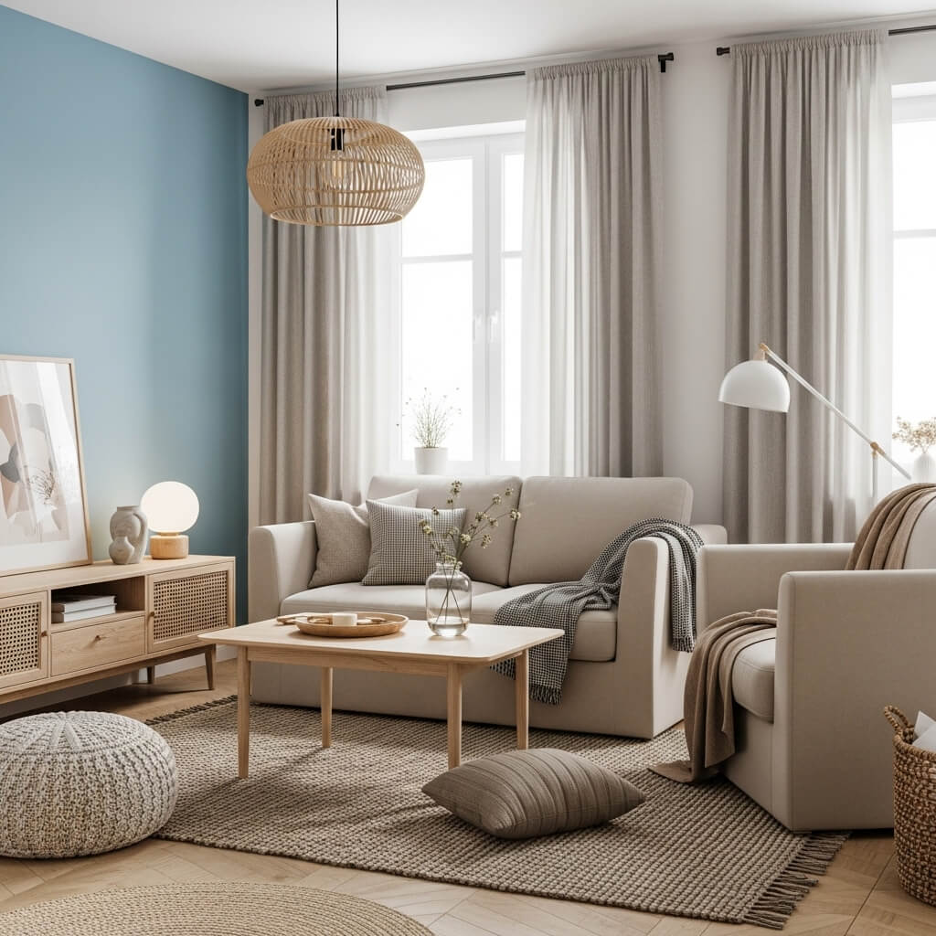
Serenity now! This combo is pure, effortless calm. Sky blue feels like a clear day, warm beige is cozy and inviting, and natural textures add organic interest.
How to keep it cozy, not cold:
- Sky blue walls or a soft, oversized sofa.
- Warm beige (think sand, taupe, greige) on larger furniture or rugs.
- Load up on jute, rattan, seagrass, and linen textures.
- Avoid cool greys – stick to warm neutrals for balance.
Personal Fave: My reading nook uses this palette. It’s my ultimate escape pod from the chaos of life. Bliss.
7. Rich Burgundy + Forest Green + Antique Gold
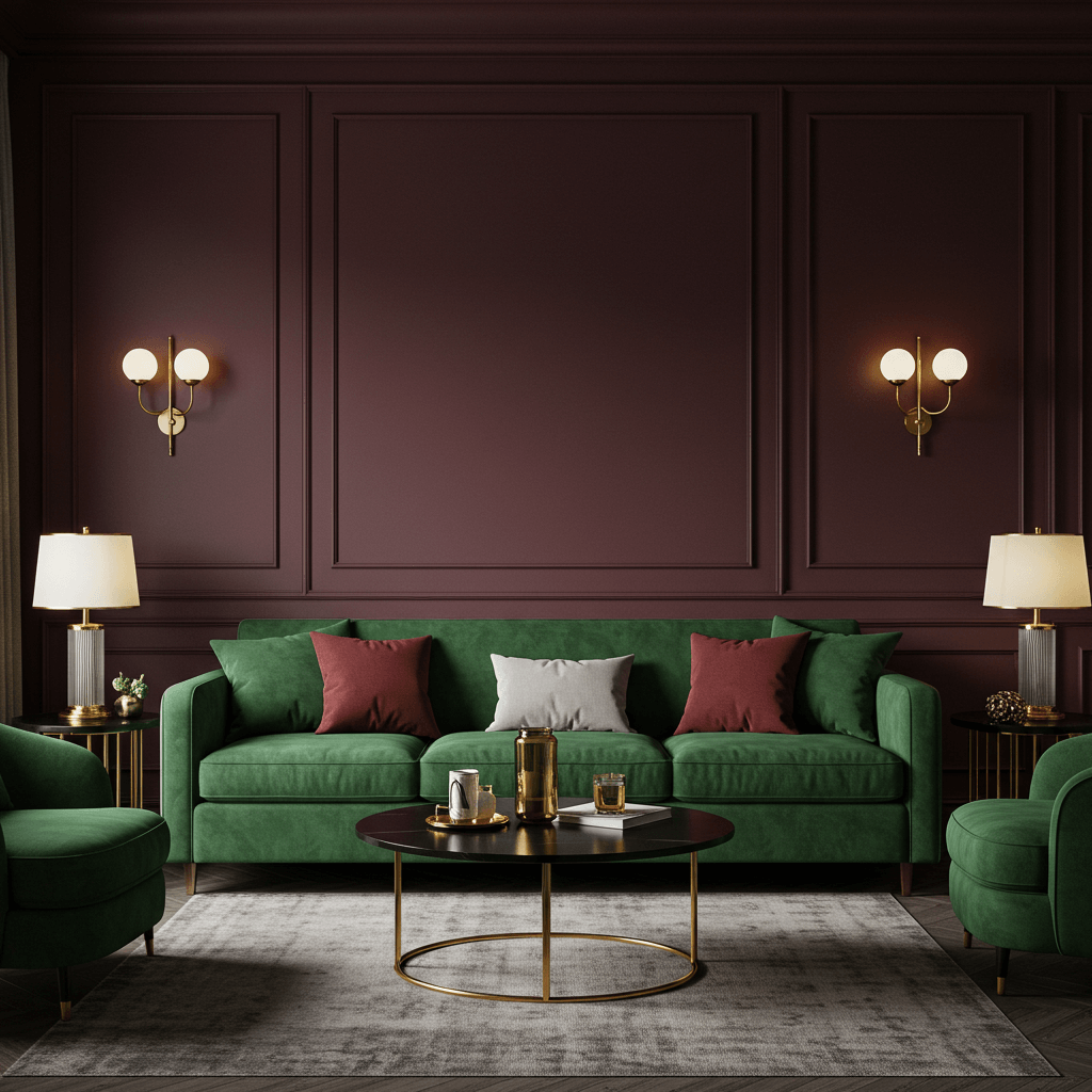
Dark academia’s sophisticated cousin. Deep, jewel-toned, and incredibly rich. It feels luxurious, library-esque, and wonderfully enveloping.
Why it’s unbeatable for mood:
- Burgundy and green are complementary colors – they sing together.
- Creates an intimate, almost cocoon-like atmosphere perfect for evenings.
- Antique gold (mirrors, frames, sconces) adds opulent old-world charm.
- Best in rooms with good natural light or strong artificial lighting.
Pro Tip: Velvet upholstery in either burgundy or green takes this to peak luxe levels. Just try not to nap constantly.
8. Sunshine Yellow + Slate Grey + Crisp White
Instant cheerfulness, but grounded. Yellow energizes, grey sophisticates, and white keeps it fresh and clean. Banishes gloom in seconds flat.
How to avoid looking like a kid’s room:
- Use yellow strategically – accent wall, armchairs, large artwork, not all walls.
- Slate grey on larger surfaces (sofa, rug) or as a secondary wall color.
- Crisp white for trim, ceilings, and to break up the intensity.
- FYI: Mustard works here too for a slightly more muted vibe.
9. Lavender + Sage Green + Pale Oak
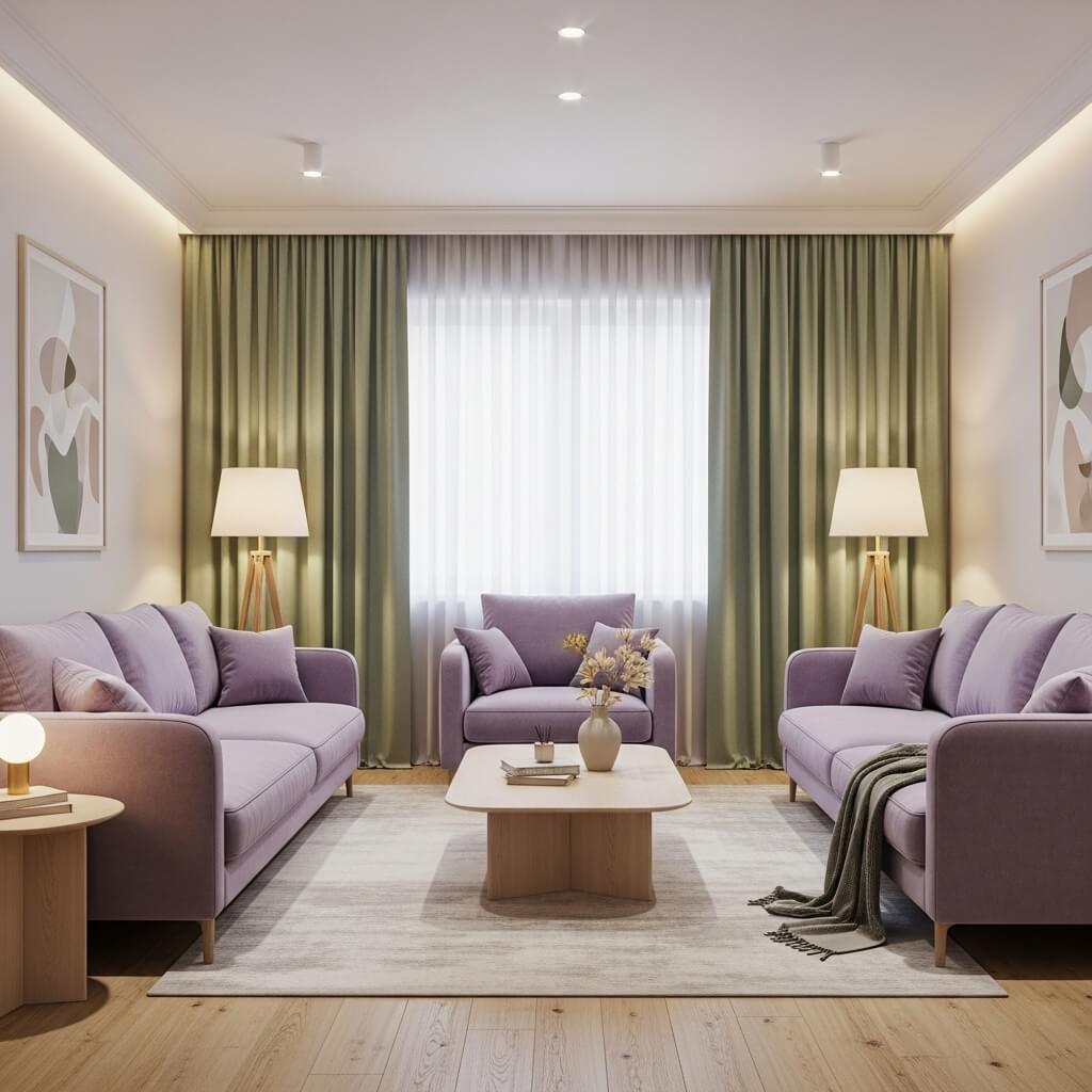
Soft, dreamy, and utterly peaceful. This ethereal combo feels like a gentle sigh. Lavender brings softness, sage adds earthy calm, pale oak grounds it naturally.
Why it’s a must-try for zen seekers:
- Both colors are inherently calming and restorative.
- Creates a light, airy feel, perfect for smaller spaces.
- Pale oak furniture or flooring adds warmth without heaviness.
- Feels fresh and modern, not frilly.
Personal Take: Ideal for bedrooms too, obviously, but why not bring that serenity into your main living space? You deserve it.
10. Terrazzo Tones (Warm Grey, Cream, Black Speckle) + Coral
Yes, terrazzo as a color palette! Embrace the flecked goodness. Warm grey base, creamy swirls, tiny black speckles – then zing it up with vibrant coral.
How to rock the look:
- Find a terrazzo-pattern rug, artwork, or even wallpaper as inspiration.
- Pull the main warm grey and cream for walls and large furniture.
- Use the black speckle in small accents (lamps, picture frames).
- Pop it! Add coral in pillows, a vase, or a funky side table.
Pro Move: This feels incredibly fresh and contemporary, nodding to the 70s without the shag carpet (unless you want shag, no judgment!).
11. Chocolate Brown + Robin’s Egg Blue + Cream
Nostalgic charm, upgraded. Think classic Americana or retro diner, but way, way cooler. Deep brown feels rich, robin’s egg blue is playful and fresh, cream balances.
Why it works so well:
- Unexpected pairing that feels both familiar and fresh.
- Brown grounds the space, blue lifts it.
- Cream prevents it from feeling too heavy or too sugary.
- IMO: Perfect for spaces with mid-century modern furniture.
12. Monochromatic Grey (All Shades) + Metallic Silver
Sleek, cool, and effortlessly modern. But avoid the hospital vibe! Use a range of greys – charcoal, dove, stone – and let silver accents shimmer.
How to keep it warm:
- Layer different grey textures: smooth velvet, nubby wool, cool metal, soft linen.
- Silver accents (mirrors, light fixtures, trays) add reflective light and glam.
- Introduce subtle warmth through wood tones (a pale oak coffee table?) or a single, very muted color accent if needed.
- Downside: Can feel cold if you don’t layer textures and lighting carefully. Add warm-toned bulbs!
13. Dusty Rose + Hunter Green + Black Accents
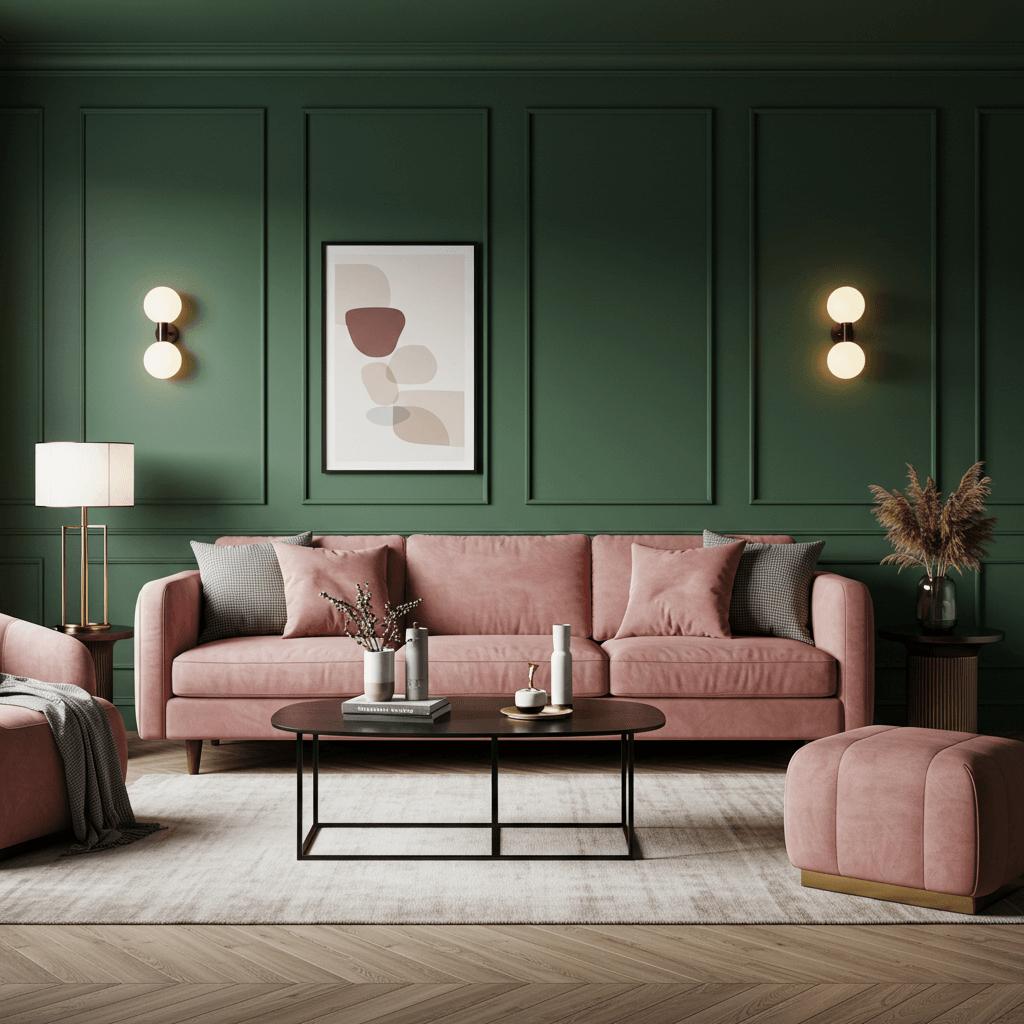
Romantic with an edge. Dusty rose is soft and sophisticated, hunter green adds depth and a touch of drama, black provides sharp definition.
Why it’s a winner:
- Creates a beautifully balanced, slightly moody elegance.
- Feels grown-up and intentional.
- Black accents (picture frames, lamp bases, table legs) stop it from being too sweet.
- Works beautifully with velvets and velveteen fabrics.
14. Cornflower Blue + Rust + Natural Linen
Sun-bleached, Mediterranean perfection. Cornflower blue is cheerful but soft, rust brings warm terracotta energy, natural linen adds effortless texture.
How to get the vacation vibes:
- Cornflower blue walls or a statement sofa.
- Rust in clay pots, a woven rug, or ceramic accessories.
- Linen on curtains, slipcovers, and throw pillows.
- Add woven baskets and plenty of greenery.
Pro Tip: This combo loves natural light and plants. Embrace the indoor-outdoor feel.
15. Pure White + Vibrant Emerald + Glossy Black
High-impact minimalism. Crisp white acts as the perfect gallery wall, emerald makes a stunning statement (sofa? accent wall?), glossy black adds sharp punctuation.
Why it’s a showstopper:
- The contrast is bold, clean, and undeniably modern.
- Emerald feels luxurious and vibrant against the purity of white.
- Glossy black (coffee table, frames, shelving) adds sophisticated depth.
- FYI: Keep clutter to a minimum. This look thrives on clean lines and intentional pieces.
16. Mustard Yellow + Deep Plum + Warm Brass
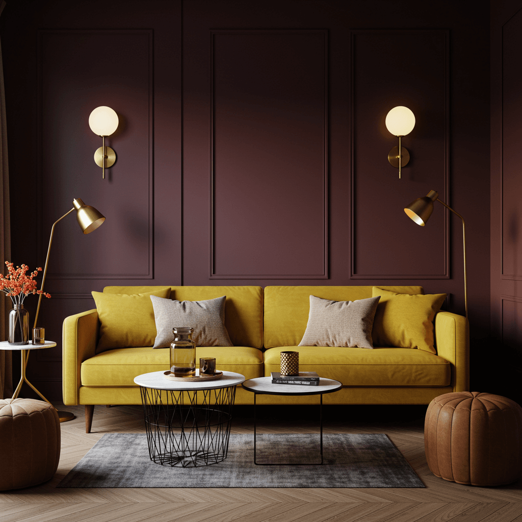
Unexpected and utterly fabulous. Mustard is energetic and warm, deep plum is rich and regal, warm brass ties them together with vintage-inspired glam.
How to embrace the bold:
- Use mustard on an accent wall, a large armchair, or curtains.
- Deep plum works beautifully on a sofa, in a rug, or on cabinetry.
- Warm brass is key for lighting, hardware, and decor accents.
- Ground with warm neutrals like taupe or cream in rugs or other furniture.
Personal Fave: This combo has personality. It’s confident, a little daring, and always memorable. Own it!
Wrapping Up
There you have it, some sixteen combos that are seriously worth ditching the beige for. See anything that made your heart skip a beat? I know I’ve got at least three on my future “must-try” list (looking at you, Olive/Terracotta and Blush/Navy/Brass!).
Remember, paint is the cheapest magic trick in home decor. Don’t be afraid to experiment. Start small with pillows or art if you’re nervous, but honestly? Go big or go home (and paint it something amazing).
The worst that happens is you repaint, and the best? You get a living room you absolutely adore walking into. What combo are you trying first? Tell me down below!