Okay, let’s talk real talk. Small bedrooms? They can feel like cozy nests or… well, slightly cramped shoe boxes. And picking the wrong paint color? That’s like inviting the walls to close in for a group hug you never asked for.
Been there, stared miserably at the magnolia beige, done that. But guess what? Color is your secret weapon, your magic wand, your tiny room’s best friend.
Forget feeling boxed in. With these 15 genius schemes, you can trick the eye, boost the mood, and create a space that feels way bigger and infinitely cooler.
Ready to ditch the boring and embrace the brilliant? Let’s dive in!
1. Cloud White & Barely-There Blush
Pure, clean Cloud White walls act like a blank canvas, bouncing light everywhere. Add soft, whispery Blush accents – maybe a throw pillow, a rug, or even the trim. It’s like a soft sunrise in your room, gentle and airy.
Why it works magic in small spaces:
- White expands: It reflects maximum light, instantly making walls feel farther away.
- Blush adds warmth: Prevents the white from feeling sterile or hospital-chic.
- Super versatile: Acts as the perfect base for any other accent colors you fancy later.
- Calming vibe: Creates a serene, almost spa-like retreat.
Personal fave: Did this a long time ago in my own box room. Waking up felt peaceful, not panicked. It’s like the walls took a step back overnight.
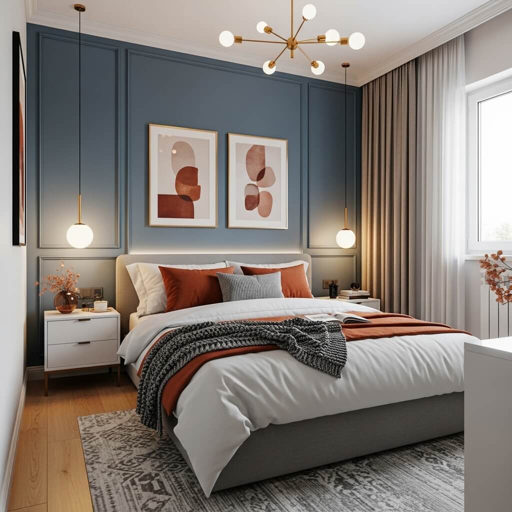
2. Deep Teal Accent Wall + Warm Neutrals
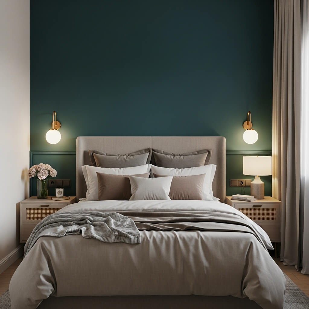
Go bold! Paint one wall (behind the bed is classic) a rich, enveloping Deep Teal. Keep the other walls and ceiling a warm neutral like creamy beige or soft greige. It adds serious depth and personality without overwhelming.
Why it’s a must-try:
- Creates a focal point: Draws the eye in, making the room feel deeper, not wider.
- Feels luxurious: That deep color screams sophistication on a budget.
- Cozy factor: Perfect for creating a snug, intimate sleeping nook.
- Neutrals balance: They keep the overall feel light and airy.
Pro tip: Choose the wall with the least doors/windows for maximum impact. Trust me, it makes a difference.
3. Light Sage Green All Over
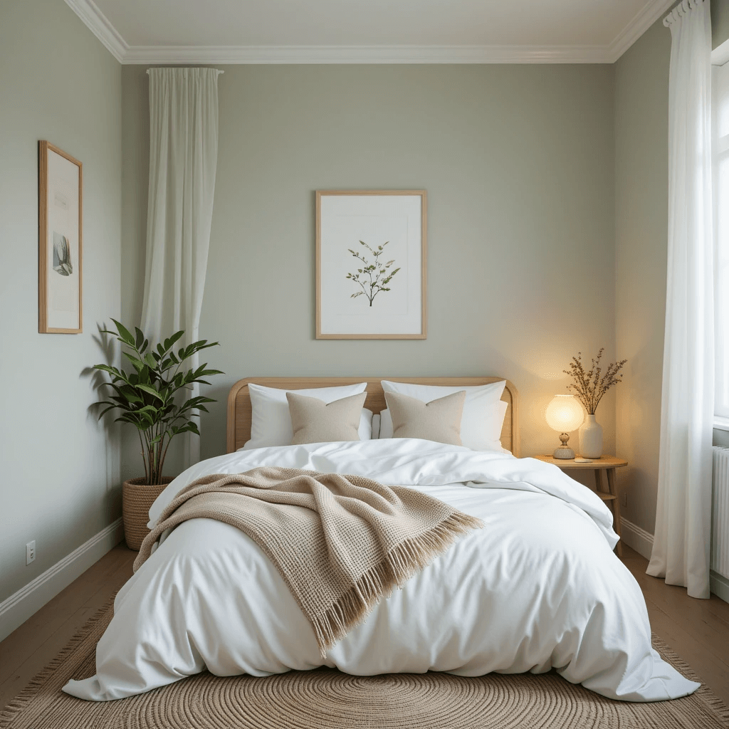
Think fresh eucalyptus or a misty morning forest. Light Sage Green is nature’s neutral. It’s calming, refreshing, and has this magical ability to feel both cozy and expansive. Perfect for small sanctuaries.
How to make it sing:
- Go monochrome-ish: Use varying shades of green in bedding, textiles, and art.
- Add natural textures: Think rattan, linen, light wood tones. Hello, earthy bliss!
- Keep trim crisp white: For a clean, bright finish.
- Plants, obviously: Brings the whole “calm oasis” vibe together.
Personal take: This is my go-to for guest rooms. People always say it feels incredibly restful. Like sleeping in a gentle hug.
4. Soft Sky Blue & Crisp White
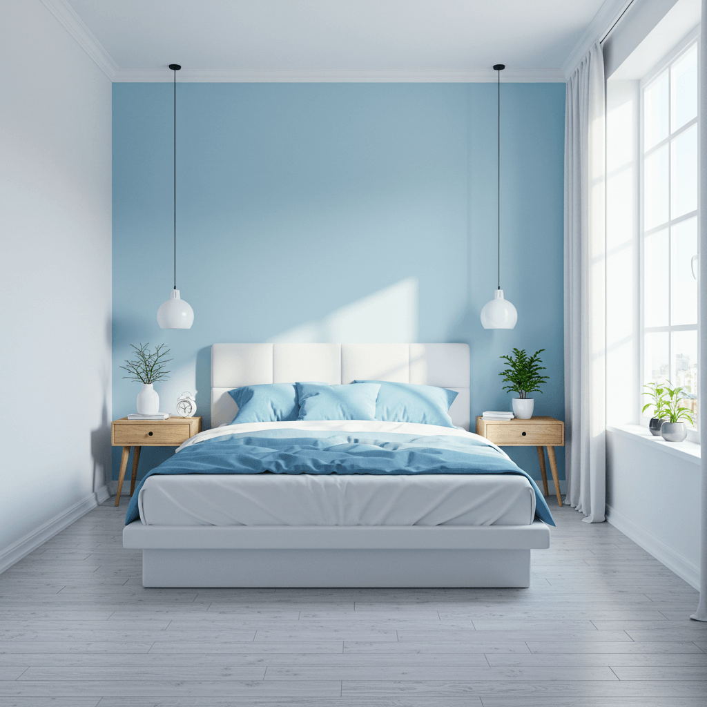
Channel beach cottage vibes without the sand in your sheets. Soft Sky Blue walls feel endlessly airy, like looking up at a clear summer sky. Pair it with Crisp White trim, bedding, and furniture for that fresh, clean lift.
Why it works so well:
- Sky-high illusion: Blue recedes visually, making ceilings feel taller.
- Ultra calming: Scientifically proven to lower heart rates. Bonus!
- Reflects light: Especially great for north-facing rooms needing a boost.
- Timeless appeal: Never goes out of style.
FYI: Avoid anything too baby-blue or primary. You want soft, hazy, and sophisticated.
5. Warm Greige & Terracotta Touches
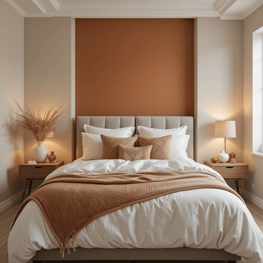
Greige (that perfect gray-beige hybrid) is your sophisticated neutral BFF. It’s warm, inviting, and goes with everything. Inject life with pops of earthy Terracotta – a pillow, a planter, an art print. Instant warmth and character.
The small space win:
- Greige grounds: Provides a cozy, enveloping base color.
- Terracotta energizes: Adds a vibrant, sun-baked touch without being loud.
- Feels grown-up: Moves beyond basic beige or cold gray.
- Pairs beautifully: With woods, blacks, brass, greens… you name it.
Story time: Used this in a client’s tiny attic room. They said it finally felt like a “proper room,” not just leftover space. Win!
6. Charcoal Gray + Mustard Yellow
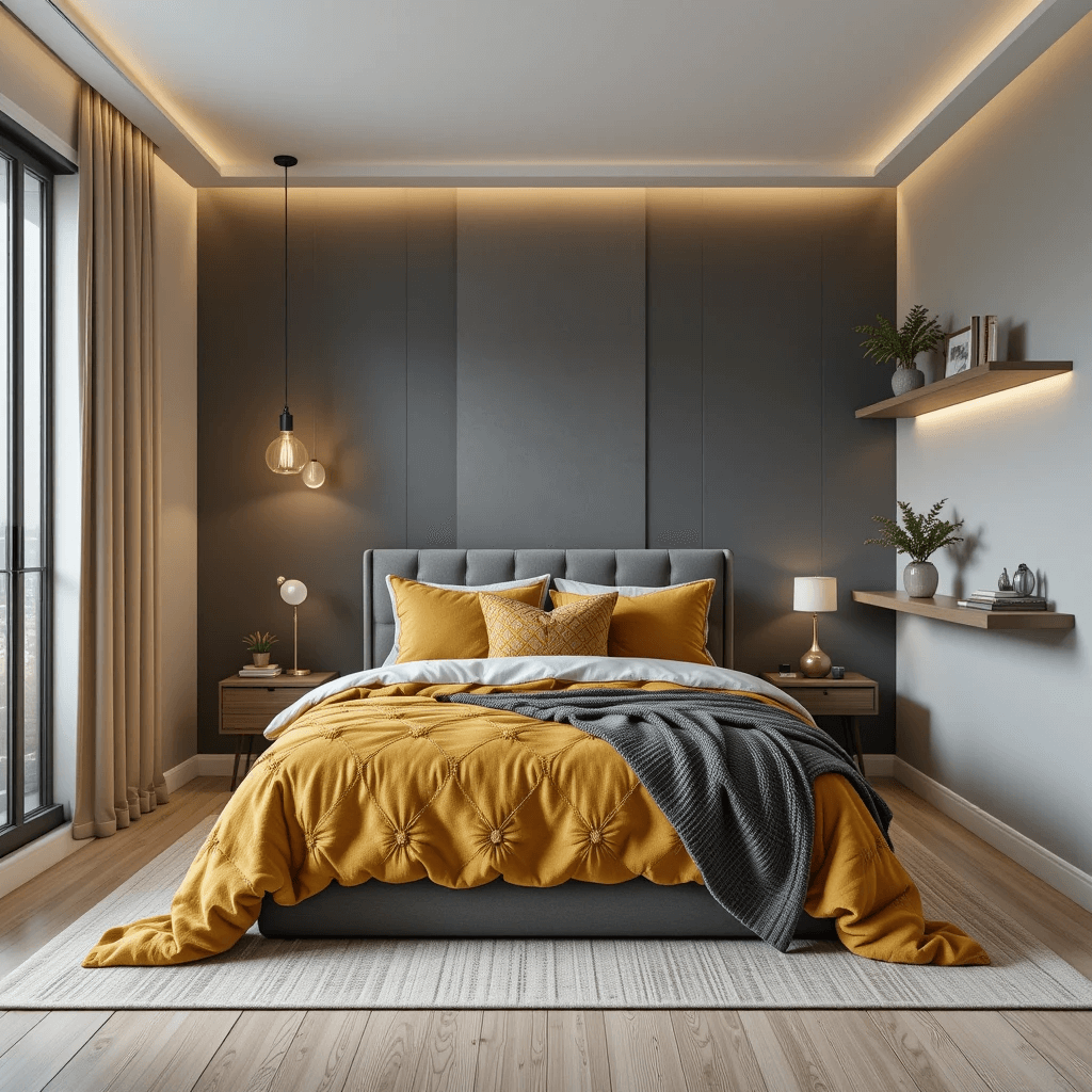
Feeling brave? Dark walls in a small space? Hear me out! Deep Charcoal Gray (think storm cloud, not black hole) on all walls creates a super cocooning, dramatic effect. Then, zing it awake with vibrant Mustard Yellow accents – bedding, a lamp, a single chair.
Why it’s unexpectedly brilliant:
- Depth creation: Dark colors recede, blurring corners and boundaries.
- Cozy cave vibes: Ideal for bedrooms where sleep is the #1 priority.
- Pops of joy: The mustard punches through the moodiness perfectly.
- Modern edge: Far from boring, super stylish.
Downside: Needs good lighting! Layer lamps (overhead, bedside, task) or it will feel like a cave (and not in the good way).
7. Pale Lilac & Silver
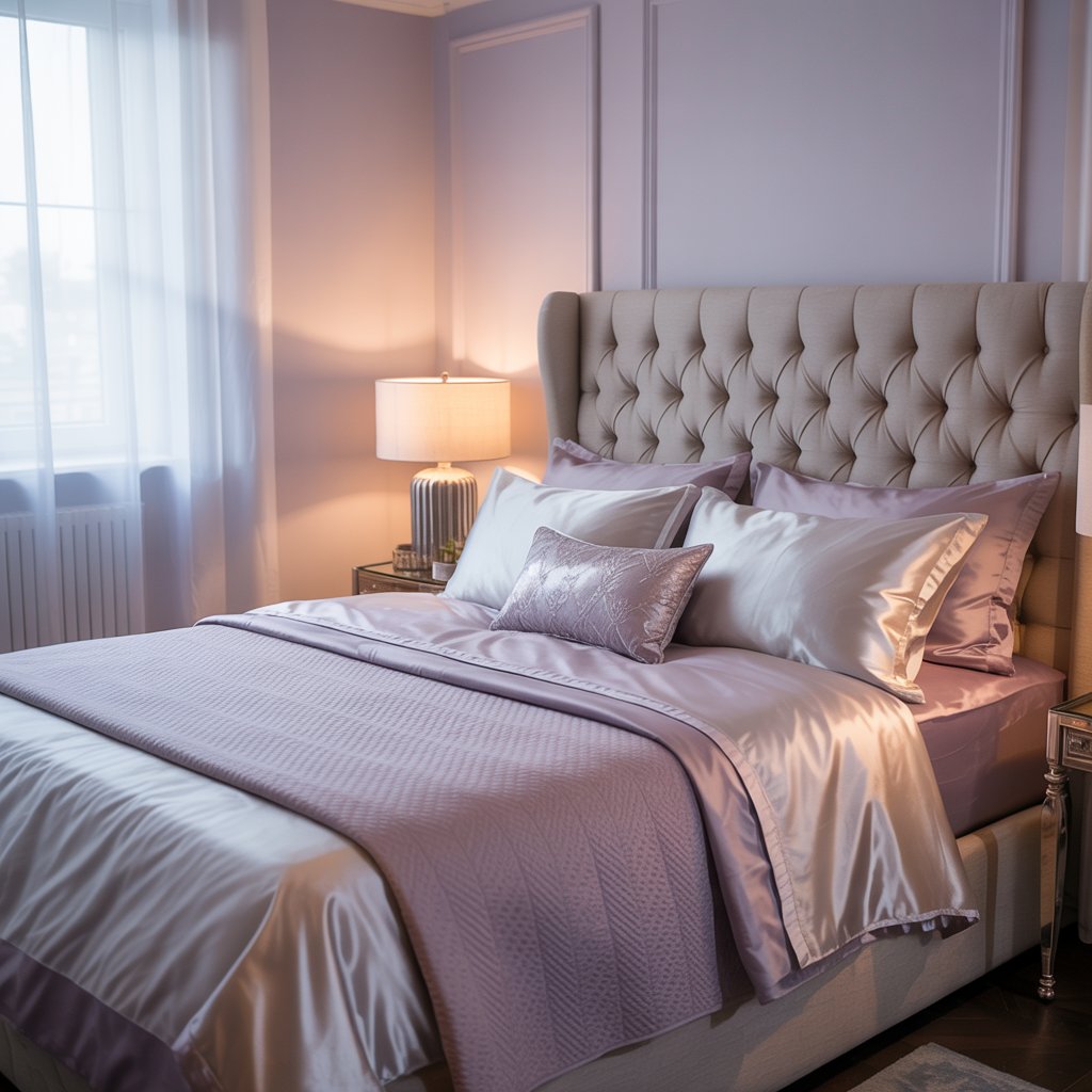
Soft, barely-there Lilac walls feel dreamy and romantic. Pair with cool Silver metallics – lamp bases, picture frames, mirror edges. It’s ethereal, light, and has a touch of glam without being OTT.
How to nail the look:
- Keep the lilac pale: You want lavender fields at dawn, not grape jelly.
- Silver accents: Reflect light and add a subtle sparkle.
- White or light gray bedding: Keeps the airiness flowing.
- Avoid clutter: This scheme shines best with a minimalist approach.
Pro move: A large silver-framed mirror opposite a window doubles the light and the magic.
8. Creamy Vanilla & Rich Espresso
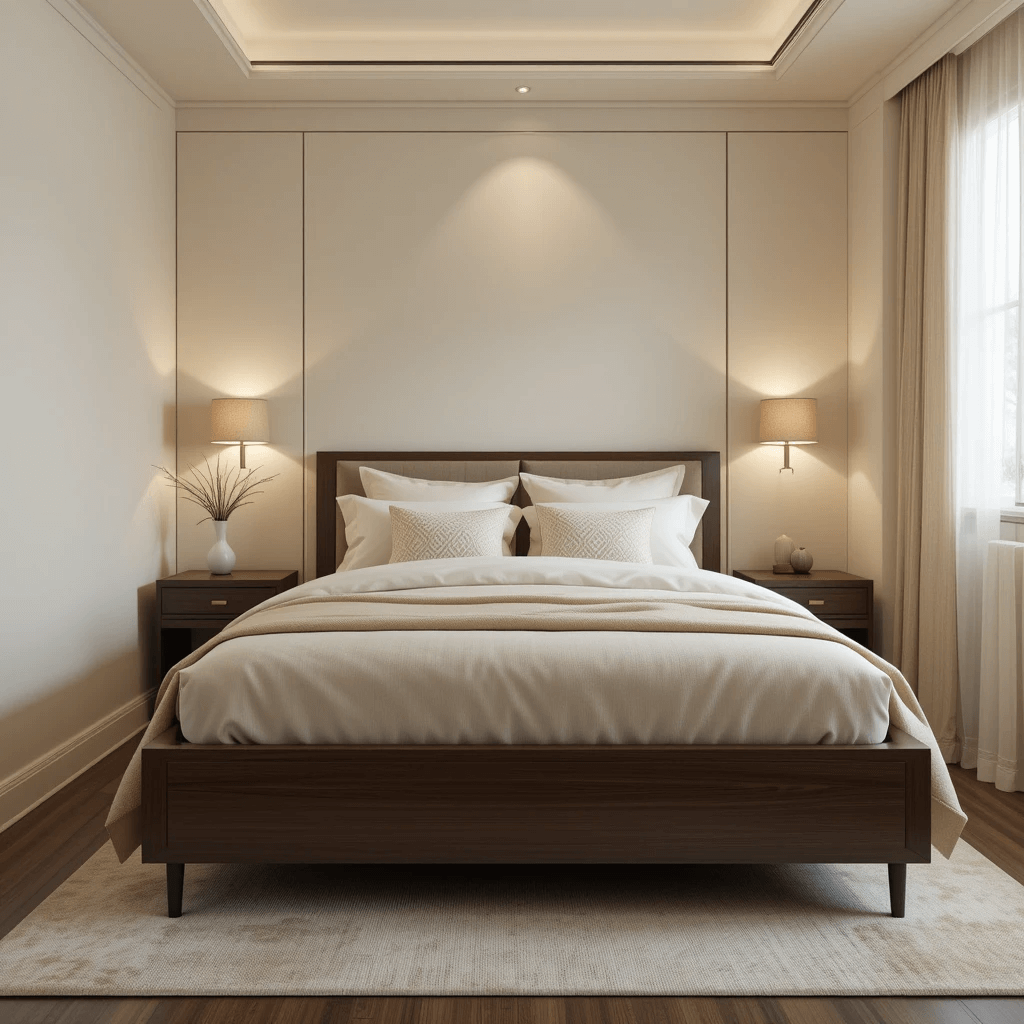
Classic, warm, and endlessly comforting. Creamy Vanilla walls (warmer than white, softer than beige) feel like a hug. Ground it with Rich Espresso wood furniture – bed frame, nightstands, a dresser. Timeless elegance achieved.
Why it works for everyone:
- Vanilla = light reflector: Brightens without glare.
- Espresso adds weight: Prevents the room from feeling floaty or insubstantial.
- Warm and inviting: Creates instant coziness.
- Easy to accessorize: Works with almost any other color you introduce.
Personal fave: This was my first “grown-up” bedroom scheme. Felt sophisticated yet totally livable. Still love it.
9. Monochromatic Light Gray
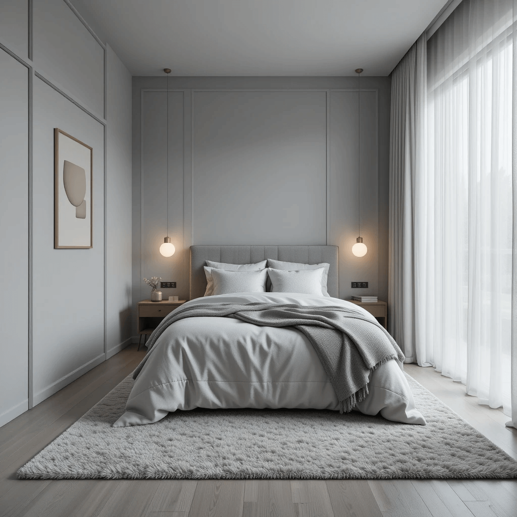
Different shades, one gorgeous color family. Walls in the lightest misty gray, slightly darker gray for bedding, maybe a charcoal gray rug. Add texture with knits, boucle, or wood. It’s sleek, serene, and visually stretches the space.
The power of one:
- No visual breaks: Using one color family avoids chopping up the space.
- Sophisticated simplicity: Less color decision fatigue, more calm.
- Focus on texture: Makes the room interesting without clutter.
- Feels expansive: The seamless flow tricks the eye.
IMO: Perfect for those who love a minimalist, Scandi-inspired look. So chic.
10. Warm White & Black Accents
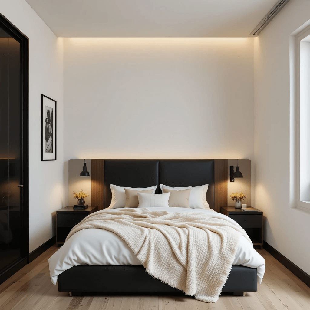
Crisp, warm white walls (think Swiss Coffee or Alabaster) are the ultimate backdrop. Then, go graphic with sharp Black accents – picture frames, a sleek lamp base, black curtain rods, maybe a geometric black-and-white rug. High contrast, high impact.
Why it’s a small space superstar:
- White = maximum light bounce: Brightest possible base.
- Black defines: Adds structure and sharpness without heaviness.
- Modern and clean: Looks incredibly pulled-together.
- Focus on form: Makes furniture and architecture pop.
Pro tip: Keep black accents intentional and sparse. A little goes a long way in a tiny room.
11. Dusty Rose & Olive Green
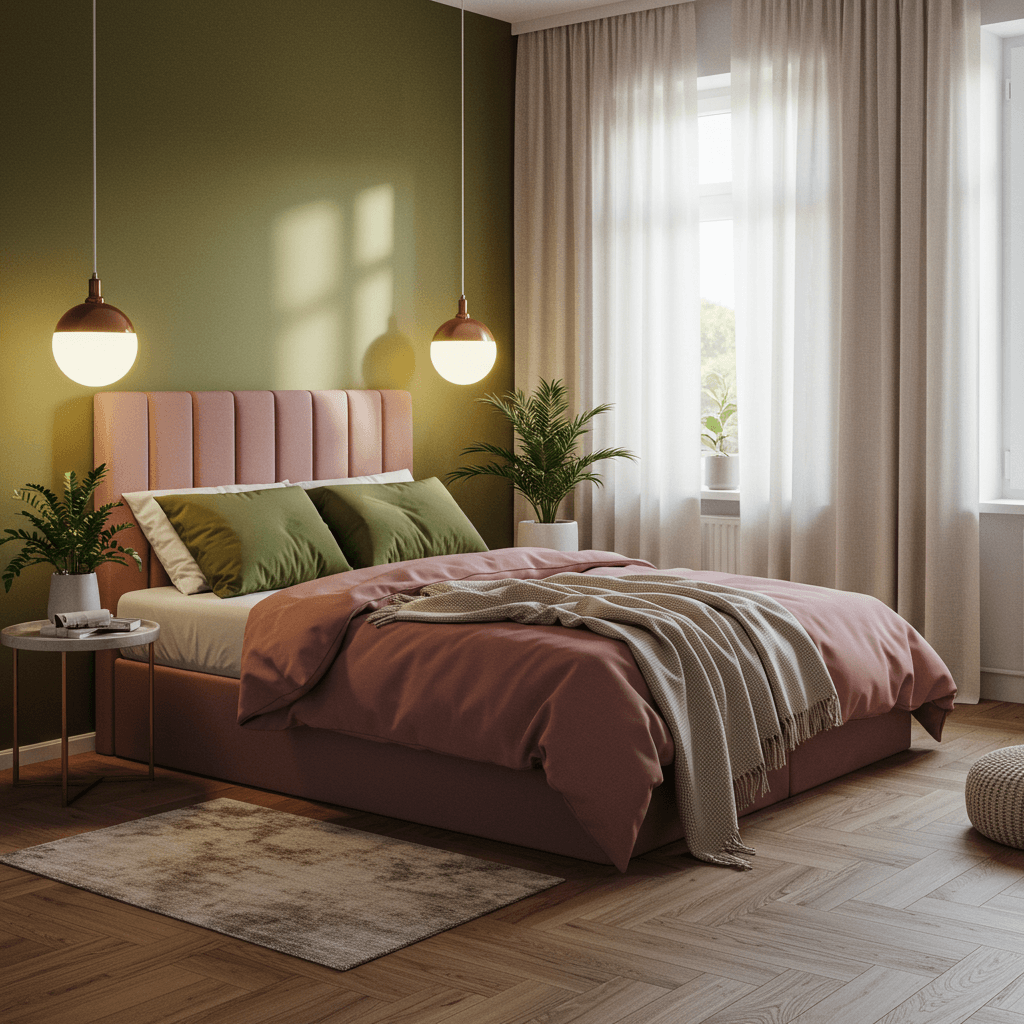
Unexpected but oh-so-good. Soft, muted Dusty Rose walls feel warm and gentle. Complement it with earthy Olive Green in textiles (duvet, curtains) and plants galore. It’s nature-inspired, cozy, and surprisingly chic.
How this combo slays:
- Dusty Rose softens: Creates a gentle, inviting atmosphere.
- Olive Green grounds: Adds depth and a natural, organic feel.
- Earthy harmony: Feels balanced and restful.
- Unique but not crazy: A step beyond the usual neutrals.
Story Time: A friend used this in a small room with big windows overlooking trees. Felt like bringing the peaceful outdoors in. Bliss.
12. Pale Butter Yellow & Fresh White
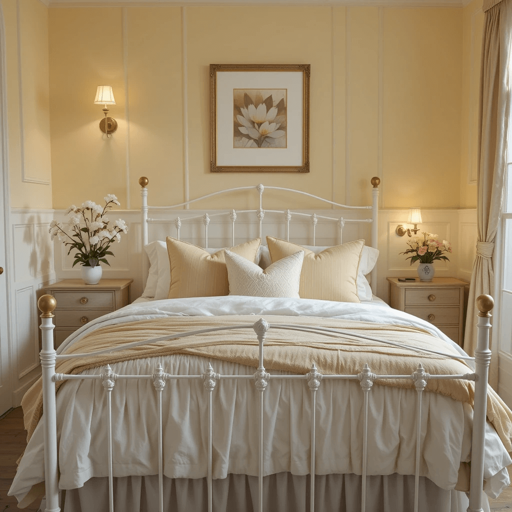
Sunshine in a can! Pale Butter Yellow walls radiate cheerfulness without being overwhelming. Pair with abundant Fresh White – trim, ceiling, bedding, sheer curtains. It’s like perpetual morning light, even on grey days.
Why it works wonders:
- Yellow brightens: Instantly lifts the mood and the space.
- Feels optimistic: Hard to be grumpy in a room this sunny!
- White keeps it crisp: Prevents any hint of sallow or dated.
- Great for dark rooms: Bounces what little light there is effectively.
FYI: Stick to pale, buttery tones. Avoid anything too primary or neon unless you want to feel like you’re inside a highlighter.
13. Slate Blue & Rusty Orange
A dynamic duo! Cool, muted Slate Blue walls (think stormy sea) feel calm and grounded. Then, ignite it with pops of warm Rusty Orange – a throw blanket, an armchair, ceramic vases. It’s balanced, energetic, and full of character.
The unexpected win:
- Blue calms, orange energizes: The perfect yin and yang.
- Color theory in action: Complementary colors make each other pop.
- Feels curated: Shows off your design confidence.
- Warmth without weight: The orange adds coziness without darkening.
Pro move: Start small with the orange pops. A little provides a lot of punch in a small space.
14. All-Over Light Oatmeal
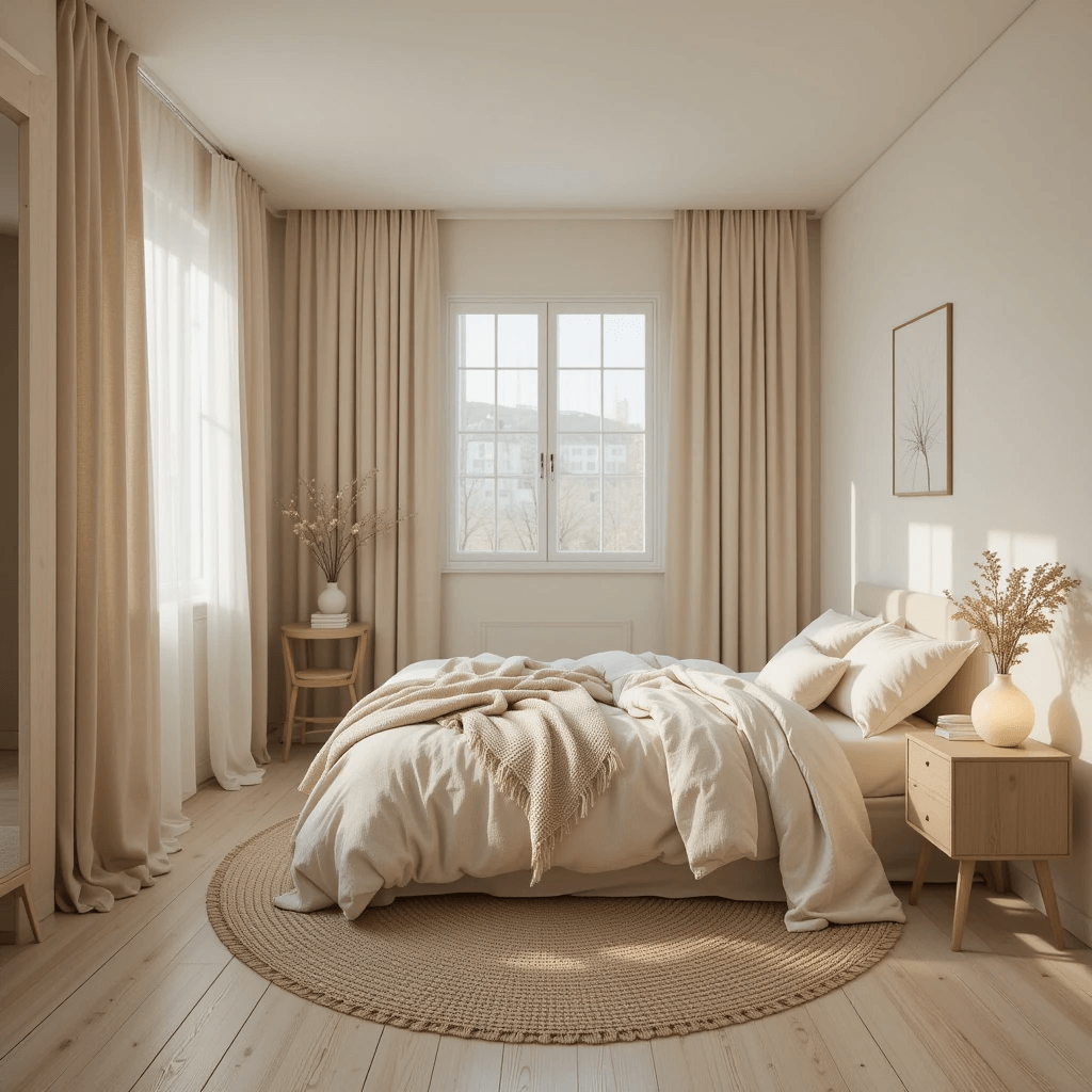
Think cozy sweater, not boring beige. Light Oatmeal is a warm, neutral hug for your walls. It’s richer than white, softer than gray, and incredibly versatile. Layer with textures and natural materials.
Why it’s a safe (but stylish) bet:
- Warmth without darkness: Creates coziness while still feeling light.
- Ultimate neutral backdrop: Lets your furniture, art, and textiles shine.
- Hides imperfections: More forgiving than stark white.
- Timeless and soothing: Never feels trendy or dated.
Downside: Can lean slightly bland if you don’t add enough texture and varied tones in your decor. Combat it with wood, rattan, linen, etc.
15. Seafoam Green & Sandy Beige
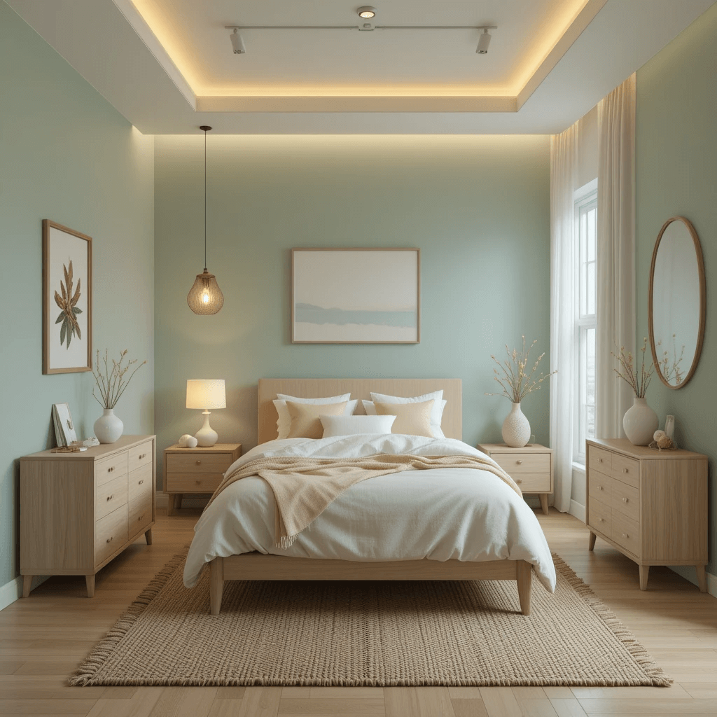
Bring the coast inside. Seafoam Green walls evoke tranquil waters. Pair with warm, Sandy Beige in bedding, rugs, and baskets. It’s fresh, relaxed, and effortlessly beachy (without the seashells everywhere).
How it creates a serene escape:
- Seafoam = cool tranquility: Instantly calming and refreshing.
- Sandy Beige = warm earth: Adds balance and comfort.
- Light and airy: Feels spacious and breathable.
- Natural harmony: Feels inherently peaceful and grounded.
Final thought: Perfect for creating a vacation vibe right at home. Who needs a pricey getaway when your bedroom feels this chill?
Wrapping Up Your Tiny Room Transformation
See? Tiny bedrooms aren’t doomed to blandness! We just busted that myth wide open. From cozy charcoal caves to airy seafoam escapes, it’s all about choosing hues that make you feel amazing in your space.
Don’t let the square footage limit your imagination. Grab those paint samples (PSA: test them on your walls at different times of day!). That dusty rose or slate blue you’re eyeing? It might just be your room’s soulmate.
Trust your gut, embrace a little boldness, and screw the “rules.” Your dream small bedroom is literally a paint can away. So, which brilliant scheme are you trying first? Spill!