Picking a kitchen color can feel like defusing a bomb, one wrong move and suddenly your dream space looks like a dated relic from your grandma’s Tupperware party.
Been there, regretted that avocado green backsplash briefly in 2012. But fear not, color-curious friend! I’ve been obsessively stalking design mags, showrooms, and my own questionable past choices to bring you 15 modern kitchen hues that scream “luxury”, without breaking the bank).
Forget boring beige (unless it’s that kind of beige, keep reading). Let’s dive into the good stuff!
1. Deep, Moody Emerald Green
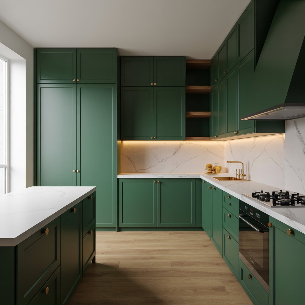
This isn’t your basic leaf green. We’re talking a rich, saturated emerald that feels like a velvet jewel box. It instantly adds drama and sophistication, especially on cabinetry.
Why it feels luxe:
- Creates instant, enveloping atmosphere – think high-end restaurant vibes.
- Pairs amazingly with brass or gold hardware (hello, glam!).
- Looks stunning against marble counters or warm wood tones.
- Feels both classic and unexpectedly modern.
Pro Tip: Commit! Use it on lower cabinets or an island for maximum impact without overwhelming the space. Trust me, half-measures look wishy-washy here.
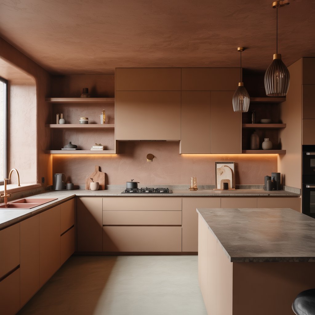
2. Warm, Earthy Clay

Move over, cool grays! Warm neutrals are having a major moment, and clay is the queen. It’s soft, inviting, and feels incredibly grounded and organic.
Why it works:
- Brings instant warmth and coziness, making the kitchen feel lived-in and welcoming.
- Plays beautifully with natural materials like wood, stone, and rattan.
- Works in almost any lighting, from sunny south-facing to moodier north.
- Feels sophisticated without being stuffy.
Personal Fave: I used a similar tone on my kitchen walls last year, and the way it glows in the evening light? Chef’s kiss. It makes my morning coffee ritual feel like a spa experience.
3. Sleek Matte Black
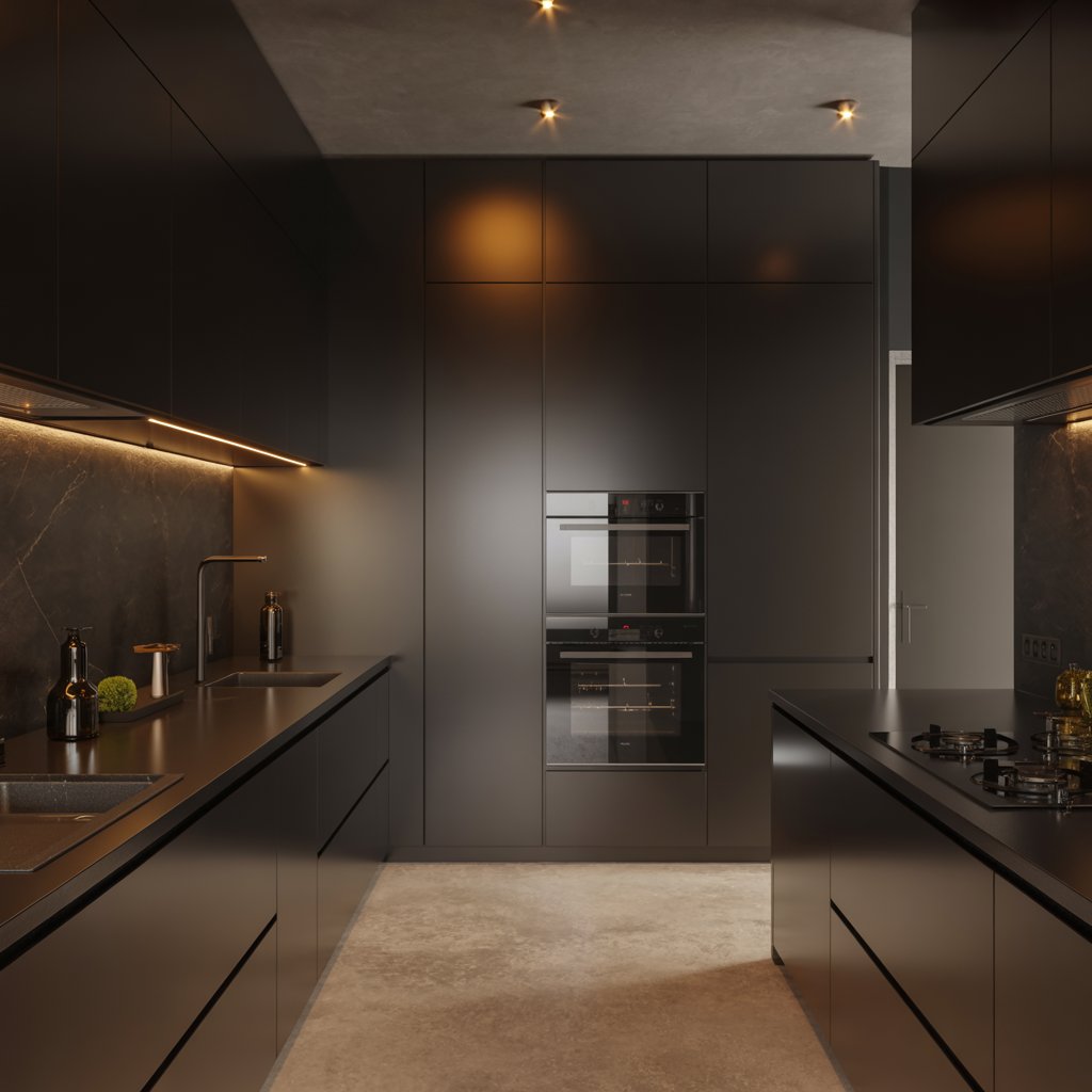
Okay, hear me out before you panic! Matte black cabinets or an island are pure, unadulterated drama in the best way possible. It’s bold, modern, and oozes confidence.
How to nail it:
- Balance is key! Pair with lighter countertops (think white marble, concrete, or light wood) and plenty of texture.
- Add warmth with wood accents or metallic finishes (brushed brass is killer).
- Ensure you have great lighting – under-cabinet lights are non-negotiable.
- Keep the lines clean and modern for maximum effect.
Downside: Shows dust and fingerprints like nobody’s business. If you have sticky-fingered toddlers or pets, maybe admire this one from afar (or invest in excellent cleaning supplies!).
4. Soft, Cloud-like Oatmeal
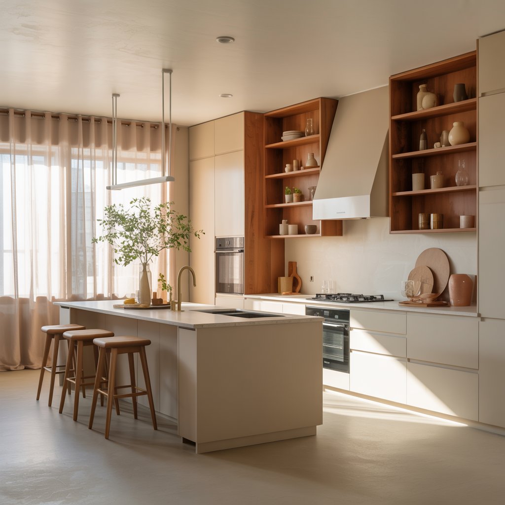
Not beige, not gray, not white… but the perfect, warm, neutral oatmeal. It’s the quiet luxury superstar – understated, elegant, and endlessly versatile.
Why it’s a must-try:
- Creates a serene, calming backdrop that lets other elements (gorgeous countertops, cool lighting) shine.
- Makes even small kitchens feel airy and spacious.
- Feels incredibly sophisticated and timeless – won’t date quickly.
- Easy to accessorize with bolder colors or natural textures.
Pro Move: Use a slightly warmer tone than you think you need. Pure whites can feel clinical; oatmeal adds just the right whisper of warmth. IMO, it’s the ultimate “elevated neutral.”
5. Rich, Chocolatey Brown
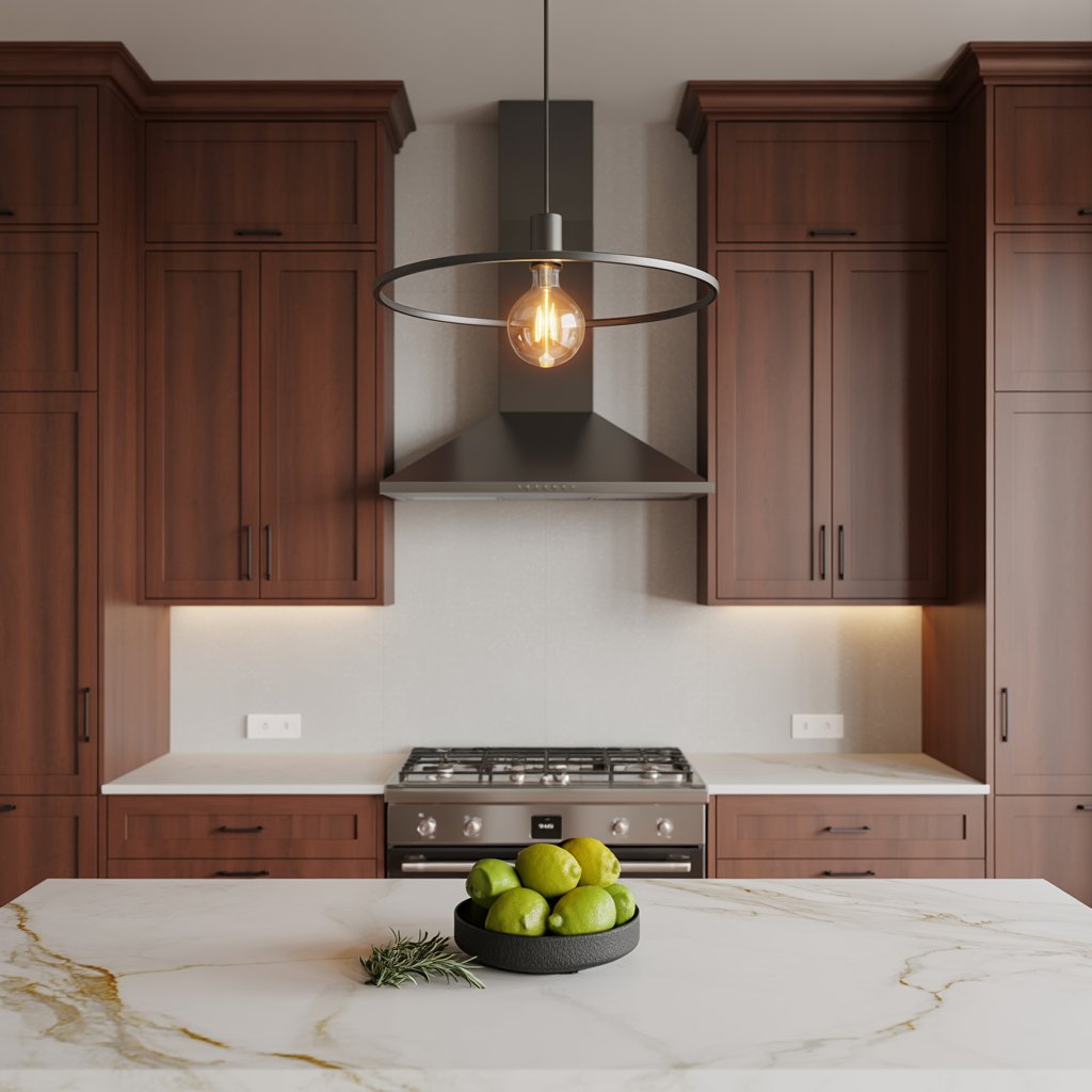
Forget the muddy browns of yesteryear. Modern chocolate browns are deep, saturated, and incredibly chic. Think decadent dark chocolate bars, not 70s wood paneling.
Why it feels luxe:
- Creates a warm, enveloping, and incredibly cozy atmosphere.
- Looks phenomenal with creamy whites, brass, and natural stone (travertine, anyone?).
- Brings a sense of richness and depth that lighter colors can’t match.
- Feels grounded and sophisticated.
Story Time: A friend did her lower cabinets in a stunning chocolate brown with cream uppers and brass pulls. Walking into her kitchen feels like getting a warm hug. Seriously luxe.
6. Vibrant Sapphire Blue
Want a pop that’s bold but still undeniably elegant? Sapphire blue is your answer. It’s energetic yet refined, adding serious personality without feeling childish.
How to use it:
- Island Power: Perfect for making a stunning island the focal point.
- Accent Wall: Use it on a backsplash or a single wall of cabinetry.
- Pair with crisp white walls and countertops for contrast.
- Add brass or polished nickel hardware for a touch of glam.
Personal Take: This is my go-to “color person’s neutral.” It feels fresh and modern but has enough depth to avoid looking cheap or trendy. Total win.
7. Sophisticated Charcoal Gray
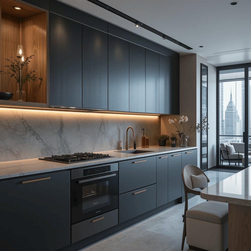
Gray isn’t dead, folks, it just evolved. Ditch the cool, flat tones and embrace a deep, complex charcoal with subtle warm or blue undertones. It’s the grown-up version of gray.
Why it works:
- Provides a sleek, modern, and incredibly sophisticated base.
- Acts as a fantastic neutral backdrop for pops of color (mustard yellow, terracotta) or metallics.
- Looks sharp and tailored, especially with handleless cabinets.
- Feels more dynamic and less sterile than lighter grays.
Pro Tip: Sample like crazy! Charcoal can read very differently depending on the light and undertones. Get big swatches and look at them morning, noon, and night. Worth the effort.
8. Warm, Earthy Terracotta
Bringing serious Mediterranean warmth and organic vibes, terracotta is having a major resurgence. It’s earthy, inviting, and feels wonderfully handcrafted.
Why it’s a must-try:
- Adds instant warmth, character, and a connection to nature.
- Looks stunning with wood, rattan, black metal accents, and greenery.
- Works beautifully on tiles (backsplash, floor) or even cabinetry for the brave.
- Feels unique and full of personality.
Downside: Can feel very strong if you use too much. Start with tiles or an accent wall. And FYI, it leans warm, so pair thoughtfully if your space gets tons of hot sun.
9. Creamy, Warm Off-White
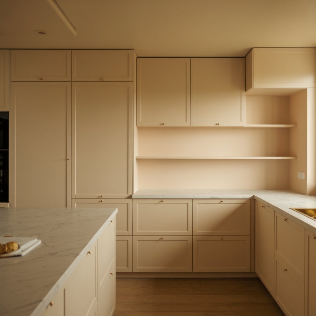
Not stark white, but a soft, buttery, warm off-white. Think “heavy cream” or “vanilla bean.” It’s the ultimate in quiet, understated luxury.
Why it feels luxe:
- Creates a bright, clean, and airy feel without being cold or hospital-like.
- Provides the perfect canvas for showcasing beautiful textures (wood grain, veined stone, linen).
- Feels timeless, elegant, and effortlessly chic.
- Makes metallics (especially gold or brass) truly pop.
10. Dusty, Muted Sage Green
Calm, collected, and utterly charming, sage green brings nature indoors without screaming “forest.” It’s soft, sophisticated, and works in almost any style.
How to use it:
- Perfect for cabinetry (all-over or just uppers/lowers), walls, or a tiled backsplash.
- Pairs beautifully with wood tones, white marble, black accents, and woven textures.
- Creates a serene and restorative vibe – ideal for the heart of the home.
- Feels fresh and modern without being trendy.
Pro Move: Choose a sage with a bit of gray in it for maximum sophistication. Avoid anything too yellow-based for that true luxe feel.
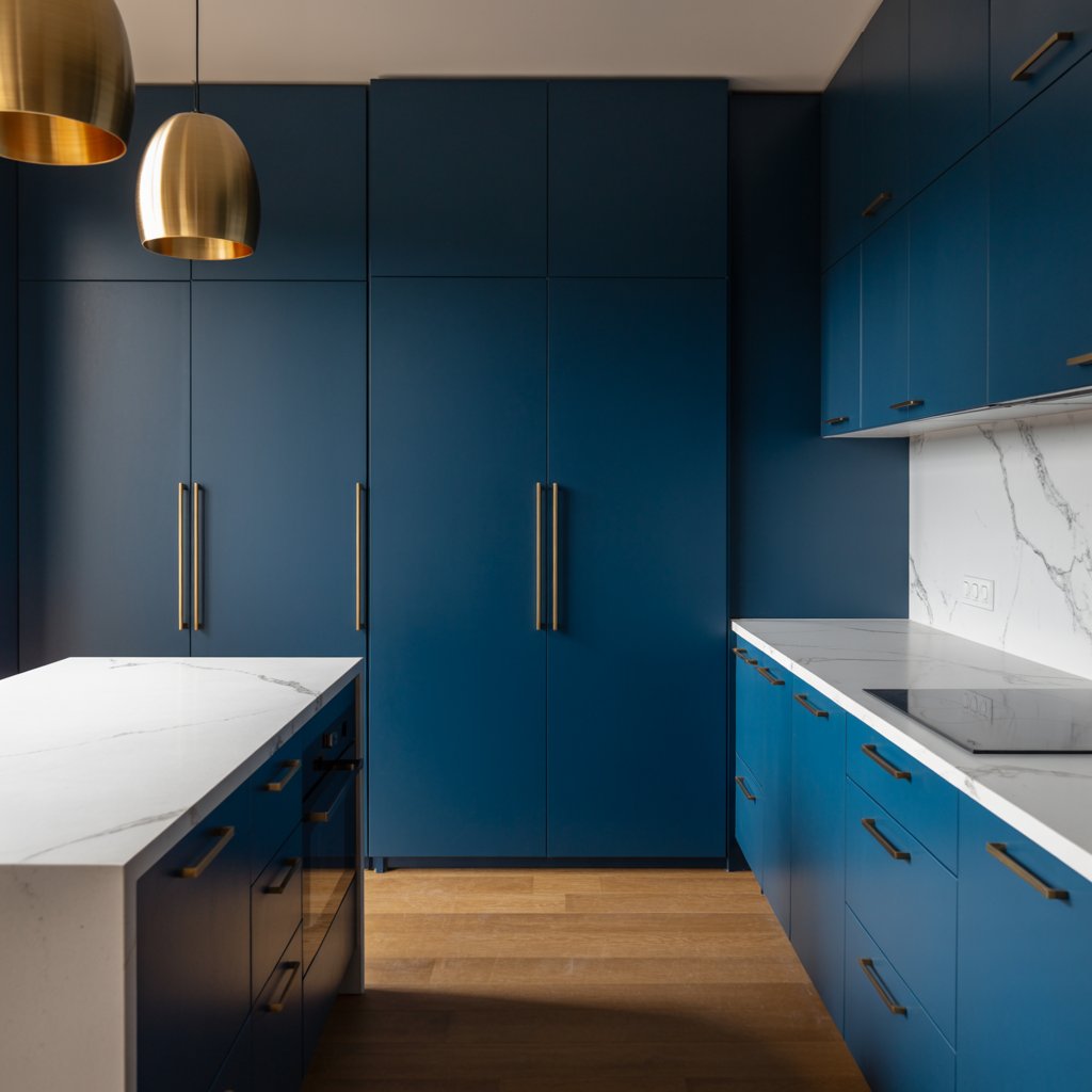
11. Dramatic Navy Blue
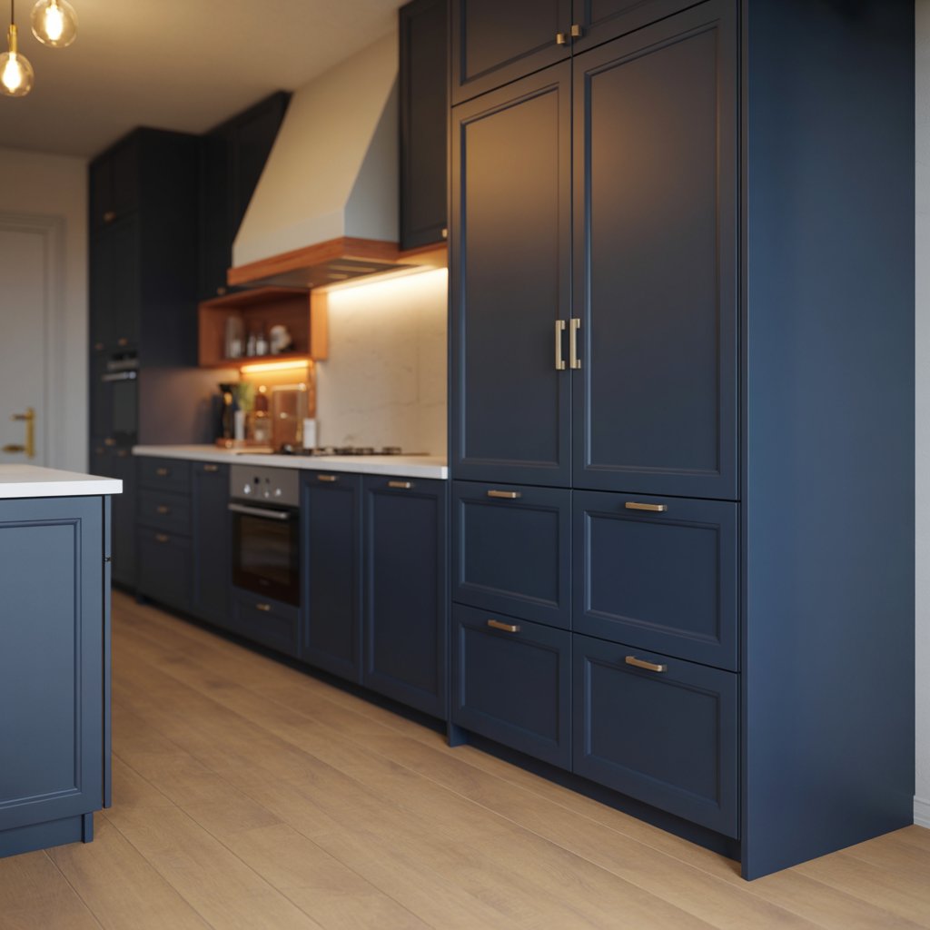
Deep, dark, and incredibly rich, navy blue is a powerhouse. It’s classic yet modern, formal yet surprisingly versatile. Think gentleman’s club meets chic contemporary kitchen.
Why it works:
- Instantly adds depth, sophistication, and a touch of formality.
- Looks phenomenal with white or light countertops, brass hardware, and wood accents.
- Creates a stunning contrast that feels both bold and refined.
- More forgiving than black when it comes to showing dust.
Story Time: I once saw navy lower cabinets with white uppers and a brass rail system. It was jaw-droppingly gorgeous. Proof that dark colors can work in smaller kitchens if balanced right!
12. Soft Blush Pink
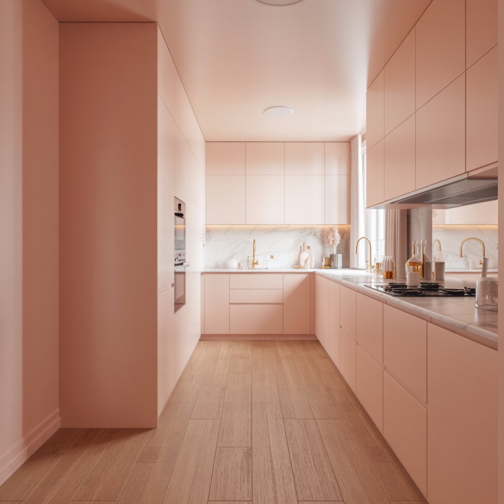
Before you scoff, hear me out! We’re not talking bubblegum. Think sophisticated plaster pink or dusty rose. It’s unexpected, warm, and surprisingly chic.
Why it’s a must-try:
- Adds a unique, soft, and incredibly welcoming touch.
- Looks amazing with brass, marble, warm woods, and even deep greens (trust me!).
- Creates a warm glow, especially in natural light.
- Breaks up the expected kitchen palette beautifully.
Personal Take: Used sparingly (like on an island or lower cabinets paired with neutrals), it feels fresh, modern, and undeniably luxurious. It’s a conversation starter for sure!
13. Warm Greige (Grey + Beige)
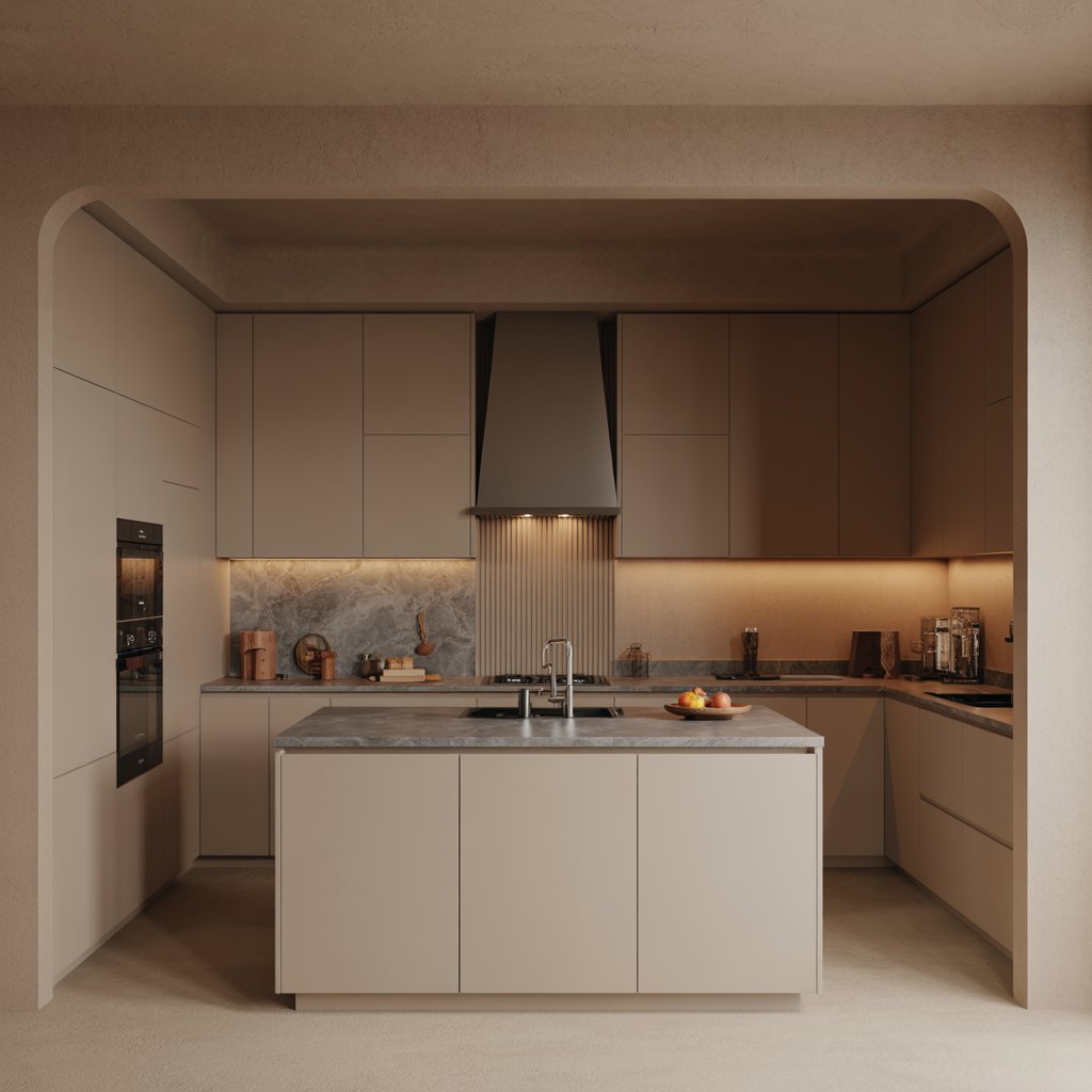
The ultimate chameleon! Greige takes the best of gray (sophistication) and beige (warmth) and blends them seamlessly. It’s the perfect neutral for those who can’t decide.
Why it feels luxe:
- Ultra-versatile – works with almost any accent color or material.
- Creates a warm, neutral backdrop that feels cozy yet modern.
- Avoids the potential coldness of gray and the potential datedness of beige.
- Looks expensive precisely because it’s so effortlessly adaptable.
Pro Tip: Pay close attention to the undertone (pink? green? taupe?) and test in your specific light. The right greige is pure magic; the wrong one can look muddy.
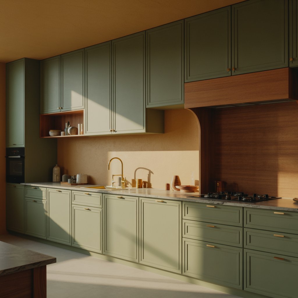
14. Bold Olive Green
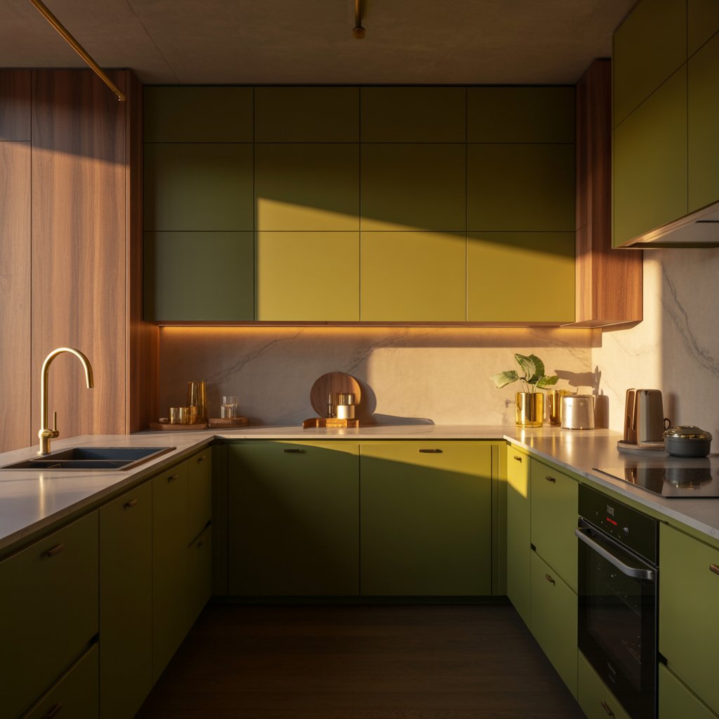
Deeper and more complex than sage, olive green has an earthy, slightly retro yet thoroughly modern vibe. It’s rich, grounded, and full of character.
How to nail it:
- Go for cabinetry: Lower cabinets or an island in olive make a stunning statement.
- Pair with warm metals (brass, copper), wood tones, and creamy whites.
- Add black accents for definition and modern edge.
- Embrace the moodiness – it’s meant to feel enveloping.
Downside: It’s a strong color that needs careful balancing. Best in spaces with decent natural light or paired with plenty of light-reflecting surfaces nearby.
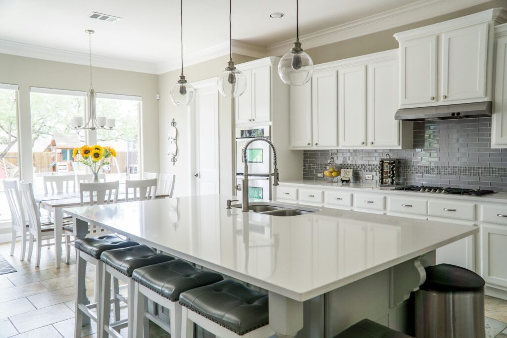
15. Pure, Crisp White (But Make It Interesting)
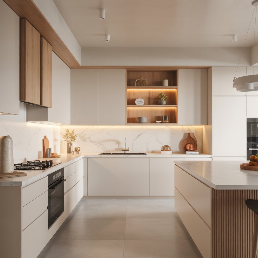
Okay, yes, white. But not just any white. We’re talking a clean, bright white with the perfect undertone (usually a touch cool or pure) used strategically.
Why it works for luxe:
- Creates an instantly bright, clean, and spacious feel – the ultimate backdrop.
- Makes high-end materials like marble, quartz, and metal fixtures truly sing.
- Feels timeless, fresh, and effortlessly elegant when done right.
- Allows for bold accents (art, stools, cookware) to pop dramatically.
Pro Move: Texture is your best friend! Combine glossy white cabinets with matte white walls, a veined marble counter, wood shelves, and woven barstools. Monochromatic doesn’t have to mean monotonous. It’s all about the layers, baby.
Final Thoughts
Choosing a luxurious kitchen color doesn’t mean playing it super safe or blowing your budget on gold leaf (unless that’s your vibe, no judgment!).
It’s about picking a hue with depth, sophistication, and personality, something that makes you feel great every time you walk in to grab your coffee.
From the moody drama of emerald or black to the serene warmth of clay or oatmeal, there’s a luxe shade for every style.
Remember the golden rules: Sample obsessively (seriously, do it!), consider your light, balance bold choices, and embrace texture.
Your kitchen is the heart of your home. Shouldn’t it feel like a million bucks? Now go forth and paint (or dream!) fearlessly. And hey, if you try one of these and love it (or hate it!), drop me a comment. I live for this stuff! What color is calling your name?