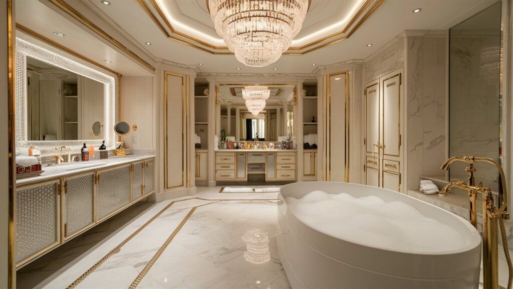
Hey there, color-curious friend! Let’s be real: picking a bathroom paint color feels way more stressful than it should. It’s not just a room; it’s your morning sanctuary, your evening unwind spot, maybe even your secret singing stage.
You want a hue that vibes with you, not one that screams “builder basic” or “what was I thinking?!” Forget about the usual boring colors and allow me to help you inject some personality to your bathroom.
Let’s dive into 14 seriously dreamy colors that’ll transform your loo from functional to fabulous. Trust me, your future bubble baths will thank you.
1. Serene Seafoam Green
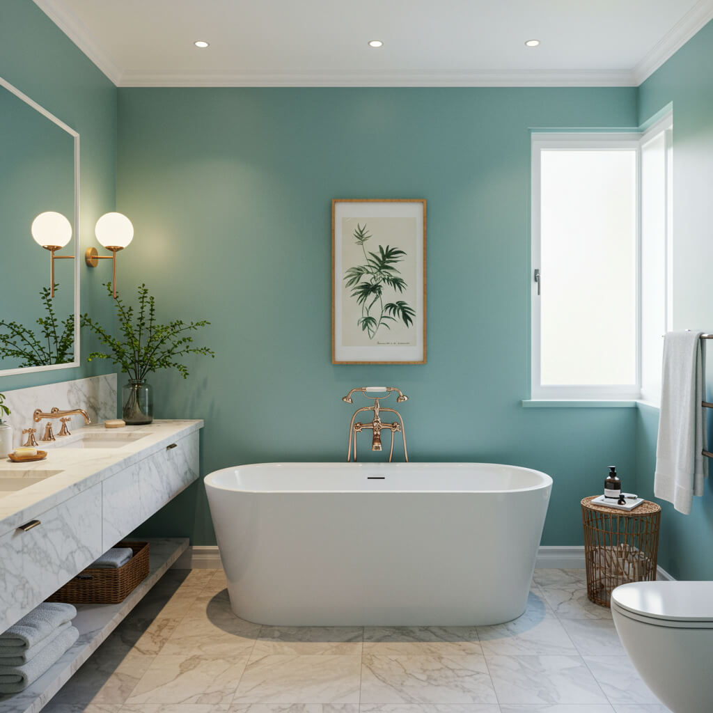
This isn’t your grandma’s mint. Think soft, calming, and just a whisper of blue. It instantly makes your bathroom feel like a spa retreat, even if the only “spa” element is a slightly fancy candle.
Why it works magic:
- Creates an instant calm and refreshing vibe, perfect for de-stressing.
- Pairs beautifully with natural wood tones, crisp white, or even brass fixtures.
- Works in both tiny powder rooms and larger bathrooms without feeling overwhelming.
- Reflects light nicely, making even windowless spaces feel brighter.
Personal fave: I once used this in my tiny windowless WC, and honestly? It stopped feeling like a closet and started feeling like a mini escape. Major win.
2. Deep, Moody Navy
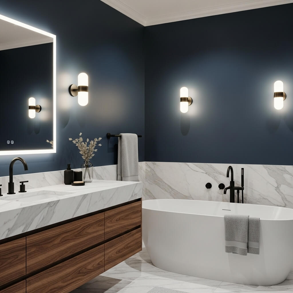
Okay, hear me out. Dark in the bathroom? Absolutely, and it’s stunning. Forget dingy; this is luxe, intimate, and seriously sophisticated.
Why it’s a must-try:
- Creates an incredibly cozy and enveloping atmosphere, like a warm hug for your walls.
- Makes white fixtures and fluffy towels pop like crazy.
- Feels unexpectedly modern and chic, especially with matte finishes.
- Perfect for creating a dramatic focal wall behind a freestanding tub.
Pro tip: If you’re nervous, start with just one accent wall or the ceiling! And ample lighting is non-negotiable – think layered sconces and overhead.
3. Warm, Earthy Terracotta
Bring the sunshine (or Tuscan villa vibes) indoors! This rich, orangey-red clay tone is surprisingly versatile and adds instant warmth.
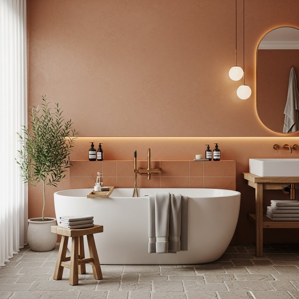
How to make it sing:
- Grounds a space and adds incredible warmth and texture, even if it’s just paint.
- Looks amazing with rattan, seagrass, black accents, and lots of greenery.
- Works brilliantly in bathrooms with natural stone or concrete elements.
- Avoids looking too “Southwest” when paired with clean lines and modern fixtures.
Story time: Saw this in a friend’s bathroom with a black freestanding tub? Jaw. Dropped. It oozed Mediterranean luxury without trying too hard.
4. Softest Blush Pink
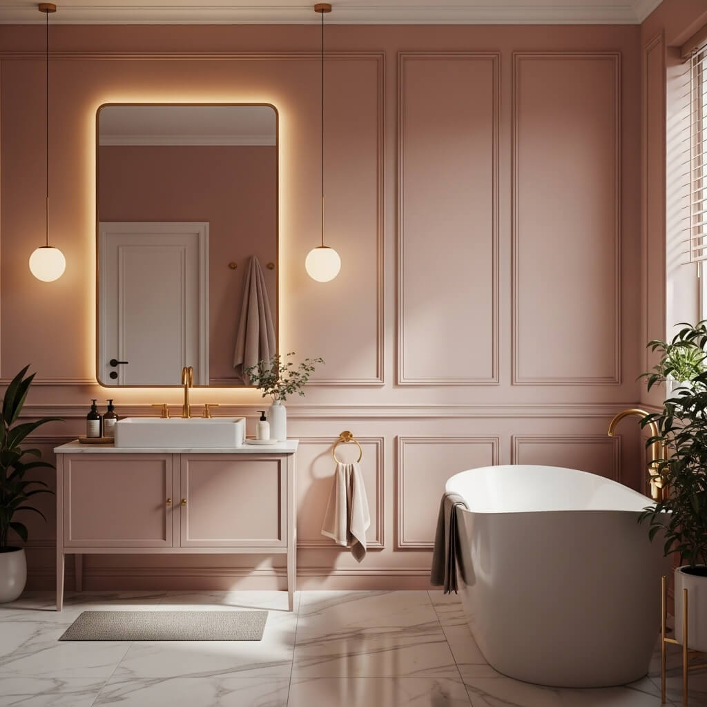
Move over, pepto-bismol! Modern blush is sophisticated, soft, and utterly dreamy. It’s feminine without being saccharine.
Why it sets the mood:
- Creates a gentle, romantic, and soothing ambiance. Perfect for that unwind time.
- Feels fresh and modern paired with grey, black, or even dark green accents.
- Makes chrome or nickel fixtures look extra crisp and clean.
- Surprisingly gender-neutral when done right (ask my husband, he loves ours!).
Downside: Can sometimes look a bit too cool-toned under harsh lighting. Test swatches! Warm undertones are usually more forgiving.
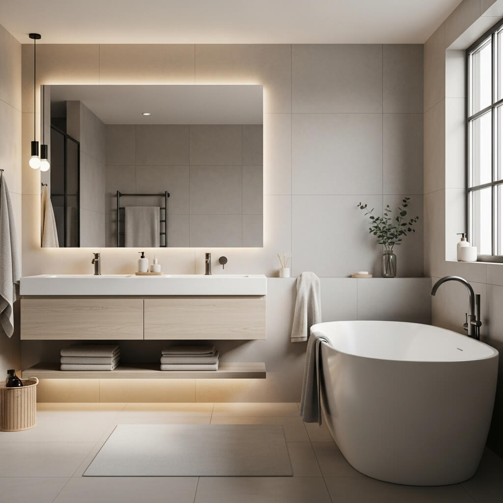
5. Classic Crisp White (But Make it Interesting)
White? Groundbreaking, I know. But stick with me. The right white is a blank canvas for pure serenity or bold accents.
Why it always works:
- Creates a clean, bright, and timeless foundation. Never goes out of style.
- Makes any space feel larger and airier – hello, small bathroom savior!
- Shows off beautiful tilework, fixtures, and textiles perfectly.
- Endlessly customizable with accessories (plants! art! colorful towels!).
Pro move: Avoid stark, clinical whites. Look for ones with subtle warmth (like “Swiss Coffee” tones) or cool undertones depending on your lighting and other finishes. It makes all the difference.
6. Rich Emerald Green
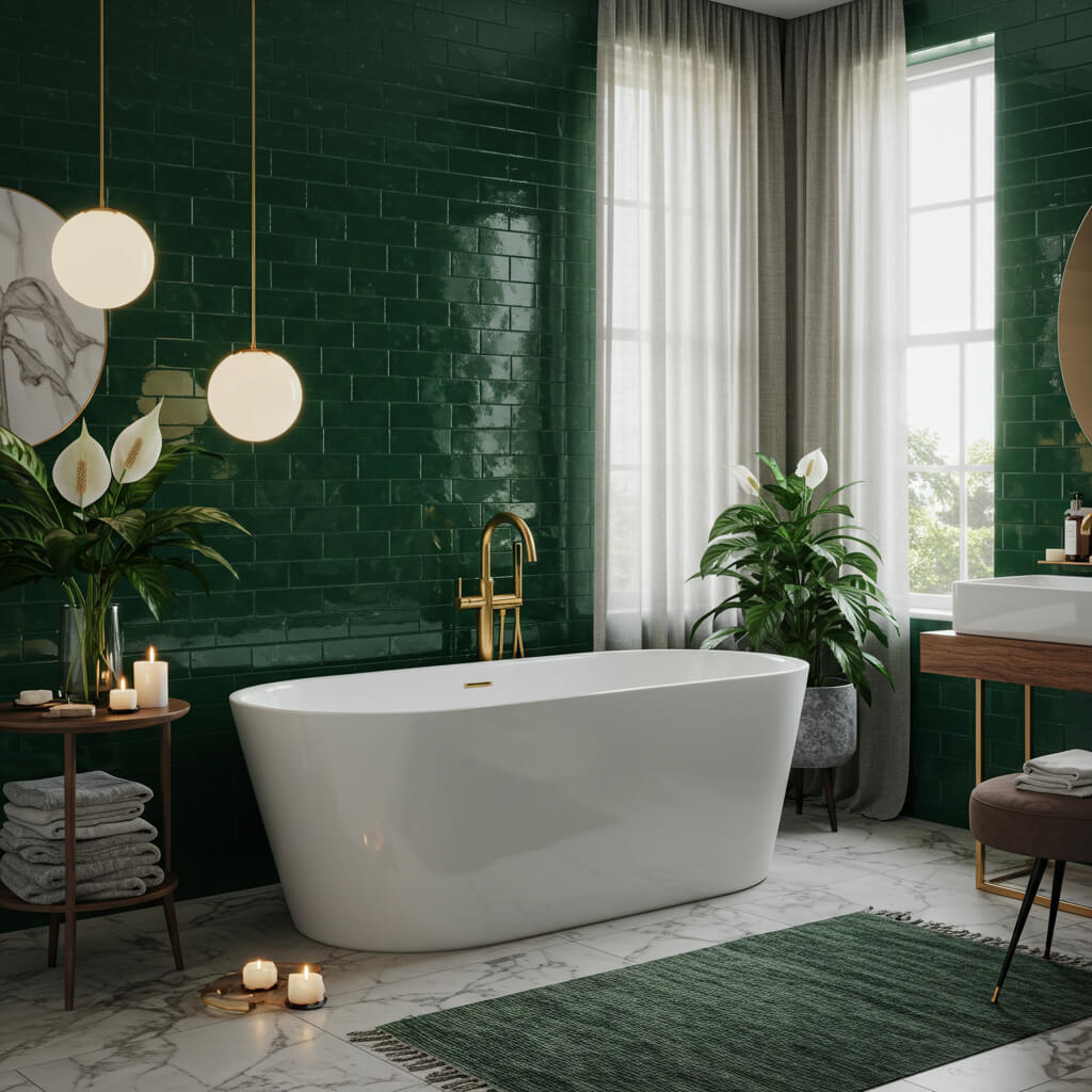
Channel your inner maximalist (or just someone who loves a bit of drama). Emerald is lush, luxurious, and surprisingly calming.
How to nail the jewel tone:
- Brings depth, richness, and a touch of nature-inspired opulence.
- Pairs divinely with gold or brass fixtures for pure glam.
- Looks stunning with marble (real or faux) and dark wood accents.
- Creates a cocooning effect that’s perfect for soaking tubs.
7. Calming Light Grey (Greige)
The perfect chameleon! Greige (grey + beige) is warm, neutral, and effortlessly elegant. It’s the ultimate peacemaker.
Why it’s so versatile:
- Provides a sophisticated, serene, and adaptable backdrop for any style.
- Works with warm OR cool metals (silver, gold, black – you name it).
- Lets your tile, textiles, and art take center stage.
- Feels modern but never cold, thanks to those subtle beige undertones.
FYI: Undertones matter BIG time here. Test swatches against your fixed elements (tile, countertop) in natural and artificial light.
8. Sunny, Buttery Yellow
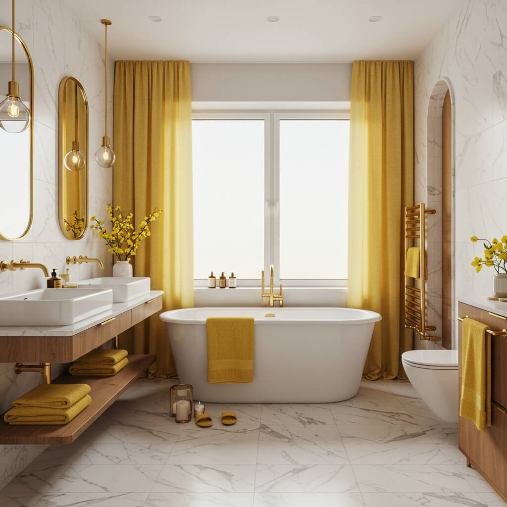
Want pure cheerfulness the second you walk in? A soft, buttery yellow is like sunshine in a can. It’s happy without being blinding.
Why it lifts the mood:
- Instantly brightens the space and creates an optimistic, welcoming vibe.
- Looks fantastic with white trim and crisp blue or green accents.
- Works well in north-facing bathrooms that need a warmth boost.
- Avoids looking juvenile when you stick to muted, sophisticated shades.
Downside: Super bright lemony yellows can feel harsh and reflect unflatteringly on skin tones. Stick to soft, muted butters and creams.
9. Sophisticated Charcoal Grey
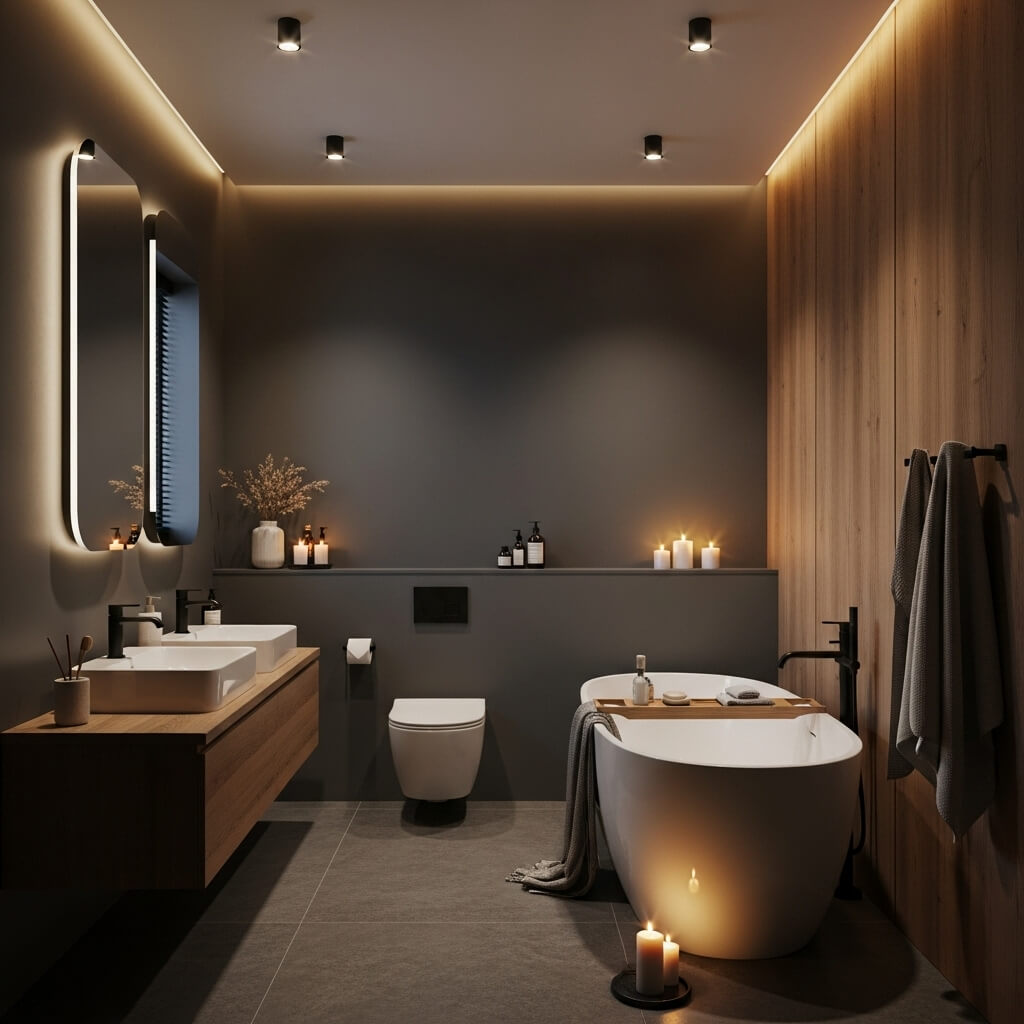
Like navy’s slightly cooler, edgier cousin. Charcoal is modern, sleek, and adds serious depth without going full black.
Why it’s a modern must:
- Delivers drama and sophistication with a contemporary edge.
- Makes white elements pop and creates a stunning contrast.
- Feels incredibly chic paired with matte black fixtures and natural wood.
- Works beautifully as an accent wall or for lower wall panelling (dado height).
Pro tip: Balance it with plenty of texture (fluffy towels, woven baskets) and good lighting layers to prevent it feeling like a cave.
10. Tranquil Sky Blue
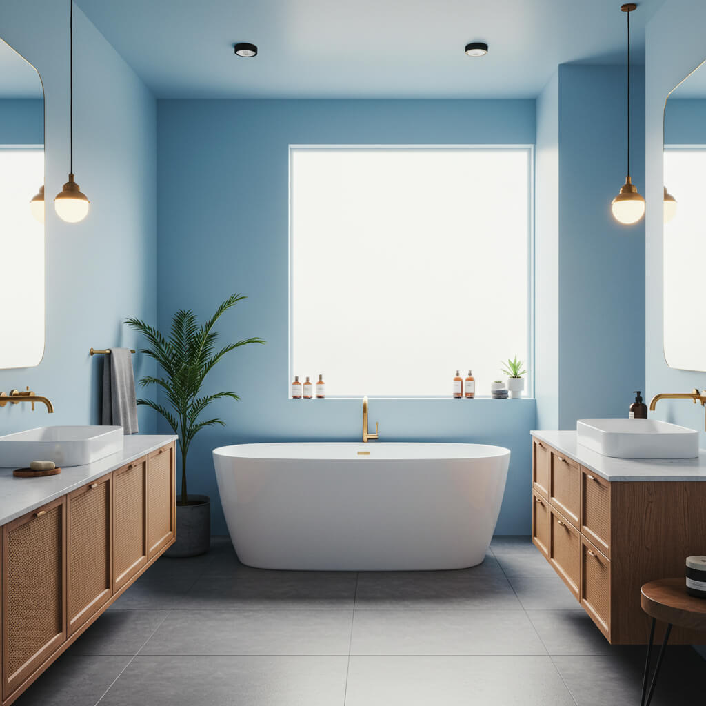
The classic bathroom color for a reason! A soft, clear sky blue feels clean, fresh, and endlessly serene.
How to keep it fresh:
- Evokes calm, clarity, and a breath of fresh air. Instantly relaxing.
- Pairs effortlessly with white, crisp grey, or warm wood tones.
- Creates a timeless, coastal, or even vintage feel depending on accessories.
- Reflects light beautifully, enhancing the sense of space.
Personal fave: This was my childhood bathroom color, and honestly? It still holds up. It just feels clean and peaceful. Total nostalgia trip!
11. Warm, Toasty Beige
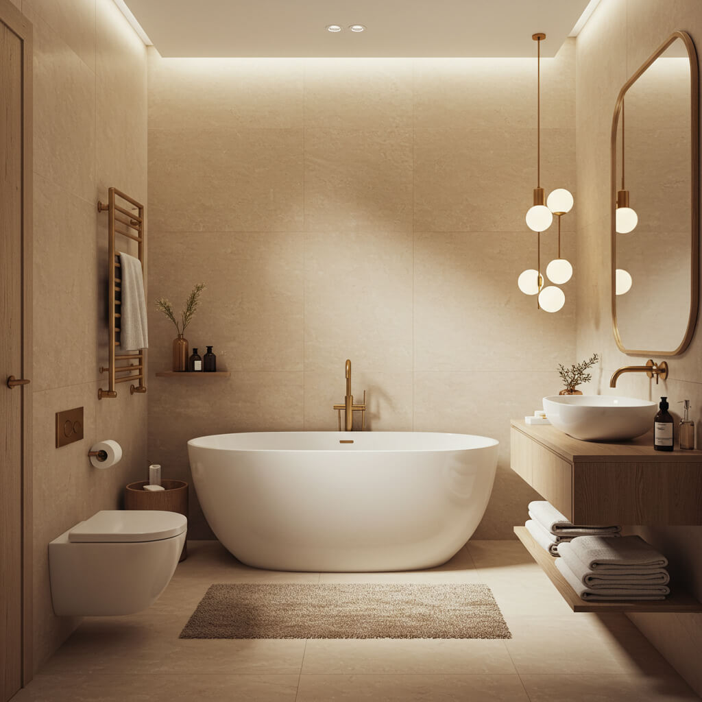
Before you yawn, listen up! A warm, rich beige (think sand or latte) is cozy, welcoming, and far from boring.
Why it deserves a spot:
- Creates a warm, inviting, and grounded atmosphere. Feels like a hug.
- Provides a beautiful, neutral backdrop that lets textures shine (stone, wood, linen).
- Works with virtually any accent color – terracotta, navy, green, you pick!
- Feels inherently relaxing and spa-like, especially in matte finishes.
IMO: Avoid yellowy or pinky beiges that can look dated. Look for ones with grey or green undertones for modern appeal.
12. Dusky Lavender
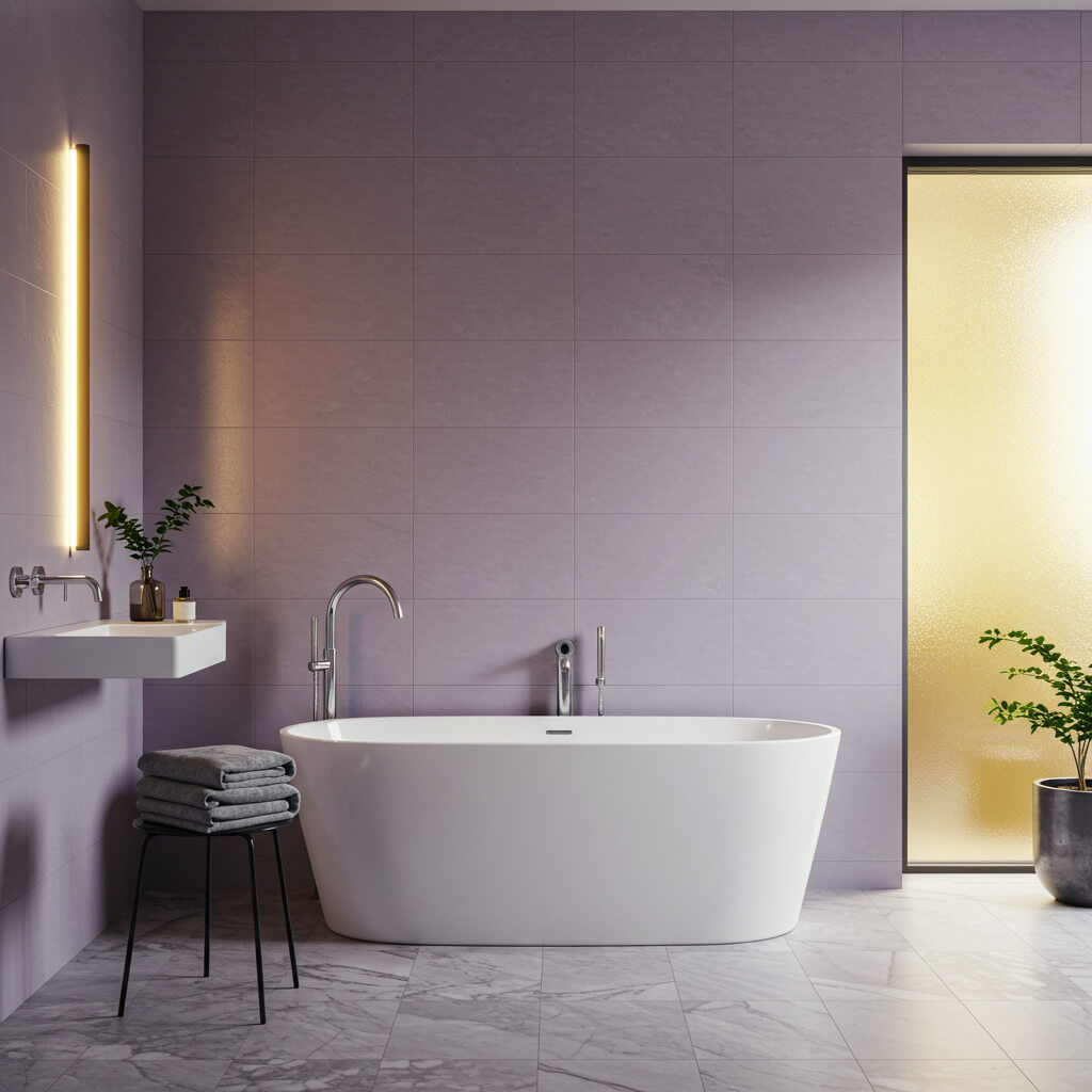
Blush pink’s cooler, more mysterious sibling. Dusky lavender is soft, romantic, and has a touch of sophistication.
Why it sets a dreamy mood:
- Offers a soothing, gentle, and slightly whimsical vibe. Less sweet than pink.
- Pairs beautifully with grey, white, brushed brass, or even deep green accents.
- Feels fresh and modern, especially in contemporary bathrooms.
- Creates a unique, calming atmosphere that’s still full of personality.
Pro move: Keep it dusty and muted! Bright purples can feel overwhelming. Deeper, greyed-out lavenders are the way to go.
13. Bold Black (Accents or Feature Wall)
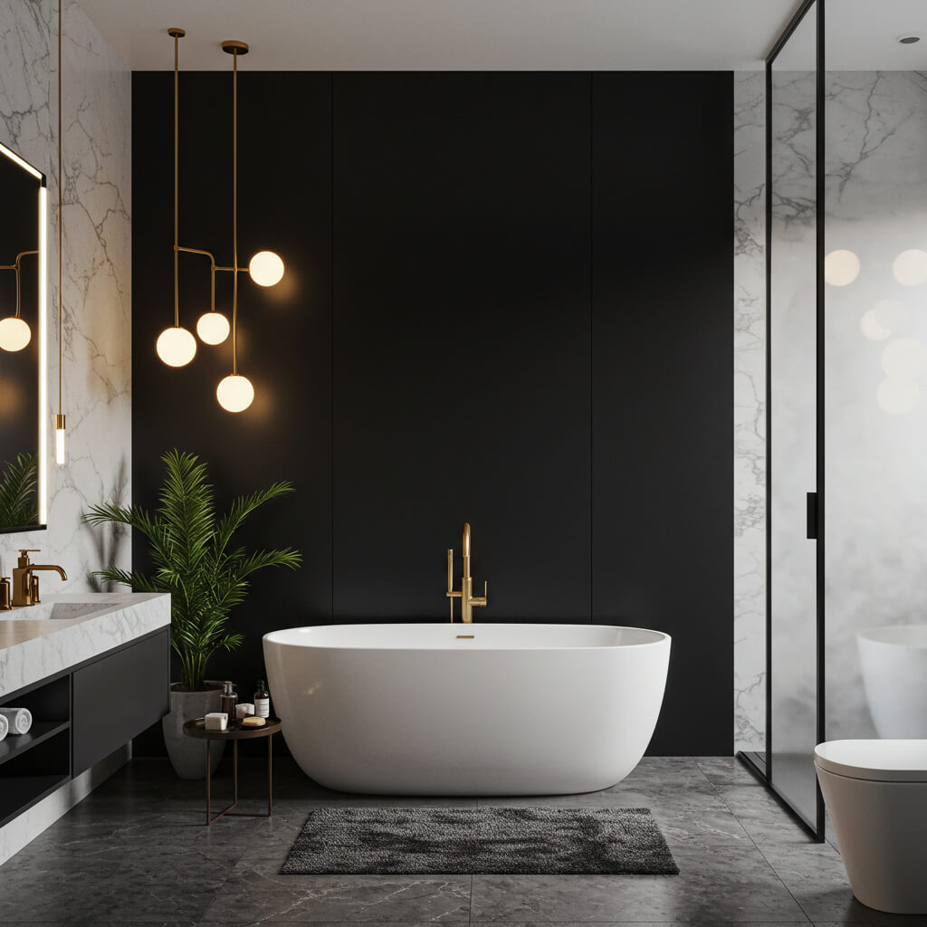
Yes, black! Used strategically, it’s the ultimate in modern drama and anchors a space like nothing else.
How to rock it without gloom:
- Adds instant drama, depth, and sophisticated edge. Major impact.
- Makes everything else (tiles, fixtures, towels) look crisp and intentional.
- Perfect for accent walls, vanities, window frames, or even ceilings.
- Creates a stunning backdrop for metallic finishes (gold, brass, chrome).
Downside: Can feel oppressive if overused in a small, dark space. Use it strategically and amplify your lighting game!
14. Refreshing Sage Green
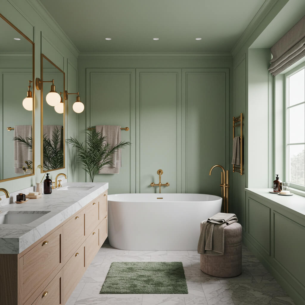
Nature’s neutral! Sage is that perfect muted green – calming, earthy, and effortlessly chic. It’s like bringing the outside in.
Why it’s universally flattering:
- Strikes the ideal balance between calm and invigorating. Soothing yet fresh.
- Works with EVERYTHING: wood, white, black, brass, marble, rattan… seriously.
- Feels timeless, organic, and incredibly versatile across design styles.
- Brings a subtle touch of color without overwhelming.
Final Splash: Paint Your Perfect Mood
Who knew picking a potty palace palette could be so exciting (or involve so many words)? Seriously though, your bathroom color sets the whole tone for one of the most-used rooms in your house. Don’t settle for “meh.”
Remember, lighting is your co-conspirator – that perfect swatch can look totally different under your bulbs. Test, test, test! And don’t be afraid to start small with an accent wall or vanity if a bold hue calls your name. Your bathroom should feel like yours, a little dreamy escape tailored just for you.
So, which color got your heart racing? Time to grab some samples, channel your inner designer, and get painting (or get a pro do it for you).
Can’t wait to hear which one you choose. Happy painting!