Close your eyes. Imagine stepping into a room that instantly makes you feel calm, inspired, or like you’ve wandered into a fairy tale. That’s the power of the right color!
Picking for a girl’s bedroom? It’s about capturing a mood, a vibe, and a whole darn atmosphere. We’re talking colors that whisper, sing, or maybe even do a little happy dance.
Forget the blah, embrace the ahhh-mazing! Ready to discover hues that feel less like paint and more like pure, bottled magic? Let’s get dreaming!
1. Cosmic Midnight Blue with Starry Accents
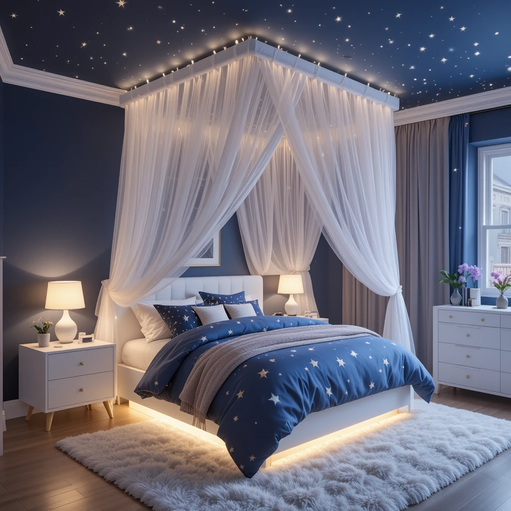
Deep, mysterious, and utterly enchanting. This isn’t just navy; it’s the color of a moonlit sky right before the stars pop. Pair it with silvery constellations and twinkly lights for instant galaxy vibes.
Why it’s pure magic:
- Creates an incredibly calming and cozy atmosphere, perfect for winding down.
- Acts as the ultimate dramatic backdrop for glow-in-the-dark stars, fairy lights, or metallic moons.
- Feels infinitely sophisticated yet totally whimsical – a rare combo!
- Works brilliantly for any age, easily growing with her style.
Pro tip: Use a flat or matte finish for the main walls to mimic the deep night sky. Glossy stars on top? Chef’s kiss!
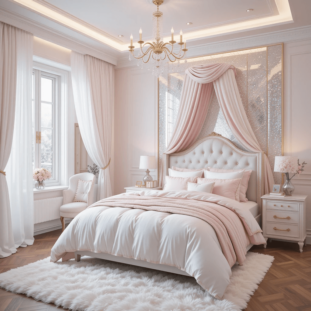
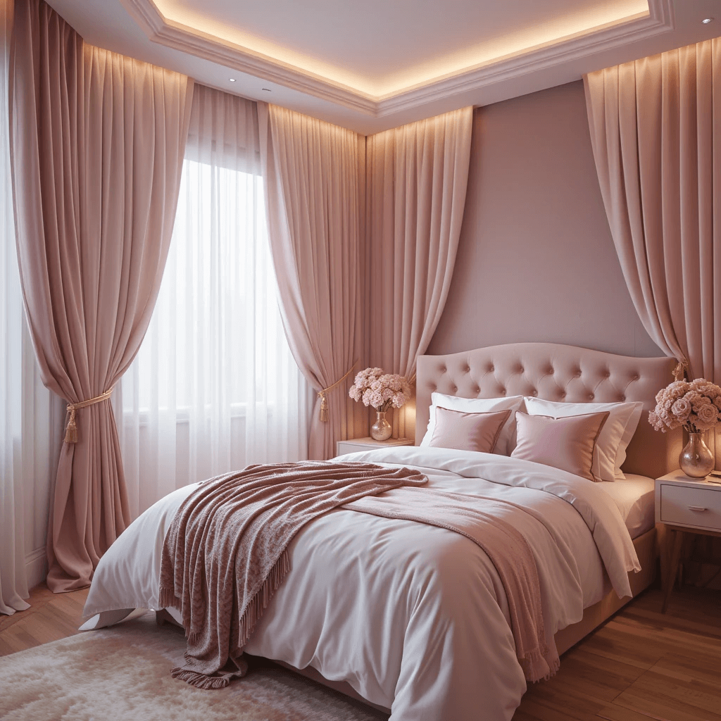
2. Blush Pink Galaxy
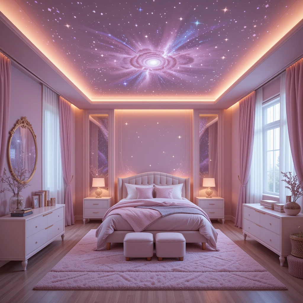
Move over, bubblegum! Think soft, ethereal pink with dusty rose undertones – like the inside of a seashell at sunrise. It’s sweet without being saccharine, dreamy without being childish.
How to elevate it:
- Layer textures! Think fluffy rugs, velvet cushions, and maybe a gauzy canopy.
- Add touches of gold or brass for a luxe, magical feel (light fixtures, mirror frames).
- Introduce deep greens (plants!) or soft greys for balance and a touch of sophistication.
Personal fave: My niece has this, and honestly? Walking in feels like stepping into a cloud made of cotton candy dreams. Zero regrets helping her pick it.
3. Enchanted Forest Green
Bring the magic of the woods indoors! We’re talking deep emerald, mossy sage, or even a softer seafoam. It instantly creates a grounding, nature-inspired sanctuary.
Why it works wonders:
- Connects her space to nature, promoting a sense of calm and wonder.
- Feels rich and luxurious, especially in velvety fabrics or matte paint.
- Pairs amazingly with wood accents, fairy lights, and botanical prints.
- Surprisingly versatile – go bold with dark walls or keep it airy with lighter shades.
Story time: A friend painted her daughter’s accent wall a deep forest green, added a mural of subtle gold ferns… now it’s literally called “The Enchanted Nook.” Goals.
4. Lavender Fields Dream
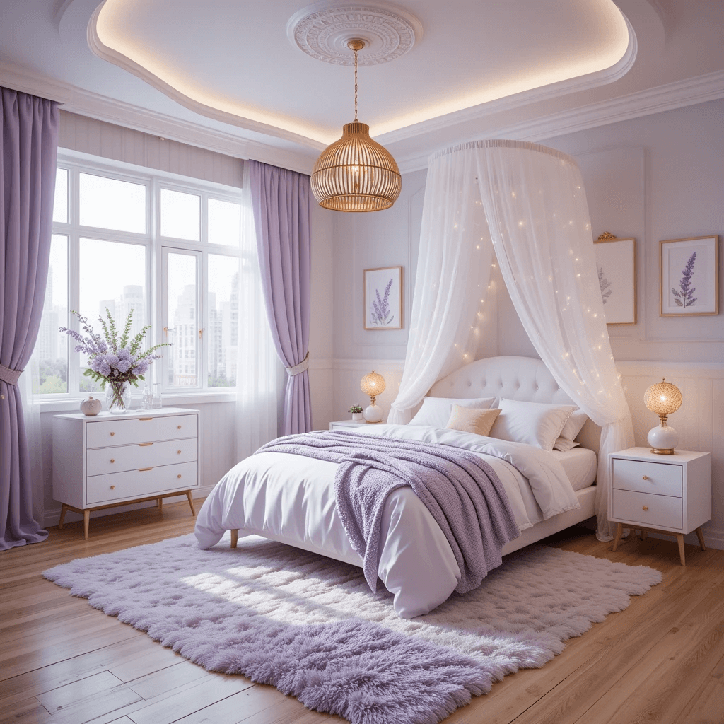
Soft, soothing, and undeniably magical. Lavender strikes the perfect balance between playful purple and serene grey. It whispers fairy tales and feels effortlessly elegant.
Why it’s a must-try:
- Promotes relaxation and tranquility – ideal for a bedroom retreat.
- Has a timeless, ethereal quality that won’t feel dated quickly.
- Looks stunning with white, cream, silver, or even pops of mustard yellow.
- Feels feminine and special without being overly “princessy.”
Downside? Picking the right lavender shade is key. Too blue? Feels cold. Too pink? Bubblegum city. Get samples!
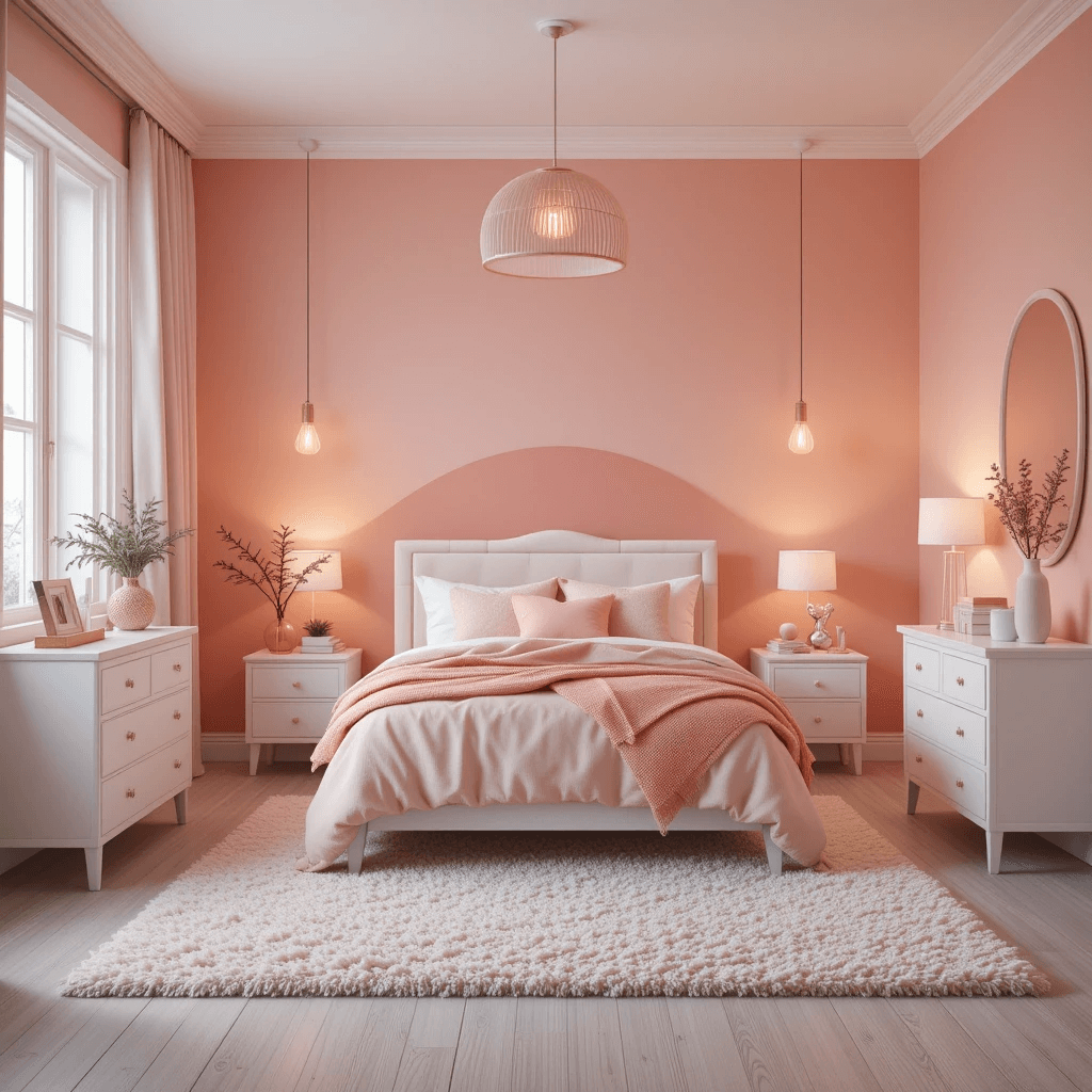
5. Sun-Kissed Peach
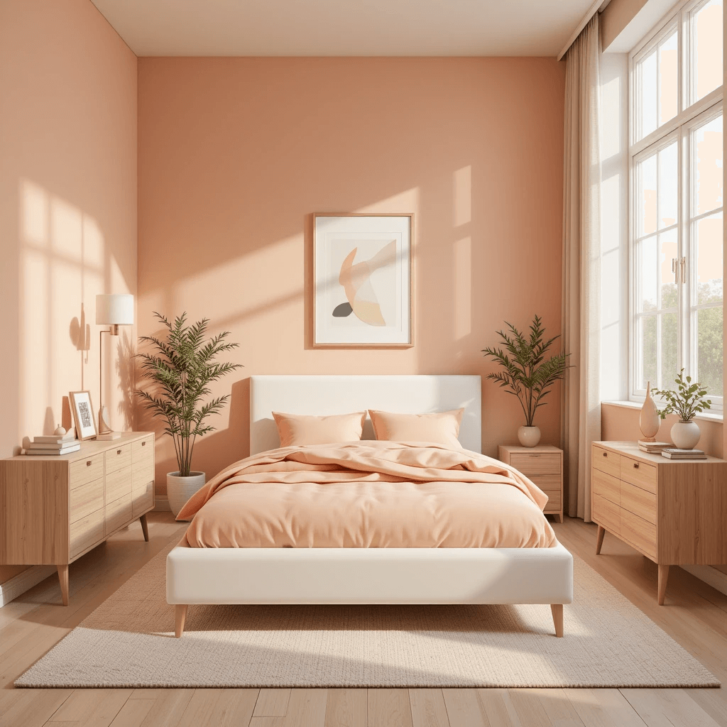
Warm, welcoming, and radiating pure joy. Peach is like bottled sunshine – optimistic, cheerful, and incredibly flattering in any light. It’s happiness on walls.
How to make it shine:
- Avoid anything too orange – aim for soft, muted, creamy peach tones.
- Pair with crisp white trim and natural wood tones for a fresh, airy feel.
- Add accents in soft blues, mint greens, or terracotta for depth.
- Perfect for rooms with less natural light – it literally brightens the space.
Pro move: Use it on all four walls for a cocooning glow, or as a stunning accent behind the bed.
6. Mystical Moody Purple
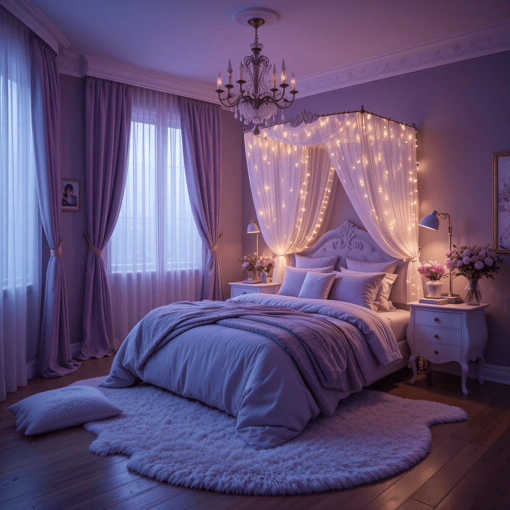
Go bold or go home! Think deep plum, rich aubergine, or regal amethyst. This is for the girl who loves drama, mystery, and a touch of royal magic.
Why it’s pure magic (with edge):
- Creates an incredibly cozy and intimate atmosphere.
- Feels luxurious, creative, and deeply personal.
- Looks amazing with metallic gold or silver accents (think chandeliers, picture frames).
- Ground it with lighter elements – white bedding, light floors, or a fluffy cream rug are essential.
Personal take: I adore this for a teen room. It’s sophisticated, moody in the best way, and screams “this is MY kingdom.” Just maybe avoid it in super tiny, dark rooms.
7. Whimsical Butter Yellow
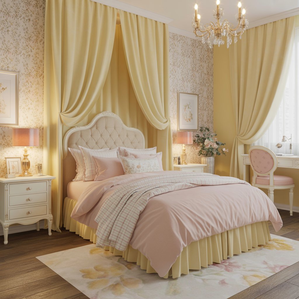
Like sunshine and daffodils! A soft, buttery yellow is pure, unadulterated cheer. It’s bright without being blinding, happy without being childish.
How to nail the vibe:
- Stick to muted, creamy yellows – avoid anything neon or overly lemony.
- Pair with white and natural textures (linen, rattan, wood) to keep it feeling serene, not chaotic.
- Add pops of soft pink, sky blue, or sage green for a sweet, spring-like palette.
- Instant mood booster! Seriously, hard to be gloomy in a buttery yellow room.
FYI: This shade can look different in various lights. Test, test, test those swatches!
8. Cloud White Sanctuary (with a Twist)
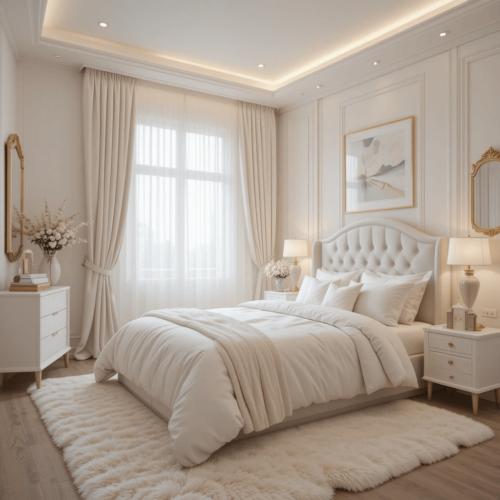
Hear me out! All-white doesn’t have to be boring. It’s the ultimate canvas for serious magic. Think texture, layers, and dreamy details.
Why it works:
- Creates a light, airy, and spacious feel, even in small rooms.
- Maximizes natural light and makes the whole room feel brighter.
- The ultimate backdrop for showcasing colorful bedding, art, fairy lights, or that amazing canopy bed.
- Feels clean, calm, and effortlessly chic.
Pro tip: Avoid stark, clinical white. Choose warm whites (like Swiss Coffee) or ones with subtle undertones (creamy, barely-there pink/grey). Layer different whites and creams for depth.
9. Sparkling Silver Accent Wall
Not the whole room! Just one wall transformed into a shimmering, starry night or a soft metallic sheen. It adds instant glamour and a touch of icy magic.
Why it’s a must-try:
- Instant wow factor without overwhelming the space.
- Reflects light beautifully, making the room feel brighter and more dynamic.
- Pairs brilliantly with almost any color – deep blues, blush pinks, lavender, even black!
- Feels luxe and special, like her own private disco ball (but classier).
Downside? Metallic paints or wallpapers can be trickier to apply and might show imperfections more. Worth it, IMO!
10. Minty Fresh Oasis
Cool, calming, and utterly refreshing. Mint green is like a breath of fresh air – clean, youthful, and packed with serene magic. Think mermaids and morning dew.
How to keep it dreamy:
- Go for soft, muted mint tones – avoid anything too neon or pastel-bright.
- Pair with crisp white, warm wood, and touches of blush pink or coral.
- Perfect for creating a peaceful, spa-like retreat vibe.
- Feels modern yet timeless.
Personal fave: Saw this in a lakehouse bedroom with white shiplap and driftwood accents. Total coastal fairy vibes. Swoon.
11. Terracotta Sunrise
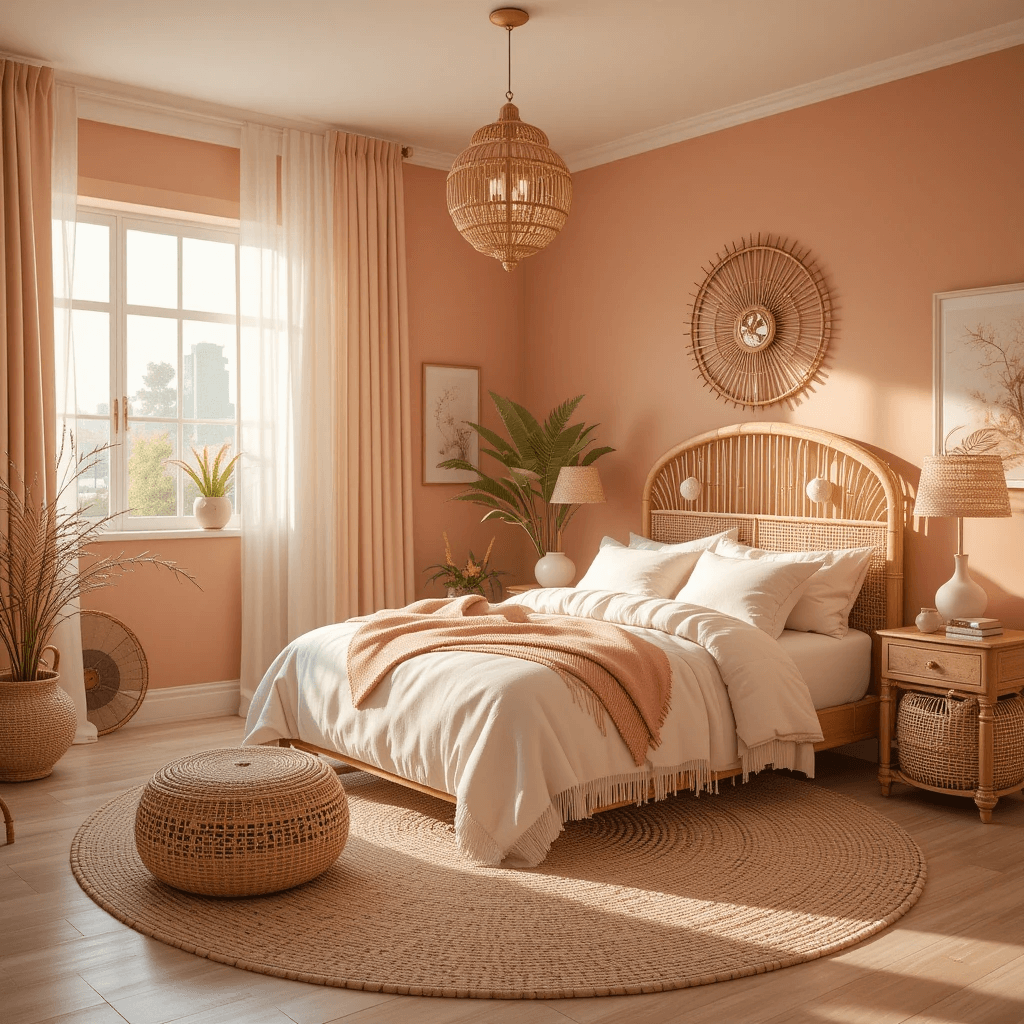
Warm, earthy, and full of life! Terracotta brings a cozy, Mediterranean or desert-sunset magic. It’s inviting, unique, and feels grounded yet vibrant.
Why it works:
- Adds incredible warmth and richness to a space.
- Pairs stunningly with deep blues, sage greens, mustard yellows, and creams.
- Creates a welcoming, bohemian, and artistic atmosphere.
- Feels both earthy and exotic.
Pro move: Use it on an accent wall or for furniture pieces. Balance it with plenty of lighter neutral walls and textiles to keep it from feeling too heavy.
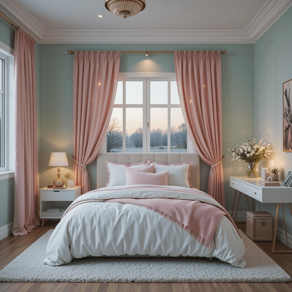
12. Dusky Rose Romance
Deeper and moodier than blush, dusky rose has hints of mauve and grey. It’s sophisticated, romantic, and feels like a perpetual golden hour.
How to make it magical:
- Avoid anything too bright pink – the grey undertone is key for the dreamy vibe.
- Pair with charcoal grey, black accents, brass, or forest green for a stunning, grown-up contrast.
- Feels elegant, cozy, and incredibly inviting.
- Much more unique than standard pink.
Story time: Helped my bestie paint her teen’s room this color. Added black wrought iron bed and vintage rug. Result? Moody, magical, and her daughter’s absolute happy place. Win!
13. Sky Blue Serenity
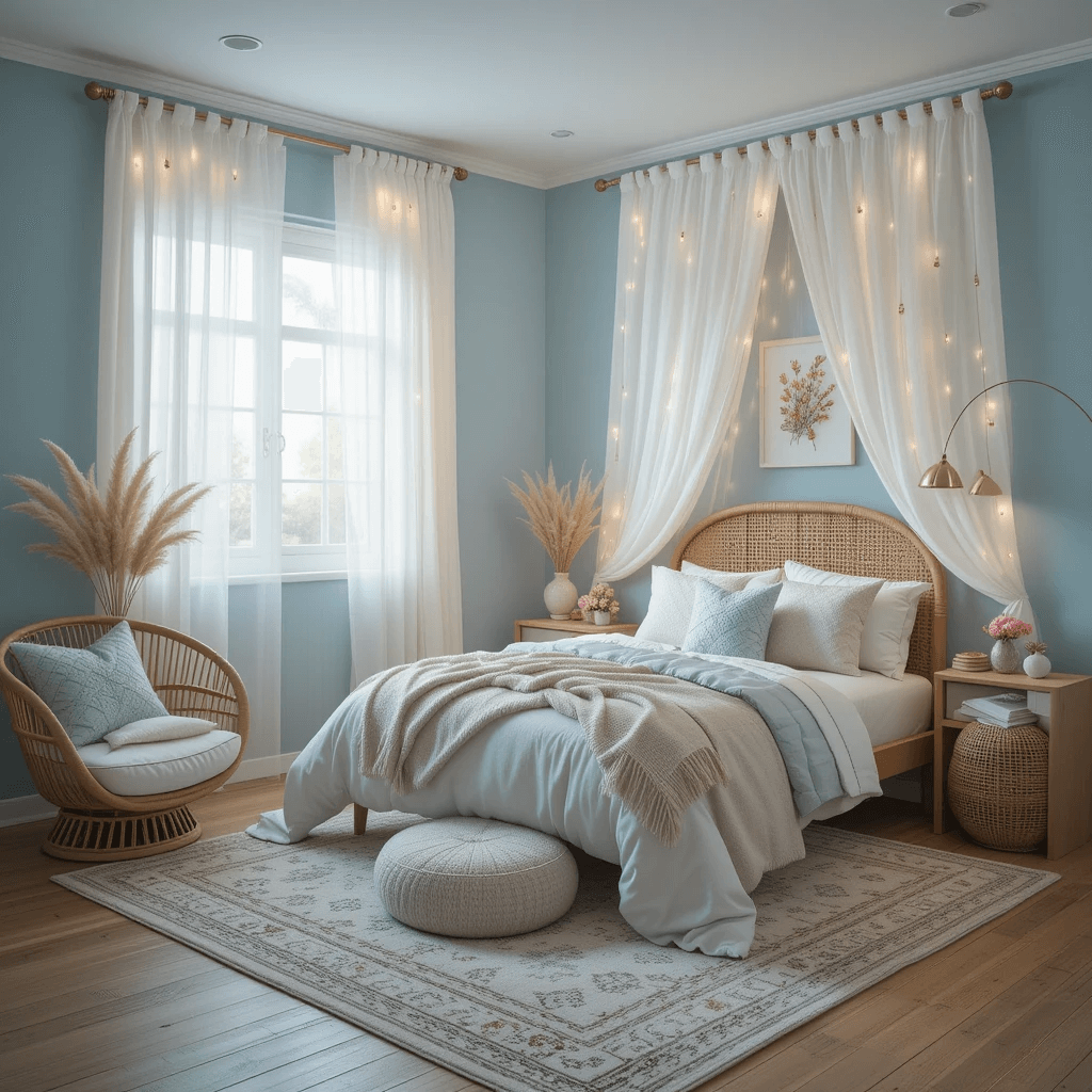
Light, airy, and endlessly calming. Think clear morning sky or soft robin’s egg blue. This color literally lifts the spirits and opens up a space.
Why it’s pure magic:
- Instantly creates a serene and peaceful atmosphere.
- Makes ceilings feel higher and rooms feel larger.
- Pairs beautifully with white, cream, pale grey, and natural wood.
- Perfect for creating a cloud-like, dreamy escape.
Pro tip: For extra magic, paint the ceiling a slightly lighter shade of the same blue. Hello, endless sky illusion!
14. Sunset Coral Ombré
Okay, this one’s a bit more adventurous, but hear me out! Imagine walls fading from a soft peachy pink at the bottom up to a vibrant coral or soft orange at the top. Pure sunset magic.
Why it’s a must-try (for the bold!):
- Maximum wow factor and pure artistic flair.
- Captures the warmth and magic of a real sunset.
- Feels energetic, creative, and incredibly unique.
- Pairs amazingly with teal, navy, or white accents.
Downside? Ombré is a commitment! Best left to professionals unless you’re a serious DIY wizard. But the result? Pure bedroom goals.
Wrapping Up
Who knew picking a magical color could spark so much inspiration?
Honestly, the best part? There are absolutely no rules. Does your kid dream of mermaids? Channel that ocean blue. Obsessed with unicorns? Lavender fields await. Craving a cozy forest nook? Bring on the deep green!
It’s all about creating a space that feels uniquely hers, a place where imagination can run wild and she feels utterly at home.
Remember those swatches! Paint looks wildly different on your wall than on a tiny card. So, test a few finalists in different spots and see how they play with the light throughout the day.
And hey, don’t be afraid to mix and match. Maybe it’s a serene sky blue with a sparkling silver accent wall, or a blush pink haven with pops of enchanted forest green in the decor. The real magic happens when the colors tell her story.
What magical hue is calling your name? Let me know in the comments and go on, make some magic!