Hey there, design buddy! Let’s be real: we all want that living room that whispers “effortless luxury,” not screams “I spent my life savings!”
But achieving that high-end look without the high-end price tag? It feels like cracking some secret interior design code, right?
Well, guess what? The magic often lies in the perfect neutral paint. We’re talking sophisticated, layered, rich neutrals that make everything look instantly more polished and expensive.
I’ve obsessed over this stuff (and painted more sample squares on my walls than I care to admit), so let’s dive into my absolute fave luxe-looking neutrals!
1. Warm, Toasty White (Like Freshly Baked Bread)
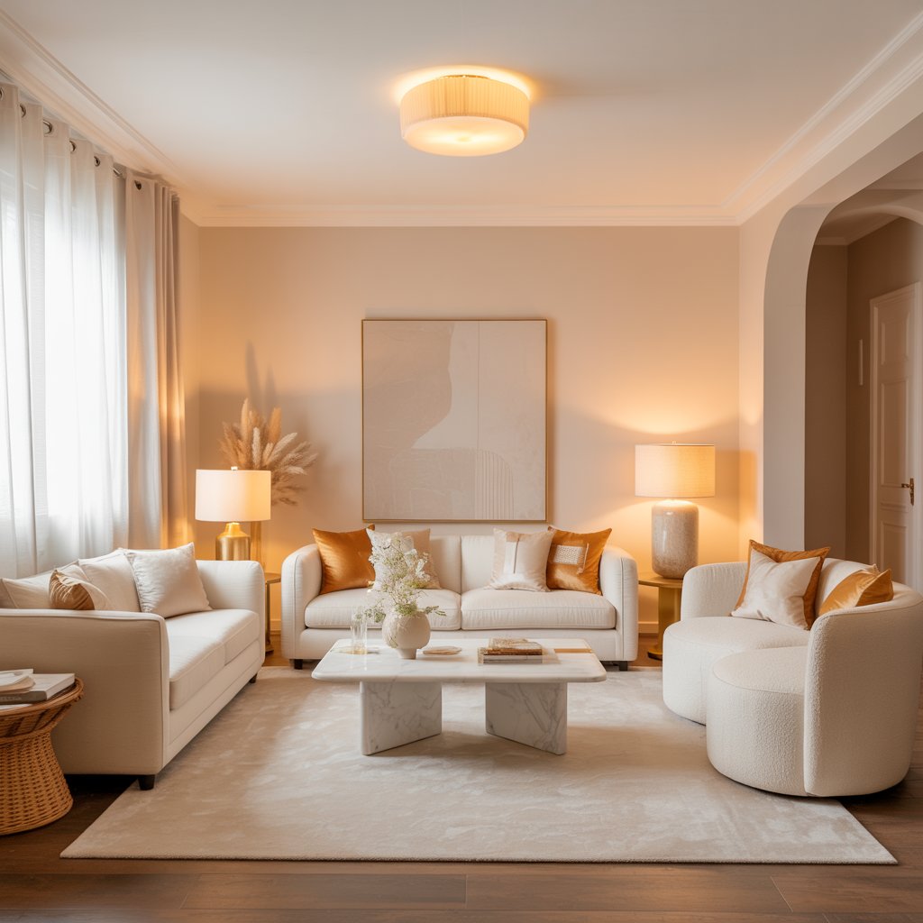
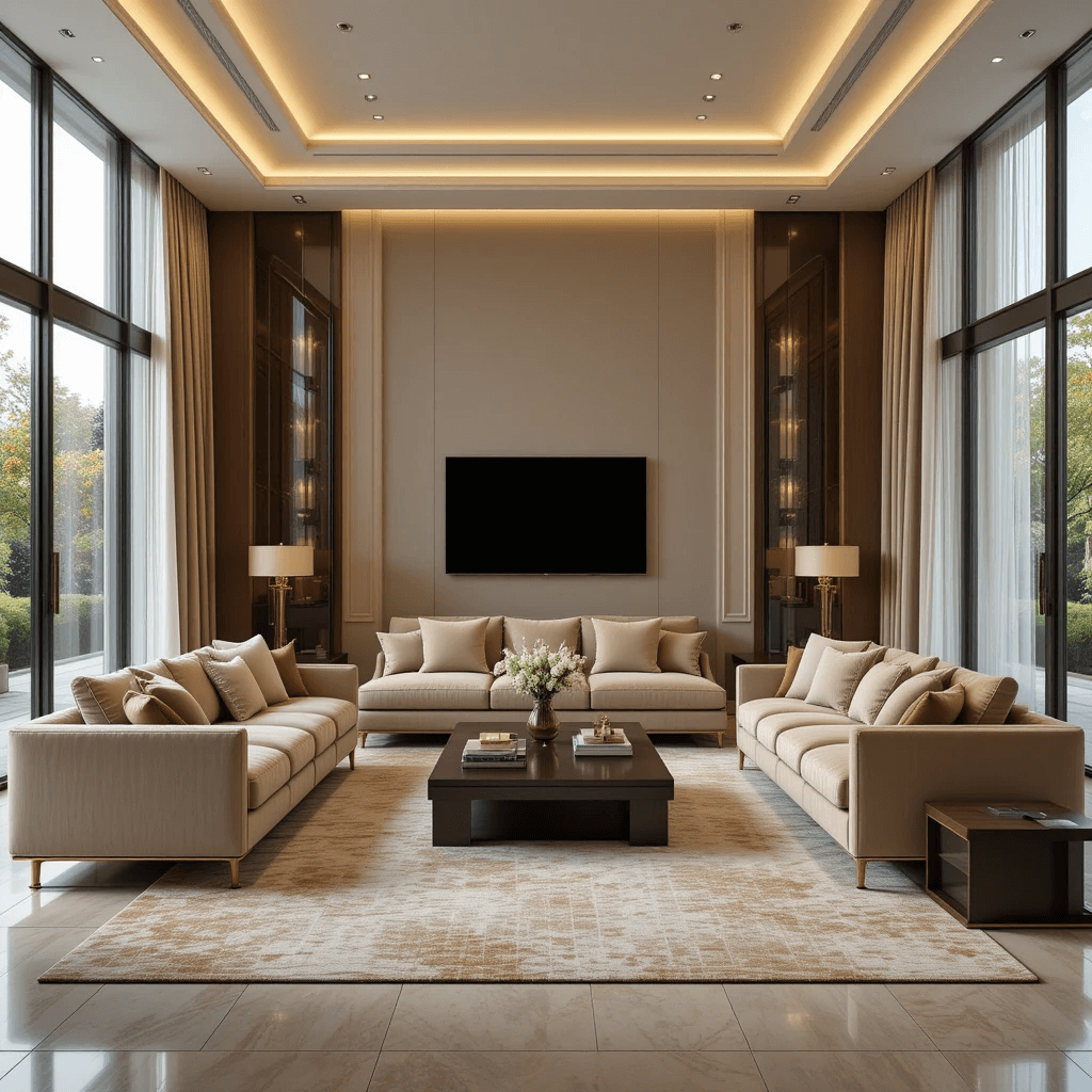
Move over, sterile hospital white. This is the cozy hug of neutrals. Think creamy ivory, soft almond, or barely-there beige undertones. It feels inviting and reflects light beautifully.
Why it screams luxury:
- Instantly makes a space feel clean, bright, and expensive.
- Acts like the perfect blank canvas, making art, wood tones, and textiles pop.
- Creates a timeless backdrop that won’t date quickly. Phew!
Personal fave: Benjamin Moore’s “White Dove” (OC-17) is my holy grail. It has just enough warmth to avoid feeling cold, even in north-facing rooms. Game changer!
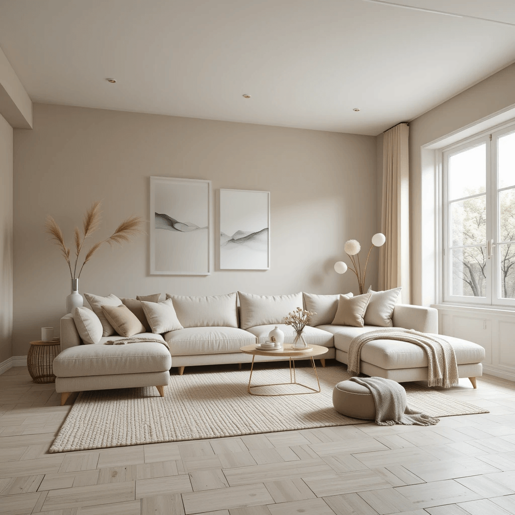
2. Sophisticated Greige (The Perfect Blend)
Beige met grey, they had a beautiful baby named Greige, and it solved all our decorating dilemmas. Okay, maybe not all, but it’s darn close. It’s the ultimate chameleon.
How to make it sing:
- Choose your undertone wisely: Slightly warmer (beige-leaning) or cooler (grey-leaning) makes a huge difference. Test samples!
- Pair it with crisp white trim for instant definition and polish.
- Layer in natural textures like linen, jute, and wood to add depth and prevent flatness.
Pro Tip: Sherwin Williams “Agreeable Gray” (SW 7029) is wildly popular for good reason. It’s the ultimate crowd-pleaser that always looks sophisticated.
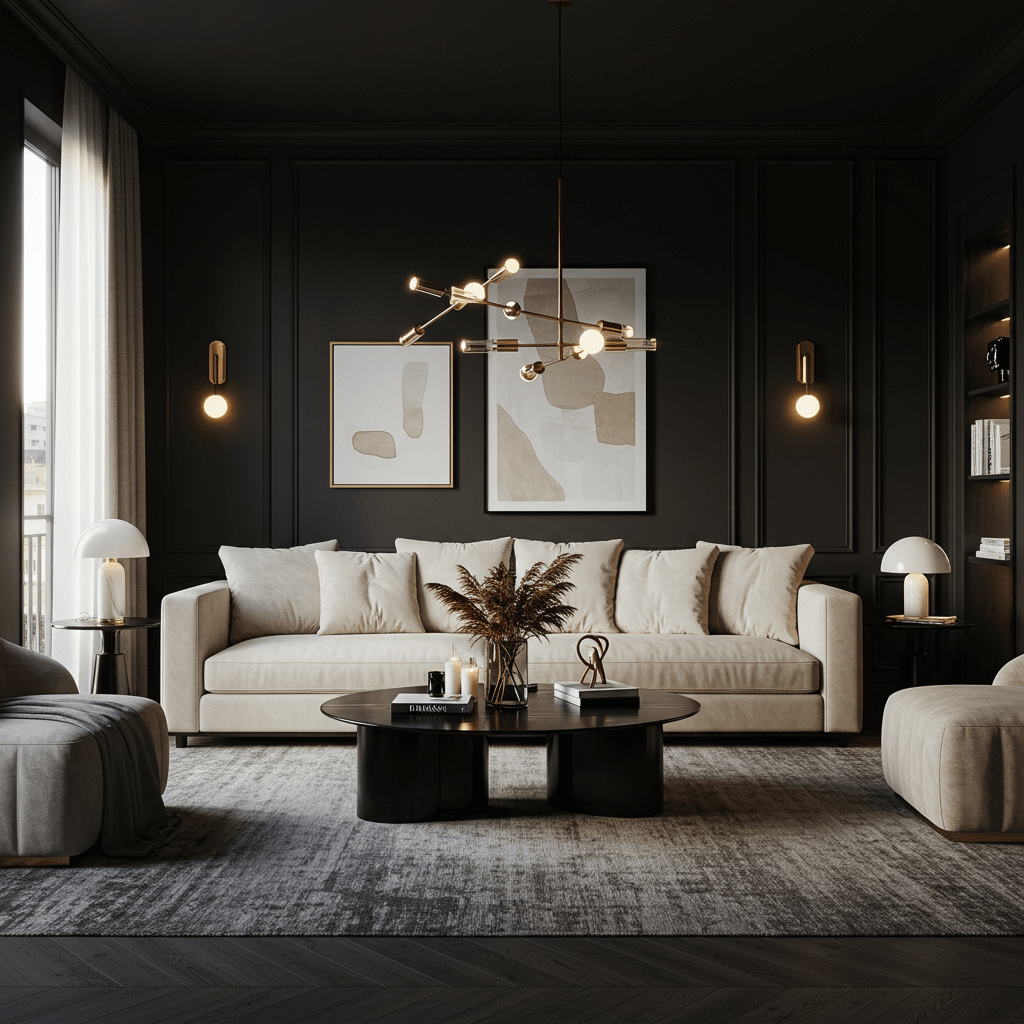
3. Deep, Moody Charcoal

Who says neutral has to be light? A deep charcoal grey on walls (or even an accent wall) is pure drama and instant sophistication. It makes a room feel intimate and cocooning.
Why it works so well:
- Creates incredible depth and makes other elements (like metallics or plush velvet) truly shine.
- Feels incredibly modern and chic when done right.
- Surprisingly versatile – works with warm woods, cool metals, and bold jewel tones.
Downside alert: Can feel cave-like in tiny, dark rooms without ample lighting. Seriously, assess your natural light first!
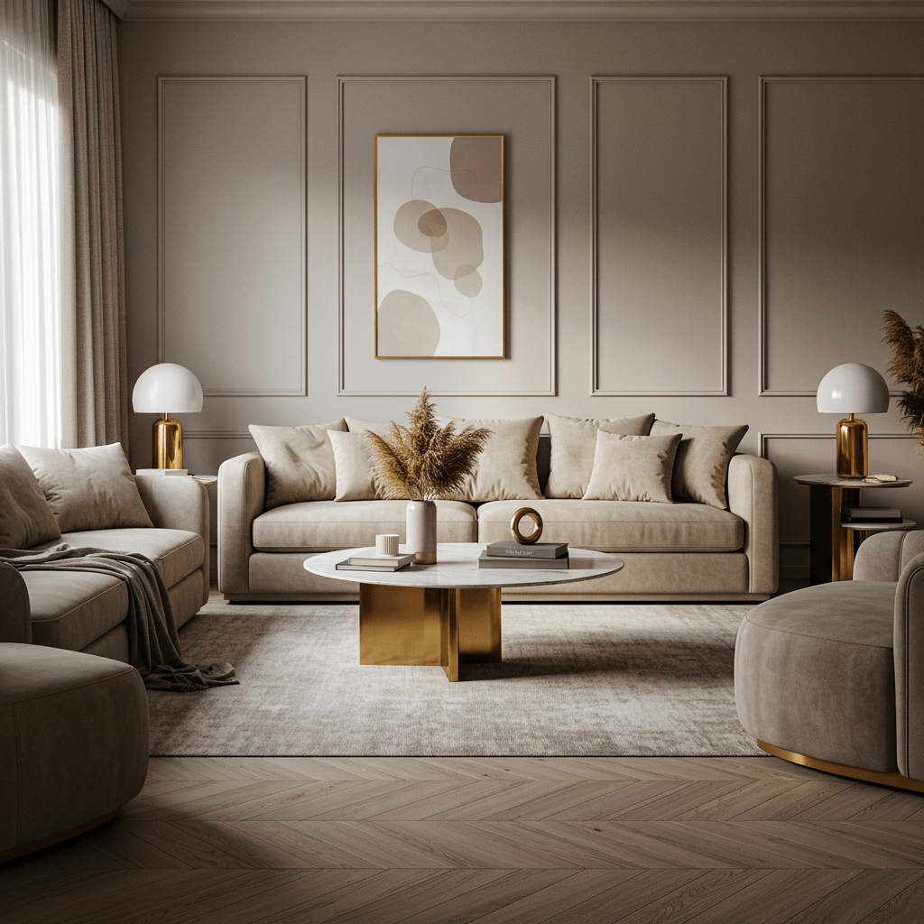
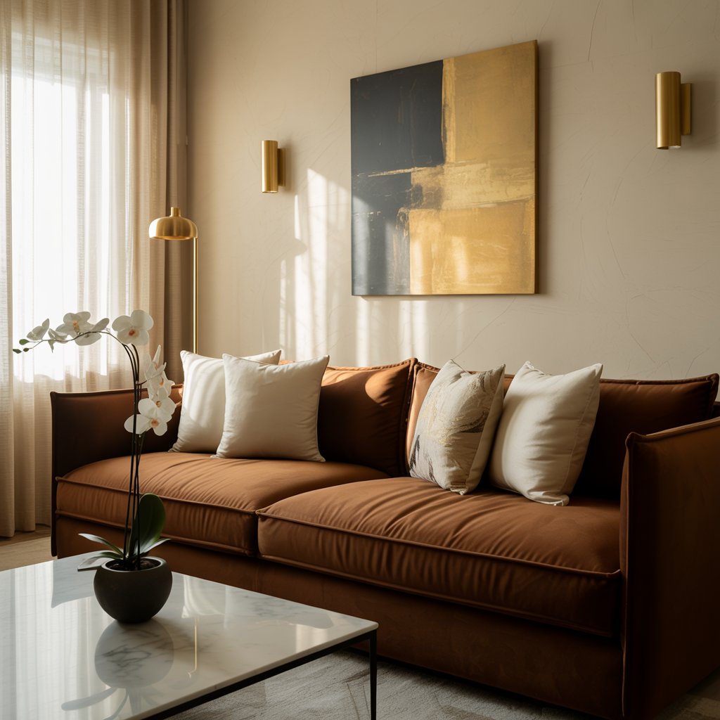
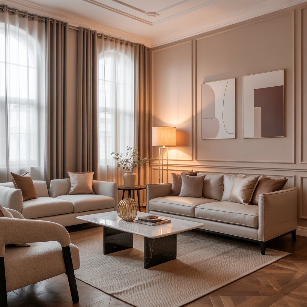
4. Rich, Earthy Taupe
Taupe is like greige’s more complex, worldly cousin. It often has subtle hints of mauve, green, or pink lurking beneath the surface. This complexity is exactly what reads as expensive.
Why it’s a must-try:
- Adds warmth and richness without being overtly brown or beige.
- Looks stunning paired with both warm metals (brass, gold) and cool metals (chrome, nickel).
- Creates a grounded, organic, and incredibly elegant feel.
Designer trick: Look for taupes with a slight purple or green undertone – Farrow & Ball’s “Elephant’s Breath” is iconic for this reason. It’s pure magic.
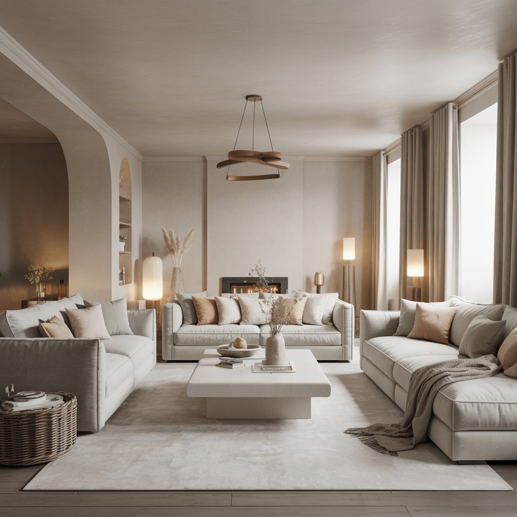
5. Soft, Cloud-Like Putty
Imagine the softest, most delicate grey with the faintest whisper of beige or brown. That’s putty. It’s ethereal, calming, and feels incredibly refined.
How to nail the look:
- Perfect for creating a serene, minimalist vibe that still feels warm.
- Looks incredible with natural materials like bleached wood, stone, and marble.
- Keep the overall palette light and airy to enhance its dreamy quality.
- Add subtle texture through boucle fabrics or a nubby rug.
Personal take: This is my go-to for bedrooms too! It’s like a visual sigh of relief.
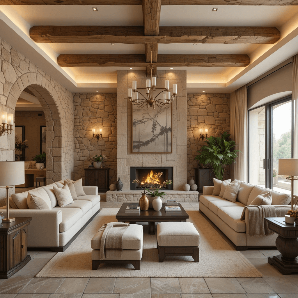
6. Warm Stone (Think Tuscany)

Channel those sun-drenched Italian villas. This isn’t cold grey stone; it’s warm, sunbaked, with subtle terracotta or sandy undertones. It feels inherently rich and timeless.
Why it looks expensive:
- Evokes a sense of history, craftsmanship, and natural elegance.
- Pairs divinely with wrought iron, aged leather, and rustic wood furniture.
- Creates a welcoming, grounded atmosphere that feels lived-in and luxurious.
Pro move: Use it in a matte finish to really enhance that authentic, stony texture feel. Glossy would just feel wrong here.
7. Almost-Black (For the Bold)
Yep, it counts as a neutral! A deep, inky black (or near-black like “Railings” by Farrow & Ball) is the ultimate power move. It’s dramatic, enveloping, and oozes confidence.
Why it’s genius:
- Makes everything else in the room look instantly more precious and curated.
- Creates an incredibly chic, gallery-like backdrop for art and sculpture.
- Feels modern, mysterious, and undeniably luxe.
Downside alert: Not for the faint of heart! Commit fully and ensure you have killer lighting (layered: overhead, task, accent) to prevent it from feeling like a dungeon. FYI, I painted my study this color and have zero regrets (but lots of lamps!).
8. Pale, Misty Grey
Lighter than greige, cooler than putty, a pale misty grey is effortlessly chic. Think of early morning fog – soft, serene, and sophisticated.
How to keep it luxe:
- Avoid anything with strong blue undertones unless you want that cool vibe.
- Look for greys with subtle green or lavender hints for added depth.
- Pair with high-contrast elements: Crisp white ceilings/moldings, dark wood floors, and rich black accents (picture frames, lamp bases).
Pro Tip: Benjamin Moore “Gray Owl” (OC-52) is a superstar in this category. It’s light, airy, and has beautiful subtle undertones.
9. Chocolate Brown (Yes, Really!)
Hear me out! A deep, rich chocolate brown (think dark melted chocolate, not milk chocolate) is surprisingly neutral and incredibly decadent. It feels warm, cozy, and library-level luxurious.
Why it works:
- Creates an instant sense of warmth and intimacy.
- Looks amazing with brass, gold, cream, and pops of emerald green or burnt orange.
- Feels opulent and grounded, especially in rooms with high ceilings.
Personal fave: I used a deep chocolate on a feature wall behind built-in bookshelves. Paired with brass library lights and cream upholstery? Chef’s kiss. Total luxe vibes.
10. Creamy Oyster
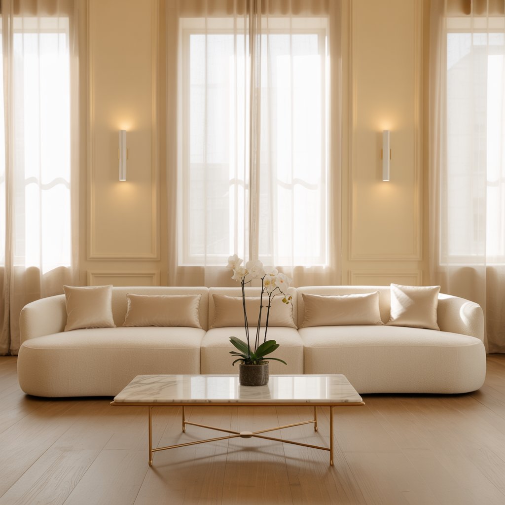
More complex than basic white, warmer than grey, oyster has a beautiful pearlescent quality. It’s soft, elegant, and universally flattering.
Why it’s a winner:
- Provides a warm, neutral backdrop that’s never stark or cold.
- Makes metallics (especially gold and champagne) look absolutely stunning.
- Works beautifully in both traditional and modern settings.
Designer trick: This is THE color for making trim and moldings look subtly expensive without being blinding white. Try Benjamin Moore “Simply White” (OC-117) for walls and trim for a seamless, elegant look.
11. Smokey Blue-Grey
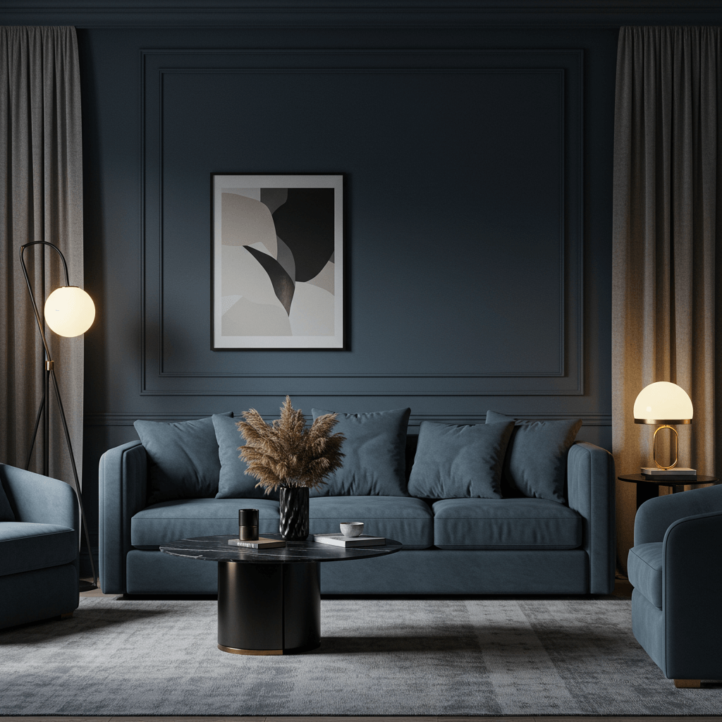
Neutrals don’t have to be warm! A sophisticated blue-grey (think stormy skies or deep sea mist) brings cool elegance. It feels crisp, clean, and undeniably chic.
How to make it feel expensive:
- Lean into the cool tones with silver, chrome, glass, and marble accents.
- Warm it up slightly with natural wood tones and creamy textiles to avoid sterility.
- Perfect for coastal, modern, or even industrial-inspired spaces.
Pro move: Sherwin Williams “Smoky Blue” (SW 7604) is a beautiful example. It’s moody yet refined. Pair with lots of texture!
12. Mushroom (The Understated Star)
A soft, earthy brown-grey, mushroom is humble yet incredibly sophisticated. It’s like the perfect cashmere sweater for your walls – understated luxury.
Why it looks so good:
- Creates a calming, grounded, and organic atmosphere.
- Blends seamlessly with nature-inspired palettes (greens, terracottas, rusts).
- Feels cozy and inviting without being heavy.
Personal take: This is the ultimate “quiet luxury” neutral. It doesn’t shout, it just is effortlessly elegant. Farrow & Ball “Mouse’s Back” nails this vibe.
13. Warm Terracotta (Surprise Neutral!)
Tapping into the earth tone trend, a muted, warm terracotta reads as a rich, unexpected neutral. It’s cozy, inviting, and full of character.
Why it’s a must-consider:
- Adds incredible warmth and a touch of Mediterranean flair.
- Looks stunning with olive green, navy, cream, and rattan.
- Feels artisanal and hand-crafted, which instantly reads as luxe.
Downside alert: Can lean orange if you’re not careful! Choose muted, clay-like versions, not bright pumpkin. Test, test, test!
14. Pale, Pinky Beige (The Flatterer)
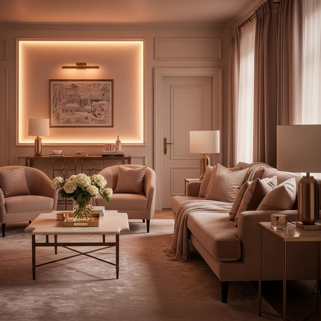
Forget the bad 90s beige! Modern pinky-beiges have a rosy, flattering undertone. They make skin tones glow and spaces feel soft and welcoming.
How to use it for luxe:
- Ideal for creating a soft, romantic, or very calm atmosphere.
- Pairs beautifully with soft greens, warm whites, and brushed gold accents.
- Looks especially lovely in rooms with lots of natural light.
Pro Tip: Benjamin Moore “Balboa Mist” (OC-27) is a classic in this category. It’s like a soft, warm hug for your walls.
15. Deep Olive Green (Neutral Adjacent)
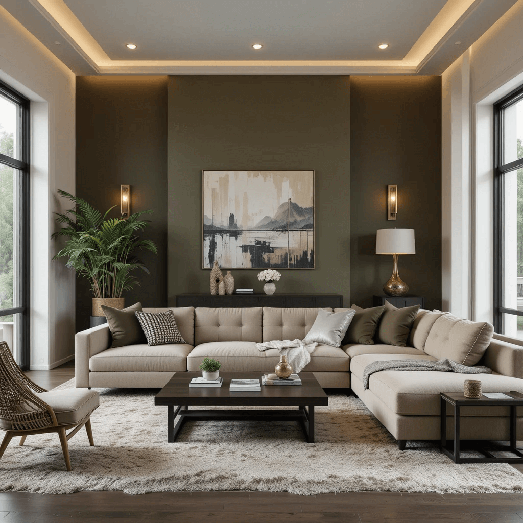
Okay, pushing the boundary slightly, but a deep, muted olive green functions as a fantastic, rich neutral. It’s earthy, sophisticated, and feels incredibly expensive.
Why it belongs:
- Brings the serenity of nature indoors in a very refined way.
- Looks phenomenal with cognac leather, black accents, brass, and creamy whites.
- Creates a unique, library-esque or study feel that oozes quiet luxury.
Personal fave: I used a deep olive (like Sherwin Williams “Sagey” SW 2850) in a dining nook. With dark wood and velvet chairs? Instant old-world glamour on a budget.
16. Soft, Buttery Yellow
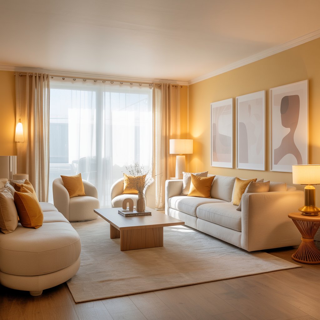
Not your grandma’s loud lemon! Think subtle, buttery, almost-neutral yellows. They bring sunshine and warmth without overwhelming.
Why it works for luxe:
- Creates a cheerful, welcoming, and optimistic feel.
- Looks stunning with crisp white, soft greys, and natural wood.
- Adds a touch of unexpected, cheerful elegance.
Designer trick: Keep it soft and muted. Farrow & Ball “India Yellow” (a very pale version) or Benjamin Moore “Hawthorne Yellow” (HC-4) are perfect examples. Avoid anything too primary!
Wrapping Up Your Luxe Neutral Journey
See? Neutrals are anything but boring. Choosing the right one (or combining a few!) is your secret weapon to crafting a living room that looks like you hired a high-end designer (shh, we won’t tell it was mostly just genius paint choices!).
Remember, it’s all about undertones, lighting, and texture. Don’t just grab the first beige chip you see. Test those samples like your design sanity depends on it (because it kinda does!).
The real magic happens when you layer your perfect neutral backdrop with rich textures. Think nubby wool throws, smooth leather, polished stone, gleaming metallics, and plush rugs.
That’s where the “expensive” look truly comes alive. So, which of these luxe neutrals is calling your name? Grab some samples, channel your inner design guru, and get painting (or get a pro to do it)! Share with me the pictures of your beautiful work.