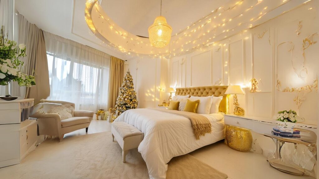
Tired of your bedroom feeling about as romantic as a spreadsheet? Yeah, “builder basic” isn’t exactly setting hearts aflutter.
What if I told you a splash of the right color could be cheaper than couples therapy and way more fun? Seriously, the right hue can turn your room into a retreat that practically encourages cuddling.
No magic required, just good paint choices (and maybe avoiding that neon green your partner secretly loves).
Been through the paint-chip wars myself, so I’ve rounded up 14 gorgeous, couple-approved colors that bring the cozy, the calm, and yes, the romance. Let’s banish the bedroom blahs and paint your love story onto those walls!
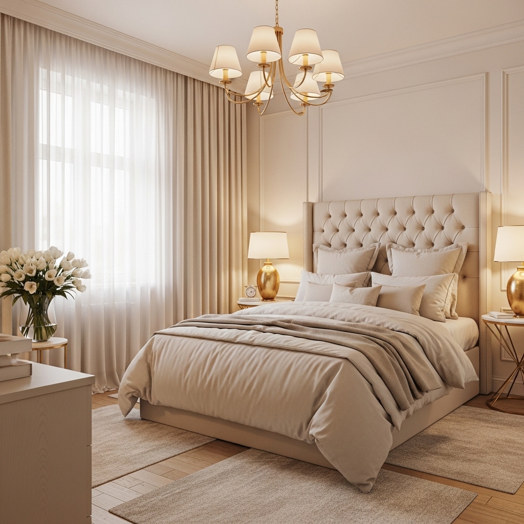
1. Whispering Warm Taupe
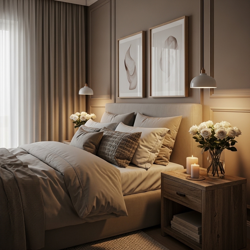
Forget cold greys. This is your cozy, neutral BFF. Taupe wraps the room in a warm, sophisticated hug that works with everything. It’s the perfect backdrop for crisp white linens or rich jewel tones.
Why it works for romance:
- Creates an instantly calming and grounding atmosphere (bye-bye, stress!).
- Acts as a neutral canvas, letting your bedding, art, or you two be the stars.
- Feels luxurious without being stuffy or overwhelming.
- Flatters all skin tones in that soft morning light – just saying.
Pro Tip: Choose a taupe with subtle warm undertones (think pinky-beige or greige leaning brown, not green). Cool taupes can feel sterile. My go-to? Benjamin Moore’s “Revere Pewter” – magic in a can.
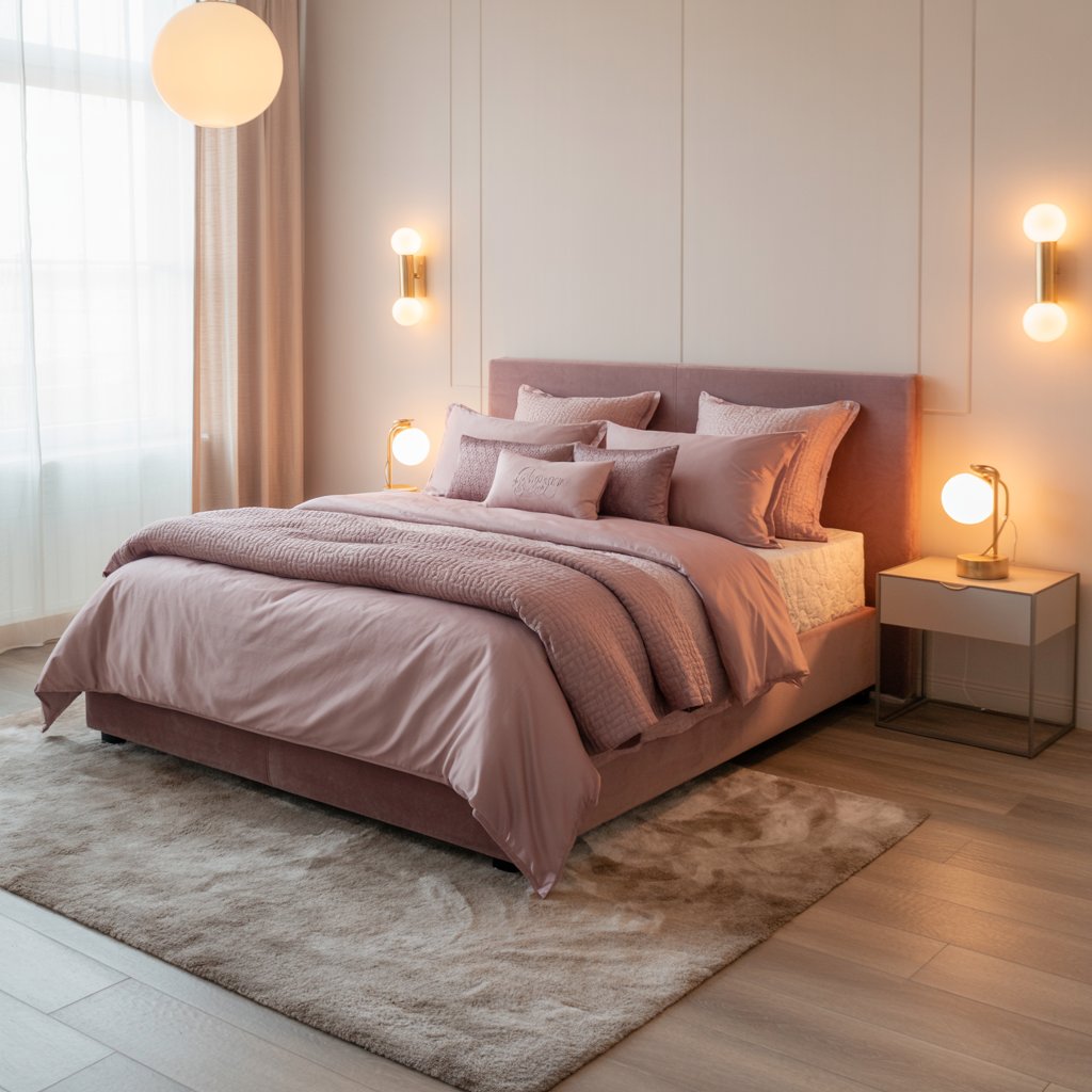
2. Blush Pink (Yes, Seriously!)
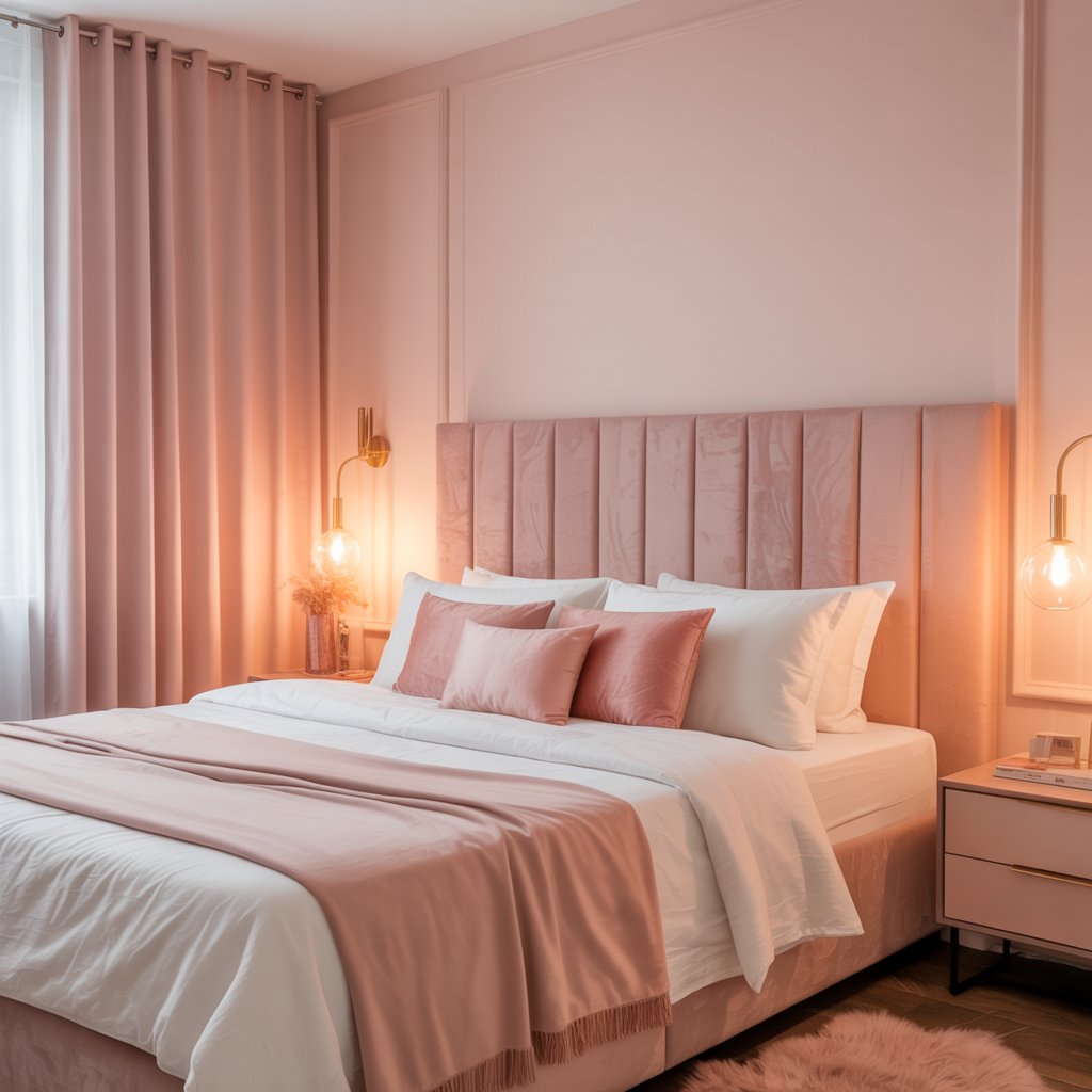
Hear me out! This isn’t your grandma’s bubblegum pink. Modern blush is soft, sophisticated, and surprisingly gender-neutral. It whispers romance without shouting it.
How to make it work for two:
- Balance is key: Pair it with deep charcoal, warm wood tones, or crisp black accents.
- Keep it muted: Go for dusty rose or clay-inspired shades, not neon.
- Layer textures: Think linen bedding, a chunky knit throw, maybe some brass details.
- Statement wall: If all-over feels risky, try it on a focal wall behind the bed.
Personal Fave: We used Farrow & Ball’s “Setting Plaster” on an accent wall with dark wood furniture and black lamps. It’s dreamy, warm, and my husband (a self-proclaimed anti-pink guy) actually loves it. Win!
3. Deep, Moody Teal
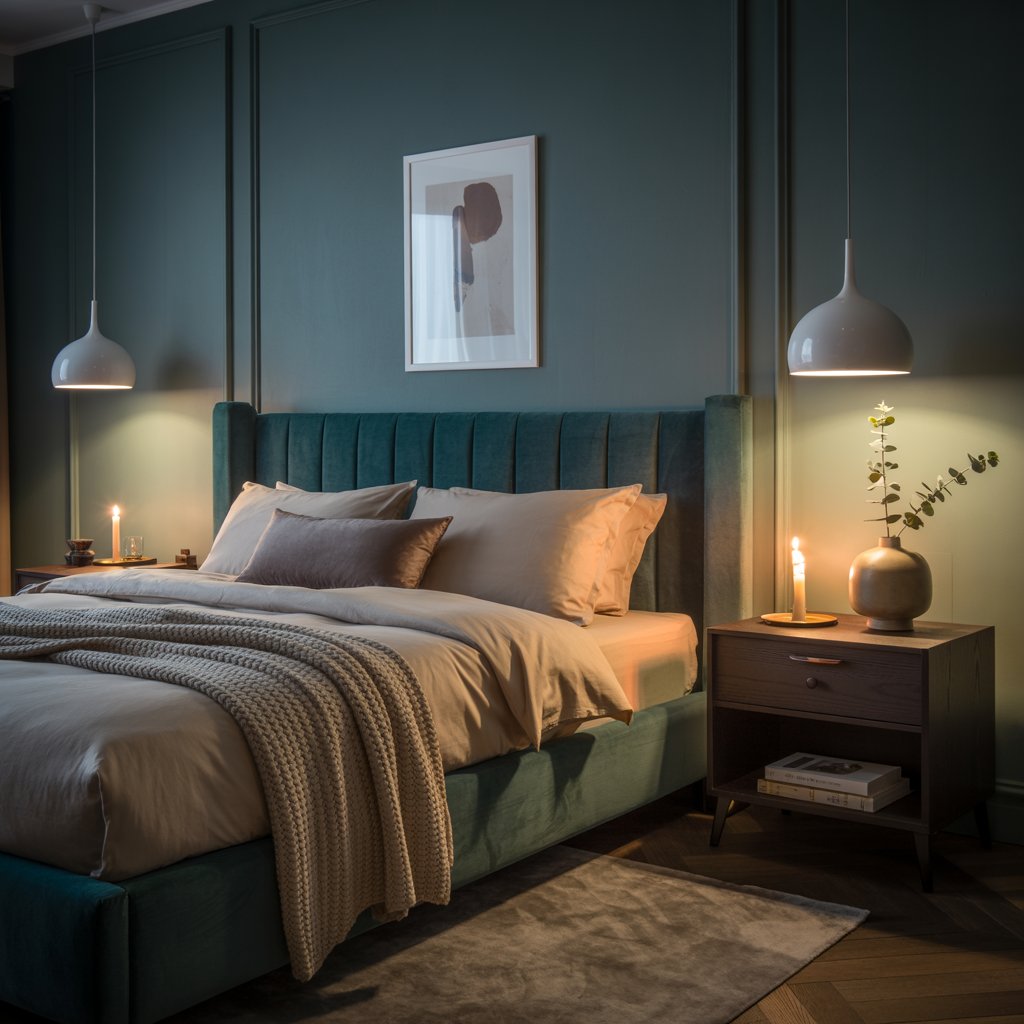
Craving drama and intimacy? Dive into a rich teal. It’s like being enveloped in twilight – mysterious, cozy, and utterly captivating.
Why it’s a must-try:
- Creates an instant cocooning effect, perfect for shutting out the world.
- Feels luxurious and decadent (hello, boudoir vibes!).
- Pairs beautifully with gold, brass, warm woods, and velvet textures.
- Surprisingly versatile – works in modern or traditional settings.
Downside: It is a commitment. Dark colors need good lighting (strategic lamps are your friend!) and might make a small room feel cozier (which could be good or bad, IMO).
4. Softest Sky Blue
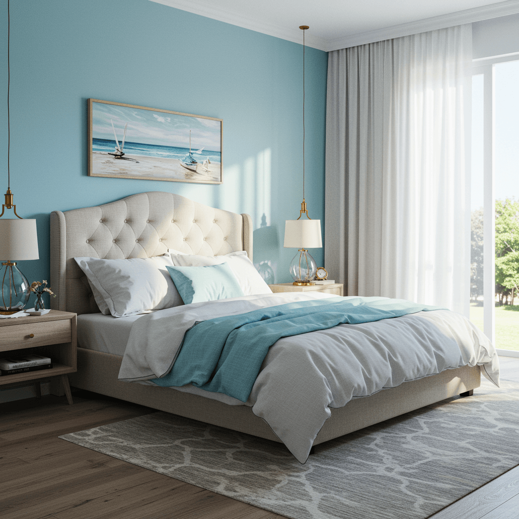
Bring the calming serenity of a clear sky indoors. Pale blue is refreshing, peaceful, and promotes relaxation – essential ingredients for a romantic retreat.
How to nail the vibe:
- Choose a blue with gray or lavender undertones for sophistication (avoid anything too baby-blue or primary).
- Pair with lots of crisp white trim and bedding for an airy feel.
- Add warmth with natural wood furniture, woven textures, and soft lighting.
- Introduce subtle blush or sage green accents for a gentle, romantic contrast.
Pro Move: Use it on the ceiling too! It creates an amazing “open sky” illusion, making the room feel taller and dreamier. Try Sherwin-Williams “Sleepy Blue” – the name says it all.
5. Rich Terracotta
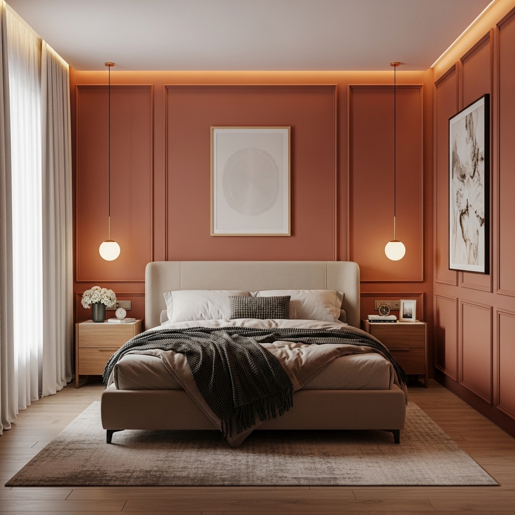
Channel sun-drenched villas and earthy warmth. Terracotta feels grounded, inviting, and full of life – a passionate choice for a couple’s space.
Why it works:
- Radiates a natural, welcoming warmth that’s incredibly comforting.
- Creates a vibrant yet cozy atmosphere (think Mediterranean escape).
- Looks stunning paired with creamy whites, deep greens, and natural textures (rattan, linen, clay pots).
- It’s unique and full of character, moving beyond safe neutrals.
Story Time: We once painted a rental bedroom a deep terracotta once (with permission!). Landlord was skeptical, but when they saw it with the white moldings and plants? They asked for the color! Instant vacation vibes every night.
6. Sophisticated Charcoal Grey
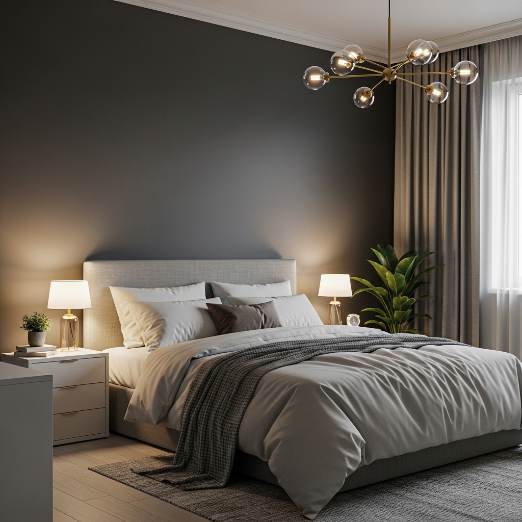
Move over, cold grey! Deep charcoal is moody, sleek, and undeniably sexy. It’s a powerful backdrop that makes everything else pop.
How to make it romantic (not dungeon-y):
- Embrace texture: Velvet headboard, fluffy rug, linen curtains – essential!
- Layer warm lighting: Multiple lamps, maybe even fairy lights or candles (battery-operated are safe!).
- Add warmth: Creamy bedding, warm wood tones, brass or gold accents.
- Keep it clean: Clutter is the enemy of a sophisticated charcoal look.
Personal Take: This is my go-to for instant “adult” and intimate vibes. Pair it with a dramatic piece of art above the bed and some lush greenery. Chef’s kiss.
7. Lavender Mist
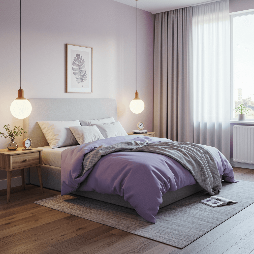
Not your childhood purple! Soft, grayed-out lavender is ethereal, calming, and subtly romantic. It’s like a gentle sigh for your walls.
Why it’s unexpectedly perfect:
- Promotes relaxation and tranquility (ideal for unwinding together).
- Feels soft, dreamy, and slightly feminine, but balanced with neutrals it works beautifully.
- Pairs effortlessly with grey, cream, white, and soft sage green.
- Creates a unique and serene atmosphere different from typical neutrals.
Pro Tip: Stick to the muted, almost greyish lavender spectrum. Avoid anything too vibrant or candy-like. Farrow & Ball’s “Pelt” or Benjamin Moore’s “Lavender Mist” are stunning choices.
8. Warm, Buttery Cream
Sometimes, classic is best. A rich, warm cream is pure, understated elegance. It’s like a blank canvas that radiates warmth and light.
How to elevate it beyond boring:
- Choose a cream with yellow or pink undertones – avoid anything too stark white or greige.
- Layer different whites and creams in your textiles (bedding, rug, curtains) for depth.
- Add rich wood tones (like walnut or cherry) for contrast and warmth.
- Introduce soft color through art, pillows, or a single accent piece.
Personal Fave: This is my safe space color that never fails. It makes any room feel instantly brighter, larger, and more inviting. Perfect if you love changing up your decor frequently!
9. Forest Green Sanctuary
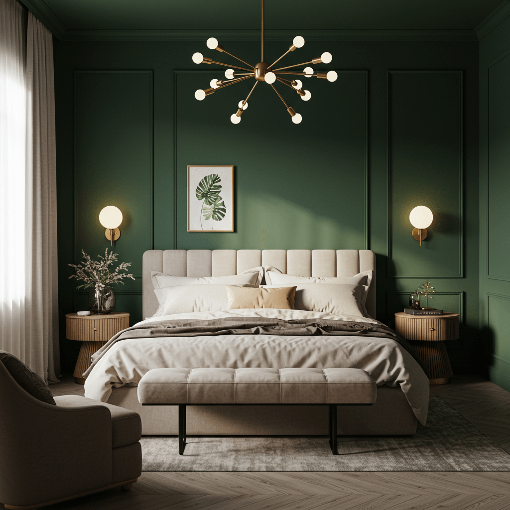
Bring the lushness of nature inside. Deep forest green is rich, enveloping, and deeply peaceful. It’s grounding and feels like a secret hideaway.
Why it creates a romantic retreat:
- Evokes feelings of tranquility, balance, and connection to nature.
- Creates a cozy, library-like atmosphere perfect for quiet evenings.
- Looks incredible with brass, gold, warm wood, cream, and even blush pink accents.
- Feels both traditional and unexpectedly modern.
Pro Move: For maximum impact, paint the ceiling too! It creates a truly immersive, cocooning effect. Ensure you have ample, warm lighting sources. Try Sherwin-Williams “Evergreen Fog” – it’s a stunner.
10. Spiced Honey (Warm Golden Yellow)
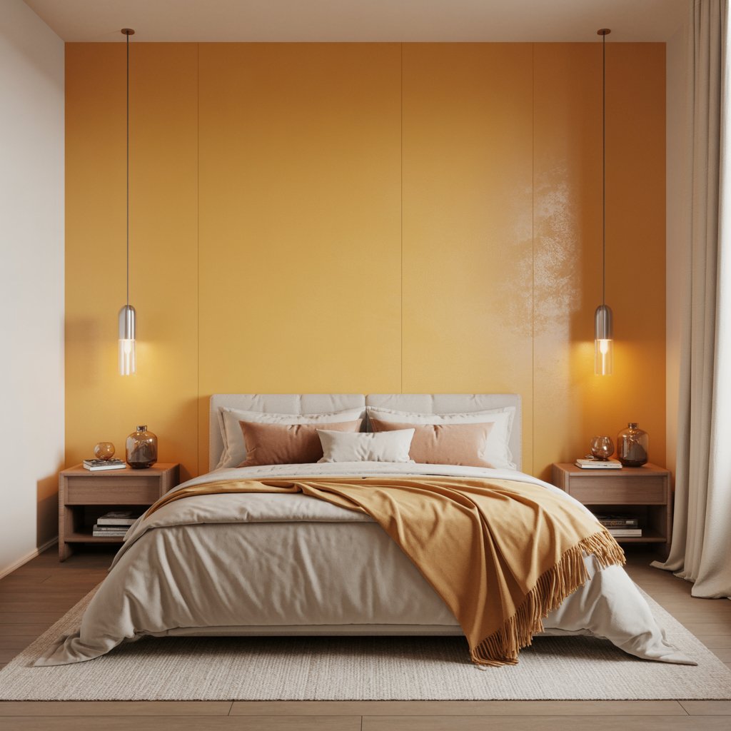
Infuse your space with sunshine and optimism. A warm, muted golden yellow (think honey, mustard, or ochre) radiates happiness and warmth.
How to make it work (without feeling like a kindergarten):
- Go muted: Choose shades with brown or grey undertones (ochre, mustard, deep gold).
- Use strategically: Accent wall, behind the bed, or on lower panels with wainscoting.
- Balance with neutrals: Pair with plenty of white, cream, charcoal, or black.
- Add natural elements: Wood, rattan, and plants complement it perfectly.
Downside: Very bright or primary yellows can be overwhelming and not relaxing. Stick to the deeper, earthier end of the spectrum. IMO, it’s perfect for a room that gets less direct light.
11. Softest Dove Grey
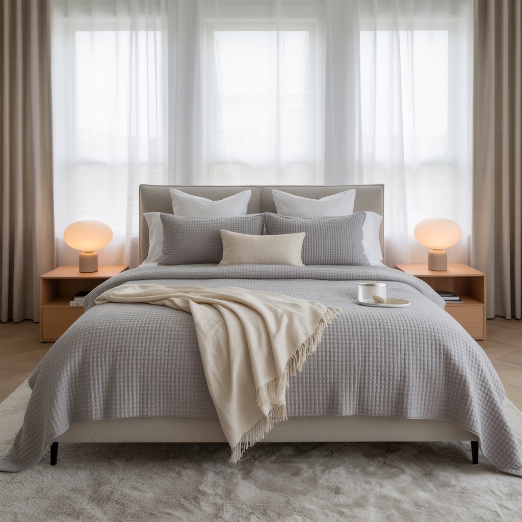
The cooler cousin to warm taupe, dove grey is serene, sophisticated, and effortlessly chic. It’s a light neutral that still has personality.
Why it’s a great couple’s choice:
- Creates a clean, calm, and airy backdrop that’s easy to live with.
- Feels modern and fresh without being cold (choose one with warm undertones!).
- Provides a perfect neutral stage for bold artwork, colorful bedding, or vibrant accents.
- Makes other textures (like wool or boucle) really stand out.
Pro Tip: Undertones matter! Pick a dove grey with subtle warm (beige/pink) undertones to avoid a chilly feel. Benjamin Moore’s “Gray Owl” is a classic for a reason.
12. Mauve Magic
Mauve is that gorgeous blend of grey, purple, and pink. It’s sophisticated, romantic, and has a lovely vintage charm without being dated.
Why it works so well:
- It’s inherently soft, calming, and visually interesting.
- Feels elegant and slightly feminine, but easily balanced with masculine elements (charcoal, black, dark wood).
- Pairs beautifully with cream, gold, brass, sage green, and even navy.
13. Navy Blue Depth
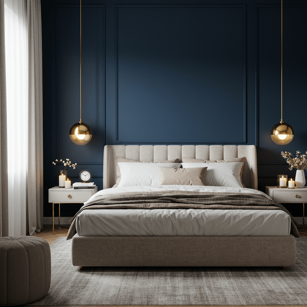
Deep, inky navy is the ultimate in sophisticated moodiness. It’s timeless, dramatic, and creates a deeply intimate atmosphere.
How to make it feel romantic (not nautical):
- Embrace luxe textures: Velvet, silk, satin, sheepskin – go for it!
- Warm metals are key: Brass, gold, and copper add essential warmth and glow.
- Layer lighting: You need multiple light sources (lamps, sconces) to prevent cave vibes.
- Add creamy contrast: Crisp white trim and bedding are non-negotiable.
Pro Move: Paint built-in shelves or the back of a bookcase in the same navy for a cohesive, luxe look. It adds depth without overwhelming the whole room.
14. Warm White (It Counts!)
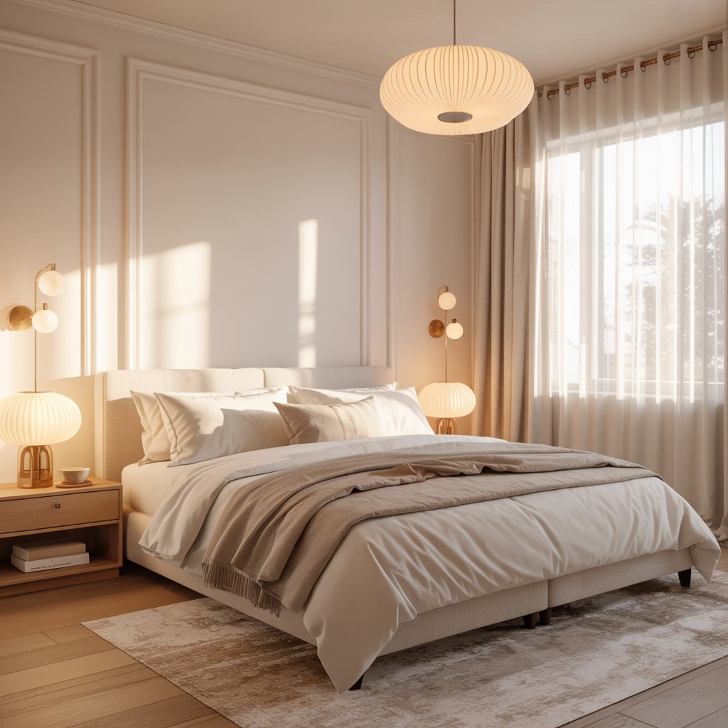
Don’t underestimate the power of a truly warm white. It’s clean, bright, and makes a space feel fresh and serene – the perfect blank canvas for romance.
Why it’s a must-consider:
- Maximizes light, making any room feel bigger and airier.
- Provides ultimate flexibility – change your bedding, art, and rug anytime for a new look!
- Feels clean, peaceful, and uncluttered (bliss for shared spaces).
- Looks amazing with any accent color or wood tone you love.
Final Thoughts
From whisper-soft creams to moody navies, you’ve got no excuse for boring bedroom walls now. Remember, romance is about feeling connected and comfy. And the right color sets that whole mood before you even light a candle.
Don’t stress about finding the “perfect” one; focus on what feels warm, inviting, and uniquely yours together. Test, bicker good-naturedly over swatches, and dive in!
A weekend of painting beats years of staring at a color you hate. FYI, minor paint-related bickering is practically a bonding ritual. Enjoy the transformation – and the cuddles in your gorgeous new nest!