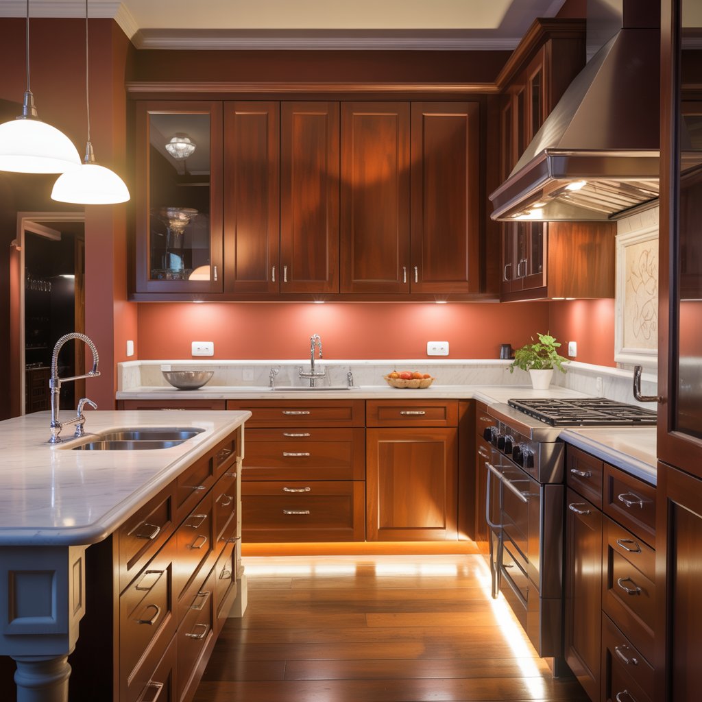
Okay, let’s talk cherry cabinets. They get a bad rap sometimes, labeled “dated” or “too 90s.” Pfft. I call that nonsense. Cherry wood has this incredible warmth and richness just begging for the right color partner to make it sing.
Seriously, done right, it’s pure kitchen magic. Forget ripping them out, and let’s make them the rockstars they deserve to be.
I’ve seen (and tried!) so many combos, and these 16? Chef’s kiss. Get ready to fall back in love with your cherry beauties!
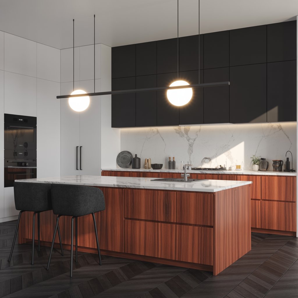
1. Crisp White & Black Accents
Classic, clean, and always in style. Bright white walls instantly lift the richness of cherry, making it feel modern, not heavy. Throw in sleek black hardware and maybe some countertop veining? Instant sophistication.
Why it Works Like Magic:
- The high contrast makes the cherry grain pop dramatically.
- White reflects light, balancing the wood’s depth and making the space feel bigger.
- Black accents (faucet, hardware, light fixtures) ground the scheme and add definition.
- It’s timeless and lets the cabinetry be the undeniable star.
Pro Tip: Go for a pure white, not creamy. Think Swiss Coffee or Chantilly Lace. Creams can clash weirdly. Trust me, I learned the hard way!
2. Moody Navy Blue
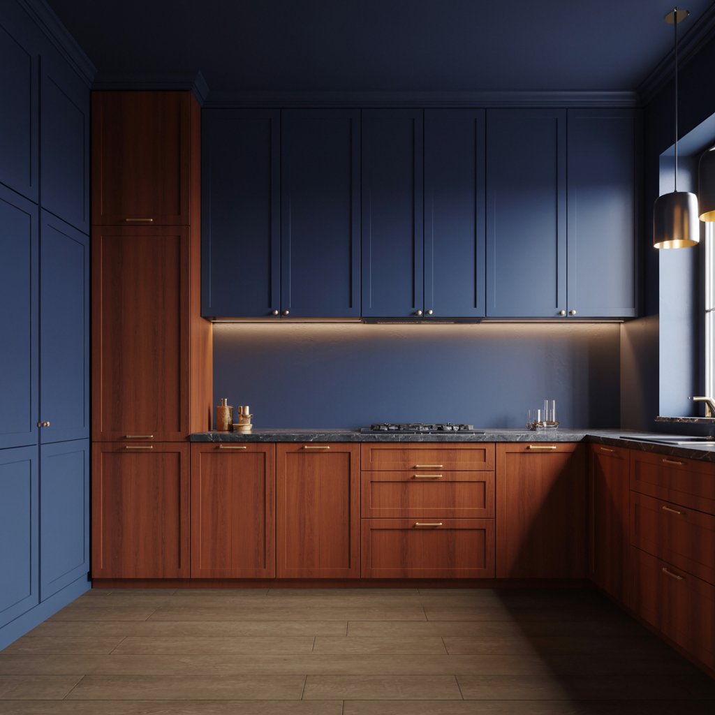
Want drama? Navy is your friend. It creates this incredible, cozy, almost library-like feel that plays with the cherry’s warmth, not against it. Think sophisticated yacht club, not nautical overload.
How to Nail the Vibe:
- Paint lower cabinets or an island navy for a bold statement.
- Keep uppers cherry or go with white uppers if you need more light.
- Pair with brass or polished nickel hardware – gold tones sing against navy and cherry.
- Add texture with woven barstools or a natural fiber rug.
Personal Fave: Did this in my cousin’s kitchen. The navy island became the instant focal point, and the cherry uppers looked richer than ever. So chic!
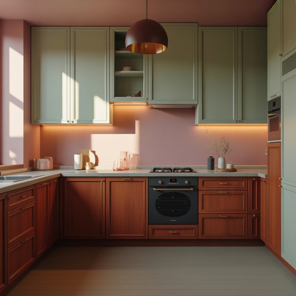
3. Earthy Sage Green
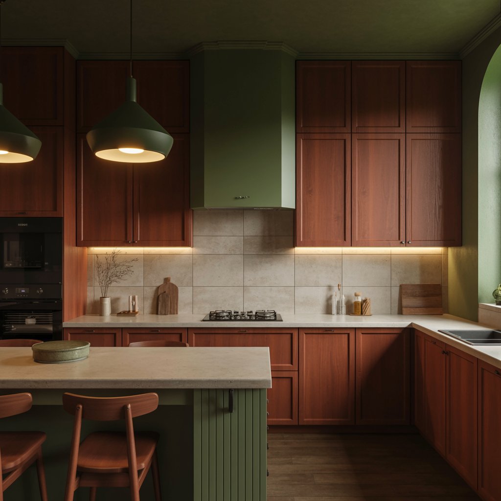
Nature knows best. Sage green is the perfect earthy complement to cherry’s red undertones. It feels calm, grounded, and totally fresh.
Why It’s a Must-Try:
- Green is opposite red on the color wheel, creating natural harmony.
- Sage’s softness tones down any potential “too red” vibe in the cherry.
- It brings a serene, organic feel to the heart of your home.
- Looks amazing with natural stone counters and wood accents.
Downside? Choosing the right sage is key. Avoid anything too minty or yellow-based. Look for muted, grayish greens. Sample pots are your BFF here.
4. Warm Greige (Gray + Beige)
Can’t decide between warm or cool? Greige is your perfect neutral middle ground. It provides a soft, sophisticated backdrop that lets the cherry shine without competing.
How to Make it Sing:
- Choose a greige with subtle warm undertones (think Revere Pewter or Agreeable Gray).
- It bridges the gap between cherry’s warmth and cooler elements like stainless steel.
- Creates a calm, unified look that feels contemporary yet cozy.
- Works brilliantly with both warm and cool countertop options.
Pro Move: Use greige on walls and bring in texture through a linen-look backsplash or woven shades. Instant depth!
5. Bold Charcoal Gray
Forget thinking gray is cold! A deep charcoal creates an incredible, moody contrast with cherry that’s seriously luxe. It’s modern, sophisticated, and unexpected.
Why it Works:
- The deep, cool gray makes the warm cherry tones pop intensely.
- Creates a dramatic, high-end aesthetic (think boutique hotel kitchen).
- Hides kitchen messes like a champ (bonus!).
- Pairs stunningly with matte black fixtures and concrete-look counters.
Personal Take: I was skeptical until I saw it. Wow. It takes cherry from traditional to seriously edgy. Just ensure you have good lighting!
6. Creamy Off-White
Want warmth without starkness? Creamy off-whites are cherry’s cozy best friend. They enhance the wood’s richness while keeping things light and airy.
How to Avoid the “Blah”:
- Choose a cream with clear yellow or pink undertones, avoiding anything too beige or muddy.
- It creates a seamless, enveloping warmth throughout the space.
- Perfect for traditional, cottage, or farmhouse styles.
- Pair with oil-rubbed bronze or unlacquered brass hardware for extra warmth.
Watch Out: Test samples! Some creams can make cherry look orangey. Look for names like “Alabaster” or “Navajo White” as starting points.
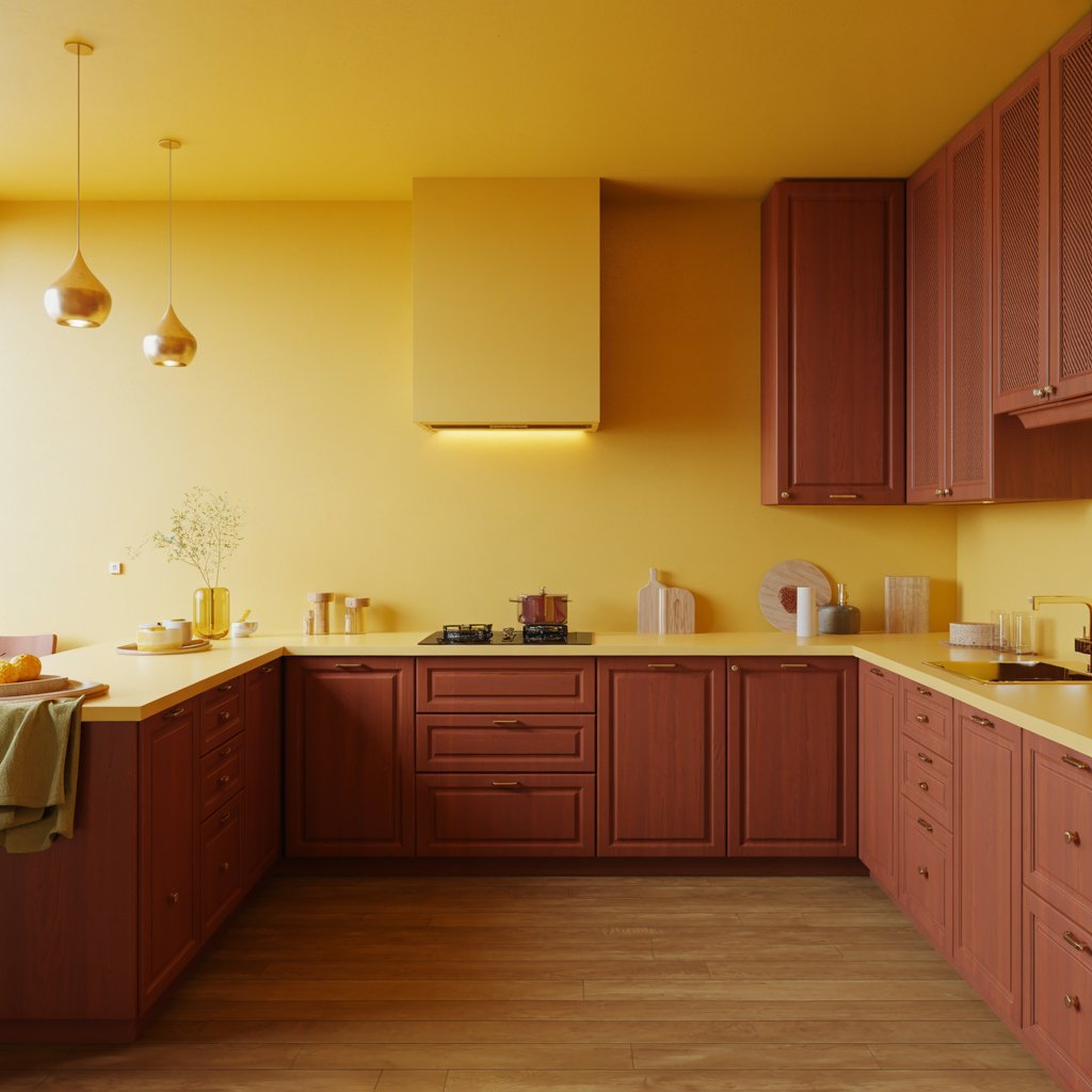
7. Sunny Butter Yellow
Feeling cheerful? A soft, buttery yellow is pure sunshine alongside cherry cabinets. It plays up the warmth beautifully without being overwhelming.
Why It’s Surprisingly Chic:
- Complements the red undertones in cherry wood naturally.
- Brightens the space and feels instantly welcoming.
- Works great as a wall color or on an island for a pop.
- Pairs wonderfully with white countertops and brass accents.
Story Time: My aunt’s 1920s kitchen has cherry cabinets with buttery walls and a white farmhouse sink. It’s the happiest, most inviting kitchen ever. Proof it’s not just for kids’ rooms!
8. Cool Light Gray
Okay, hear me out. A light, cool gray (think fog or mist) can actually work wonders. It provides a crisp, clean contrast that modernizes cherry instantly.
The Trick to Making it Work:
- Stick to light, airy grays with definite cool undertones (blue or green base).
- Avoid mid-tone or warm grays – they can clash awkwardly.
- The coolness offsets the warmth, creating a balanced, contemporary feel.
- Add warmth through lighting (warm bulbs!), wood floors, and textiles.
FYI: This works best in kitchens with great natural light. North-facing? Maybe test samples extra carefully.
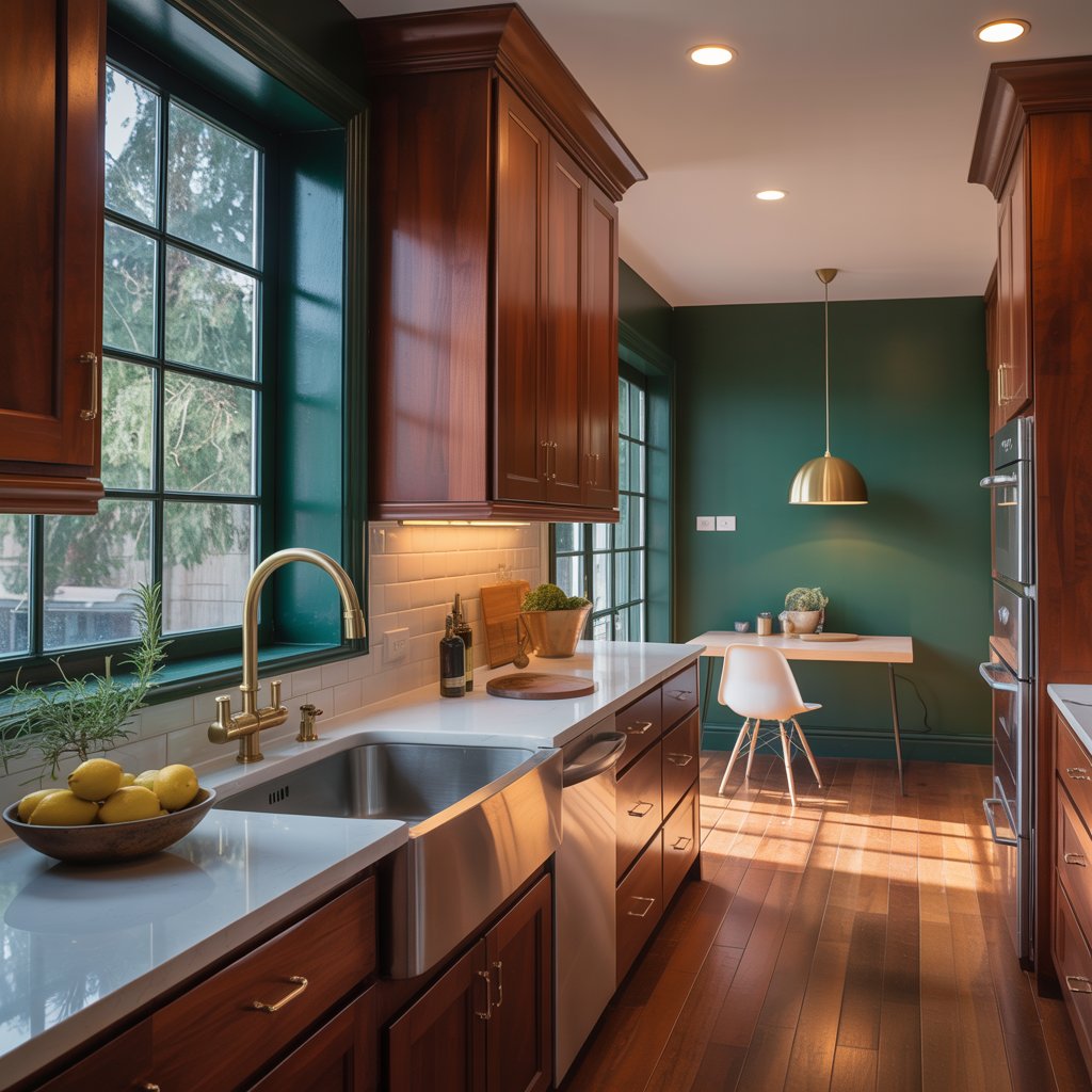
9. Deep Emerald Green
Go full-on glam. Deep emerald green and rich cherry wood together? It’s a power couple. Luxurious, enveloping, and utterly unique.
How to Achieve Max Luxe:
- Use emerald on lower cabinets, an island, or as a dramatic accent wall.
- Brass or gold hardware is non-negotiable here. Pure magic.
- Keep other elements simple – white or very subtle countertops, minimal clutter.
- It creates a jewel-box effect that’s unforgettable.
Pro Tip: Got high ceilings? Paint them a deep coordinating color (like a charcoal or even black) for ultimate drama. Not for the faint of heart, but wowza.
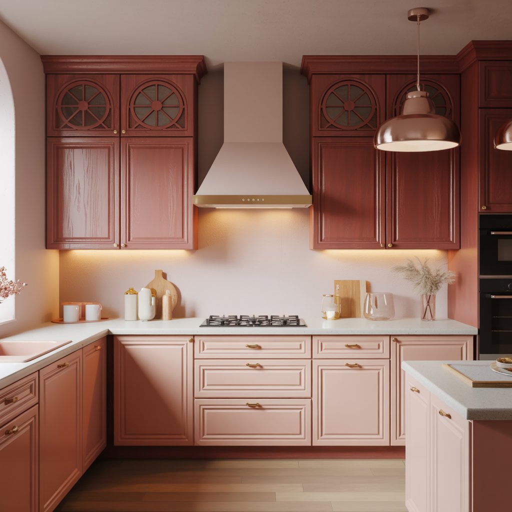
10. Soft Blush Pink
Wait, pink? Absolutely! A muted, sophisticated blush (think dusty rose or clay) creates the most unexpected and gorgeous soft contrast with cherry.
Why You Should Consider It:
- It’s unexpectedly chic and modern, not saccharine.
- Softens the boldness of the cherry beautifully.
- Creates a warm, inviting, and slightly feminine vibe (but guys love it too!).
- Pairs stunningly with marble-look counters and brass.
IMO: This is perfect for someone wanting something unique and warm. Try it on walls first if you’re hesitant. You might be surprised!
11. Classic Black & White (with Cherry Starring)
Take the classic up a notch. Let cherry cabinets be the warm wood element within a sharp black and white scheme. Think black countertops, white backsplash, black hardware.
Why it’s Killer:
- The cherry adds essential warmth to the potentially stark combo.
- It becomes the beautiful, organic focal point.
- Feels incredibly tailored and high-design.
- Timeless, yet distinctly modern.
Personal Fave: Saw this in a designer showhouse. Black granite counters, huge white subway tile, warm cherry cabs, black matte pulls. Jaw-droppingly good. Proof cherry can be ultra-modern.
12. Warm Terracotta
Channel Mediterranean vibes. Terracotta, whether on walls, tile, or even a rug, brings an earthy, sun-baked warmth that harmonizes perfectly with cherry.
How to Bring in the Heat:
- Use terracotta tiles for a backsplash or floor for authentic texture.
- A terracotta accent wall adds instant coziness.
- It enhances the natural, organic feel of the wood.
- Pair with cream-colored counters and wrought iron or black accents.
Downside: Can feel very specific style-wise (Tuscan, Southwestern). Make sure it fits your overall home vibe!
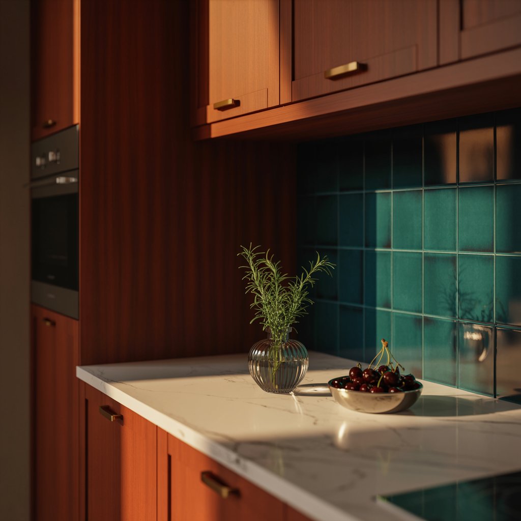
13. Pale Aqua or Seafoam Green
Light, airy, and beachy without being kitschy. Pale aqua or seafoam green is a refreshing counterpoint to cherry’s depth.
Why it Pops:
- The cool, watery tones contrast beautifully with the warm wood.
- Keeps the space feeling light and bright, even with darker cabinets.
- Feels fresh, calming, and a little bit retro (in the best way).
- Looks fab with white trim and chrome or nickel finishes.
Pro Move: Use it on upper cabinets if you have them, or as a wall color. Pair with natural woven textures.
14. Rich Olive Green
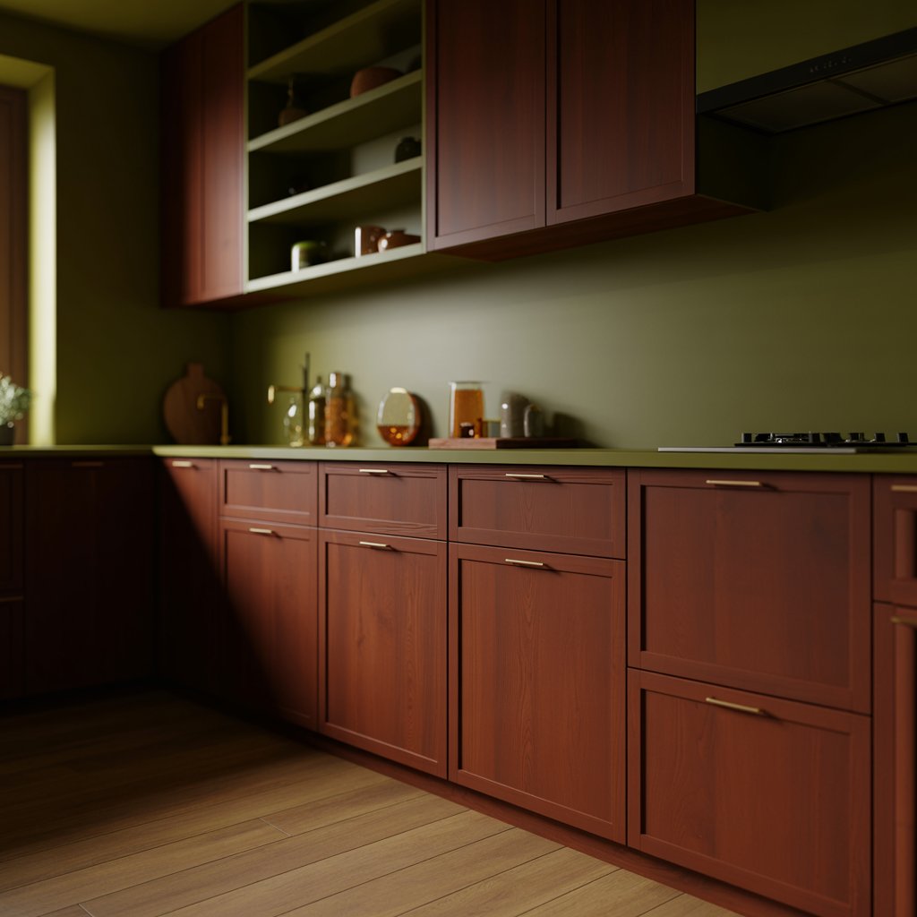
Deeper than sage, more complex than emerald. Olive green has this amazing earthy sophistication that pairs incredibly well with cherry’s warmth.
How it Creates Depth:
- It’s a complex color that complements, not fights, the cherry.
- Creates a warm, inviting, and nature-inspired palette.
- Looks especially stunning with brass hardware and leather accents.
- Works well on lower cabinets or walls.
IMO: Olive green is the unsung hero of greens. It’s rich without being loud, earthy without being dull. Perfect partner for cherry.
15. Vibrant Teal
Ready for some personality? Teal is bold, confident, and makes cherry cabinets look vibrant and modern. It’s a conversation starter!
Why it’s a Bold Win:
- The blue-green vibrancy makes the red undertones in cherry zing.
- It’s energetic and fun, perfect for a lively kitchen.
- Use it on an island or as a backsplash for maximum impact without overwhelm.
- Gold or brass accents elevate it instantly.
Story Time: A friend did her island in a deep teal with cherry perimeter cabs. Everyone who walks in gasps (in a good way!). It’s pure joy.
16. Warm Taupe
The ultimate sophisticated neutral. A warm, complex taupe (think mushroom or putty) provides a subtle, elegant backdrop that lets cherry cabinets be the star without high contrast.
Why it’s a Sleeper Hit:
- Creates a cohesive, serene, and upscale atmosphere.
- Allows the beauty and grain of the cherry wood to take center stage.
- Pairs seamlessly with stone countertops (granite, quartz, marble) in similar tones.
- Feels timeless and incredibly calming.
Pro Tip: Ensure your taupe has warm undertones (pink, yellow, or green) to harmonize with the cherry. Avoid anything too cool or gray-leaning.
Wrapping Up The Cherry Color Adventure
See? Told you cherry cabinets weren’t a design dead end! Forget the haters. Cherry wood is a timeless beauty just waiting for its perfect color match.
From crisp contrast (hello, navy and white!), to earthy harmony (sage, olive, terracotta), to a bold statement (emerald, teal!), there’s a scheme here with your name on it.
The key? Don’t be afraid to experiment, and see what sings to you. Consider your lighting (big factor!), your countertops, and your own personal style.
I promise, giving your cherry cabinets a fresh color partner is way cheaper and more satisfying than a full gut job. Go on, fall in love with your kitchen all over again.
What color combo are you leaning towards? Get it done and share your photos with me.