Small bathrooms? They can feel like… well, a bit of a puzzle. You want style, but you also don’t want to feel like you’re showering in a shoebox.
Been there, painted that (sometimes successfully, sometimes not!). The secret weapon? Color. Seriously, the right hue can trick the eye, lift the mood, and make that tiny space sing.
Forget feeling cramped; let’s make it captivating. Ready to ditch the boring? Grab your virtual paintbrush, friend, and let’s dive into 12 game-changing color ideas!
1. Classic Crisp White (But Make it Interesting!)
Pure, clean, reflective. White is the OG small space expander for good reason. But let’s avoid hospital vibes, shall we?
Why it slays in a small bath:
- Bounces light like crazy, instantly making walls feel farther away.
- Creates a clean, spa-like foundation that feels bigger.
- Acts as the perfect neutral backdrop for killer textures (think: fluffy towels, cool tile, wood accents).
- Seriously versatile – plays nice with literally any other color or finish.
Personal Take: My first apartment bath was tiny and north-facing. A bright white with lots of glossy tile made it feel infinitely brighter and less cave-like. Lifesaver!
2. Moody Midnight Blue
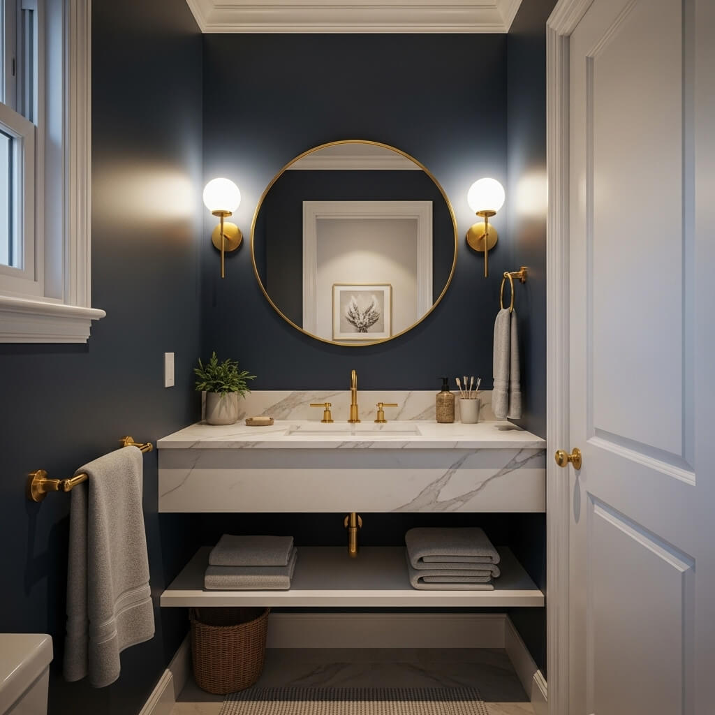
Deep, dramatic, and oh-so-sophisticated. Don’t fear the dark side in a small space!
Why it works (trust me!):
- Creates a cozy, enveloping, intimate feel – perfect for a relaxing soak.
- Makes ceilings feel higher by blurring the corners (magic!).
- Looks incredibly rich and luxurious, especially with gold or brass fixtures.
- Reflects light surprisingly well in deep, saturated tones.
Pro Tip: Keep your ceiling white or a very pale blue to avoid closing the space in completely. And lean into good lighting!
3. Soft, Sandy Beige (The Good Kind)
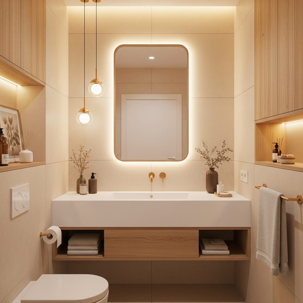
Warm, earthy, and effortlessly calming. Think desert dunes, not builder-basic beige.
How to avoid the boring trap:
- Choose a beige with clear undertones – warm pink/peach or cool grey/green.
- Pair it with natural materials like rattan, seagrass, or warm wood tones.
- Add texture through tile, matting, or woven accessories.
- Layer in black or dark bronze accents for definition.
Story Time: I used a warm, peachy-beige called “Latte” in a windowless powder room. Added woven baskets and black fixtures – instant cozy chic, zero blah.
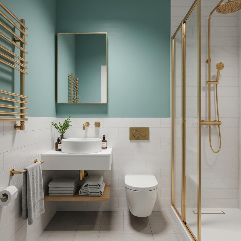
4. Zesty Sage Green
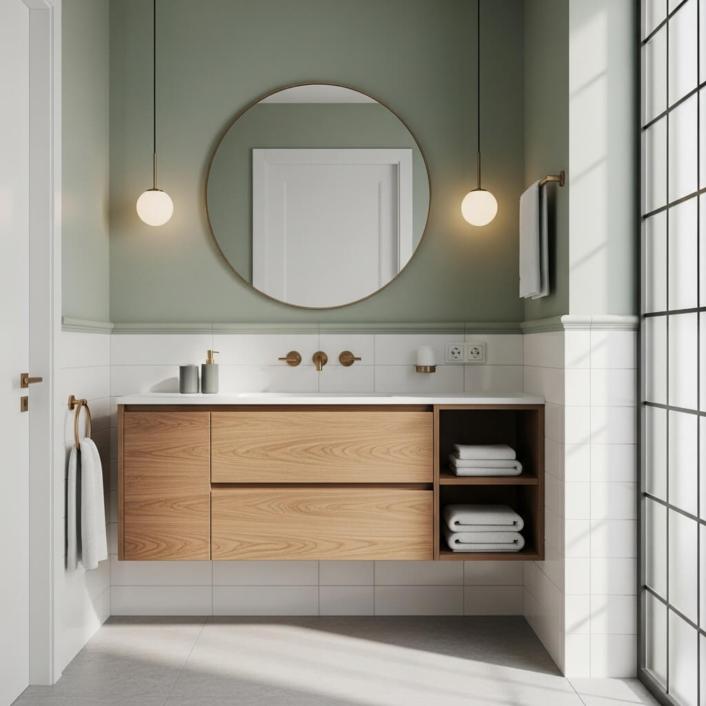
Fresh, organic, and totally serene. It’s like bringing a tiny bit of the garden inside.
Why it’s a must-try:
- Green is inherently calming and restful – ideal bathroom vibes.
- Sage has enough grey to feel sophisticated, not childish.
- Works beautifully with white, wood, black, brass, and marble.
- Feels current but also timeless. Win-win!
Personal Fave: Paired sage green walls with crisp white trim, matte black fixtures, and a teak stool. Felt like a tiny, tranquil oasis. Perfection.
5. Pale, Powdery Pink
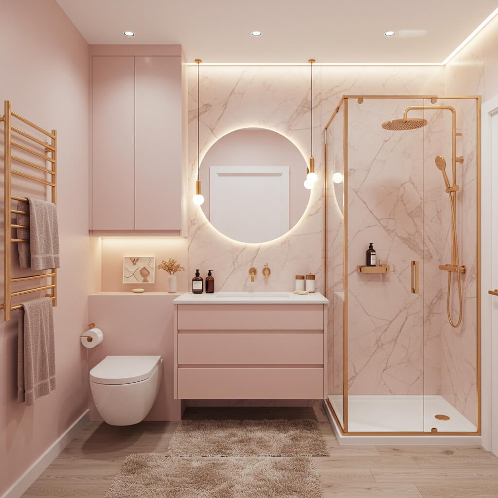
Soft, romantic, and surprisingly chic. Forget bubblegum; think elegant blush or dusty rose.
How to nail the grown-up pink bath:
- Stick to muted, greyed-out or peachy pinks, not brights.
- Balance it with plenty of crisp white (tiles, trim, fixtures) or fresh grey.
- Add metallic accents – brass or polished nickel work beautifully.
- Ground it with natural elements like wood or stone.
Pro Move: Try it just on the vanity or lower half of the wall (wainscoting!) if full walls feel like too much commitment. So pretty!
6. Sleek Charcoal Grey
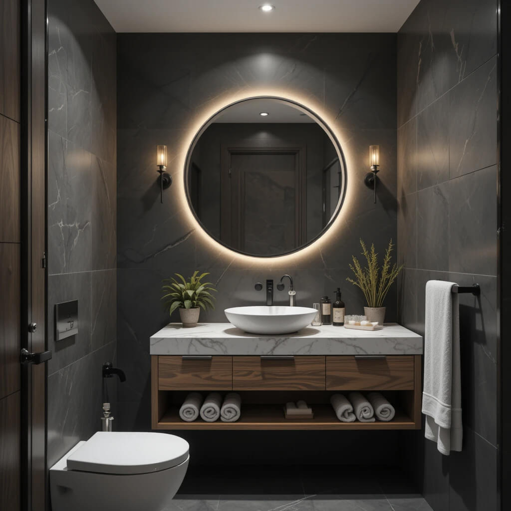
Modern, sharp, and incredibly versatile. Darker than grey, lighter than black – the Goldilocks of moody neutrals.
Why it rocks a small space:
- Adds instant sophistication and depth without feeling as heavy as black.
- Creates amazing contrast with white fixtures and tiles.
- Looks stunning with both cool metals (chrome, nickel) and warm metals (brass, copper).
- Hides splashes and water spots like a champ (parenting win!).
Downside: Can feel a bit cold if you don’t add warmth (think wood tones, textiles, good lighting). Worth it for the style points, IMO.
7. Bright & Sunny Pale Yellow
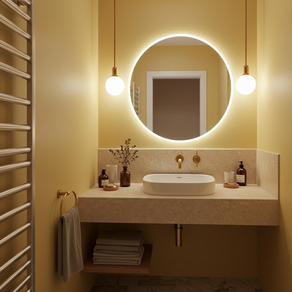
Cheerful, warm, and energy-boosting. Like sunshine in a can for those windowless wonders.
Why (the idea) works:
- Instantly lifts the mood and makes the space feel brighter.
- Pale yellows (think buttercream, lemon chiffon) reflect light well.
- Creates a welcoming, happy vibe first thing in the morning.
- Pairs beautifully with white, grey, soft blues, and natural wood.
Personal Take: Used a very pale, buttery yellow in a basement bath. Combined with bright white subway tile and a big mirror, it totally banished the dungeon feeling. FYI, avoid neon!
8. Earthy Terracotta
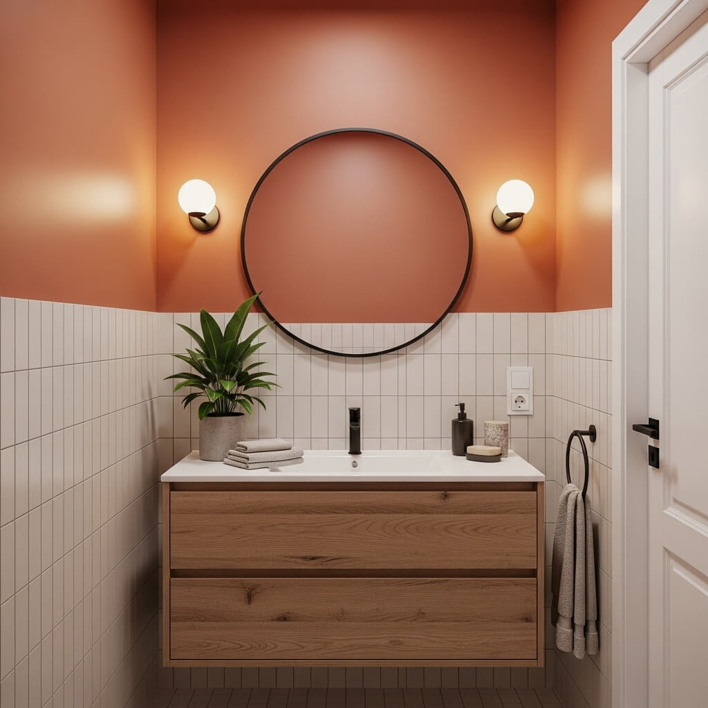
Warm, grounded, and full of character. Brings Mediterranean or desert vibes right to your water closet.
How to embrace the warmth:
- Terracotta adds incredible warmth and texture, even in small doses.
- Looks amazing with creamy whites, deep greens, and natural materials.
- Try it on the floor with encaustic tiles, or on the walls for a bold statement.
- Perfect for adding rustic charm or boho flair.
Pro Tip: Balance the warmth with cool elements like white fixtures, chrome, or pale blue towels to keep it fresh, not overwhelming.
9. Cool, Icy Light Grey
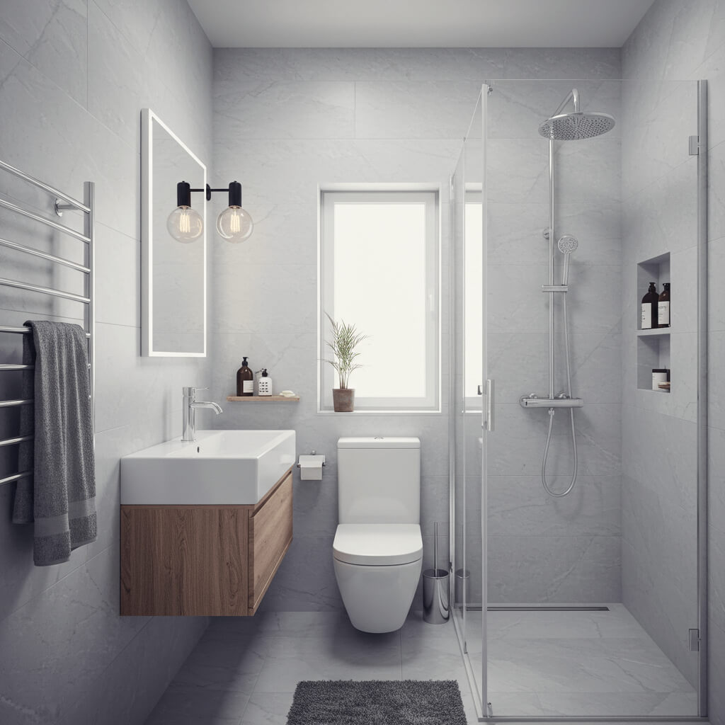
Crisp, clean, and effortlessly modern. The cooler cousin to beige that always looks polished.
Why it works:
- Creates a sleek, minimalist backdrop that feels open and airy.
- Provides a neutral canvas that lets fixtures, tile, and accessories shine.
- Looks fantastic with white trim and pops of brighter color (teal, coral, navy).
- Feels fresh and spa-like.
10. Bold Black Accent Wall
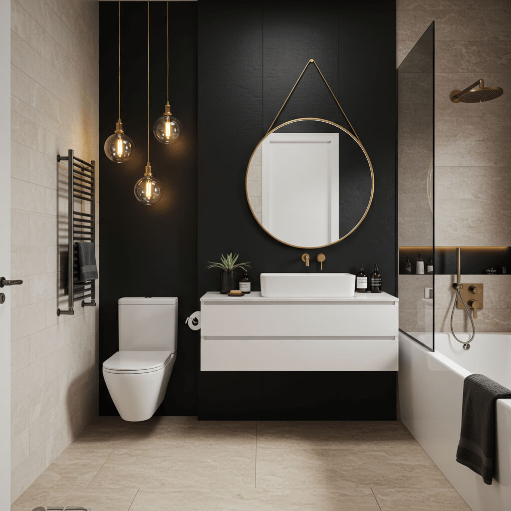
High-drama, high-impact. One feature wall in black? Game-changer.
Why it’s a must-try (even in small spaces!):
- Creates instant, jaw-dropping focus and depth.
- Makes the other walls seem to recede, feeling further away.
- Looks incredibly chic and modern, especially with gold or brass.
- Perfect behind a vanity or freestanding tub.
Pro Move: Keep the other walls light (white, pale grey) and ensure you have excellent lighting. This isn’t the time for a single sad bulb!
11. Refreshing Seafoam Green
Light, airy, and reminiscent of the coast. Softer than sage, with a hint of blue.
Why it slays:
- Evokes calm, clean ocean vibes – perfect for a bathroom escape.
- The blue undertone helps it feel cool and spacious.
- Pairs beautifully with white, sandy beiges, pale wood, and navy accents.
- Feels fresh and unique without being overwhelming.
Story Time: Painted a tiny beach house bathroom seafoam. Paired with white shiplap and rope details – felt like stepping onto a boat (in the best way!).
12. Warm, Creamy Off-White
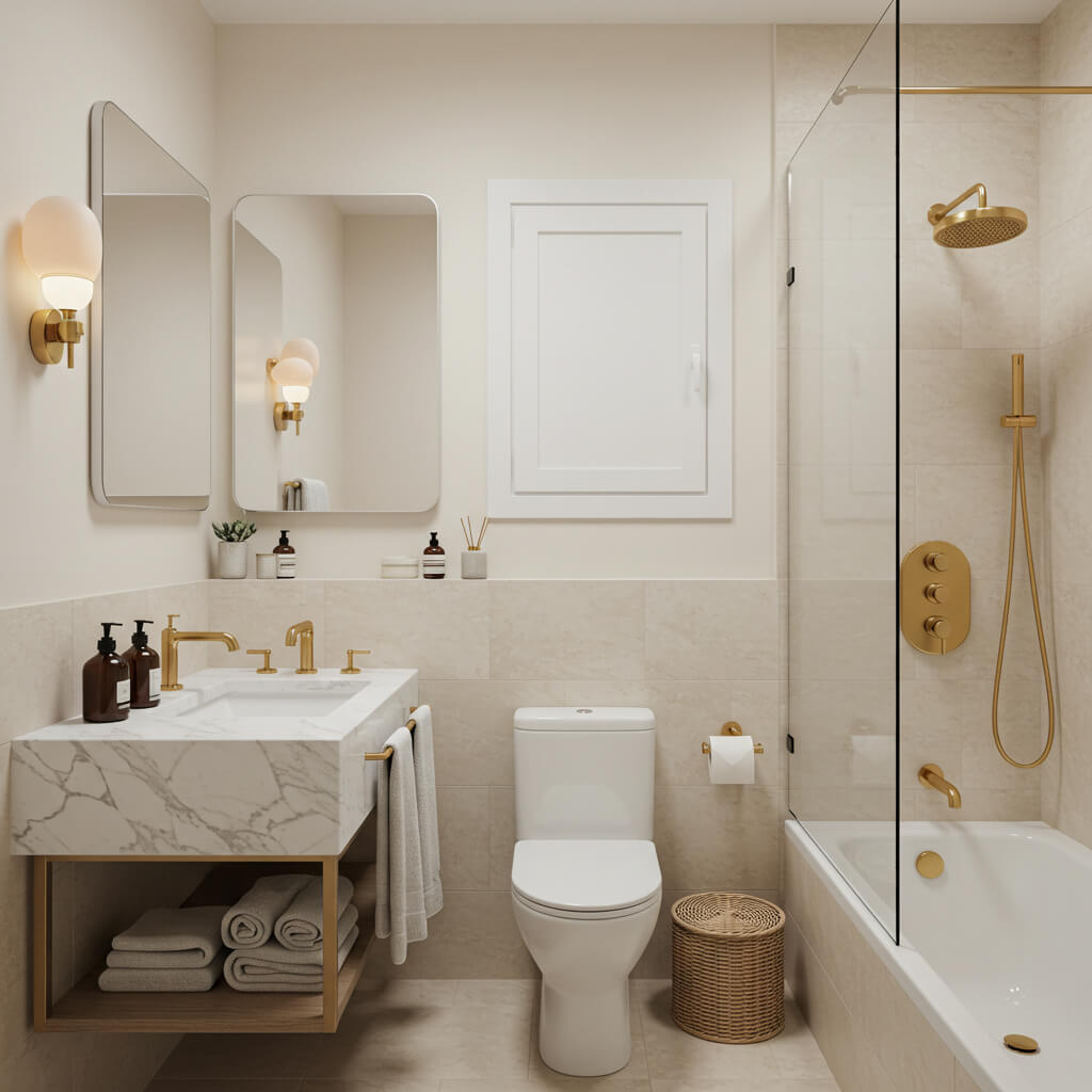
Softer and warmer than stark white, but just as light-reflecting. Think vanilla ice cream or fresh linen.
How to nail it:
- Choose an off-white with warm undertones (yellow, peach, pink) for cozy vibes.
- Prevents the space from feeling cold or sterile.
- Creates a beautifully neutral, elegant backdrop for any style.
- Looks especially luxe with marble, brass, and rich wood tones.
Wrap Up
Who knew that little paint ideas could pack such a punch? The biggest takeaway? Don’t let square footage limit your style.
Whether you go bright and airy with crisp white or seafoam, cozy and moody with midnight blue or charcoal, or warm and earthy with terracotta or creamy off-white, the right color absolutely transforms the feel of a compact bath.
Remember the golden rules: light reflection is your friend, contrast adds depth, and texture brings life.
So, which color is whispering your name? Maybe it’s the drama of a black accent wall, the serenity of sage, or the sunshine boost of pale yellow.
Which ever you choose, grab a sample pot (or twelve!), slap it on the wall, and see how it sings in your light. Your dream small bathroom is just a paint can away.
Go on, make a splash!