Ever feel like your bedroom is stressing you out more than it’s calming you down? Mine looked like a chaotic laundry explosion met a crayon factory for way too long. Not exactly zen.
Then I discovered the magic trick: color. Seriously, swapping out those jarring vibes for a serene palette was like giving my brain a warm hug. Forget generic hotel beige; we’re talking about real retreat energy.
Ready to ditch the bedroom blues (unless, you know, calming blues are your jam)? Let’s unlock some serious serenity with these 17 color schemes.
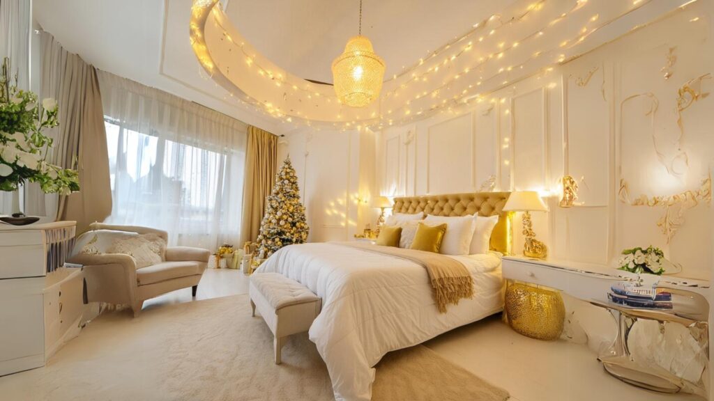
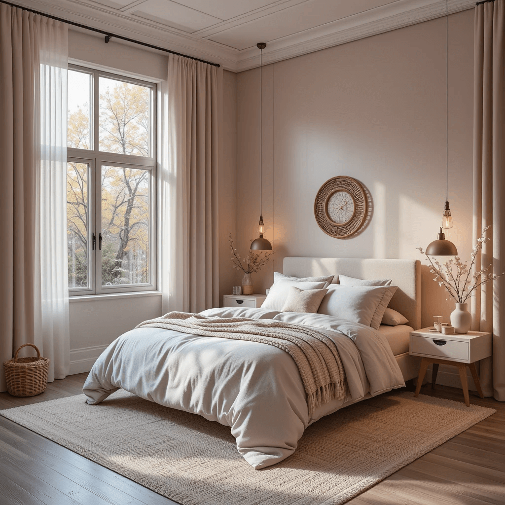
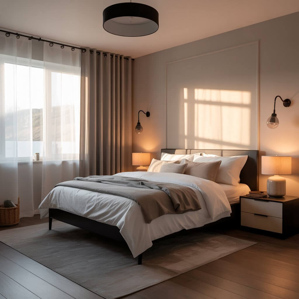
1. Cloud-Whisper White & Warm Wood
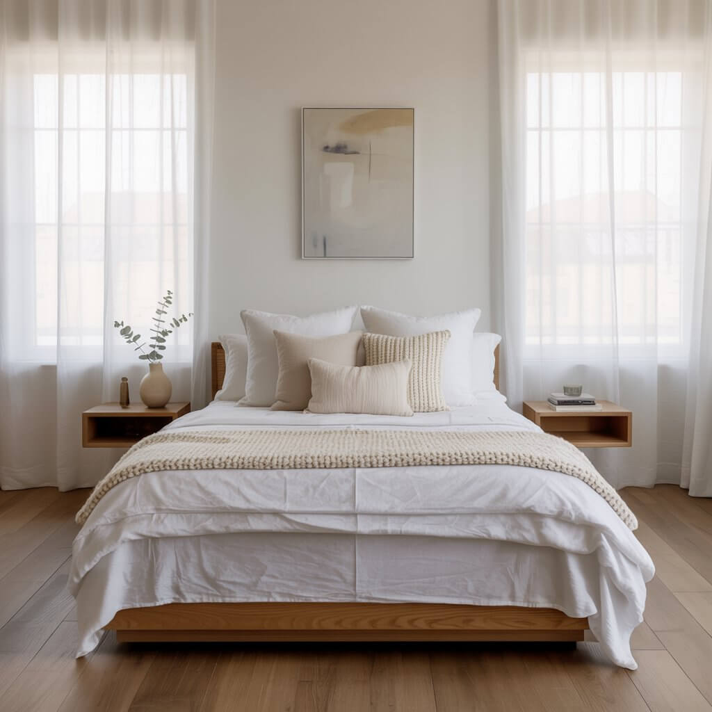
Pure, simple, and endlessly calming. Think crisp white walls meeting warm, natural wood tones (furniture, floors, beams). It’s like a hug for your senses.
Why it Works Like Magic:
- Reflects maximum light, making even small rooms feel airy and expansive.
- The warm wood adds grounding depth and organic texture, stopping it from feeling sterile.
- Creates a minimalist, uncluttered foundation perfect for de-stressing.
- Super versatile – layer in any accent color later if you get bored (but will you?).
Personal Fave: A bedroom in my house uses this, and walking in after a hectic day feels like hitting a giant mental “reset” button. Total brain declutter.
2. Deep Dive Navy & Creamy Linen
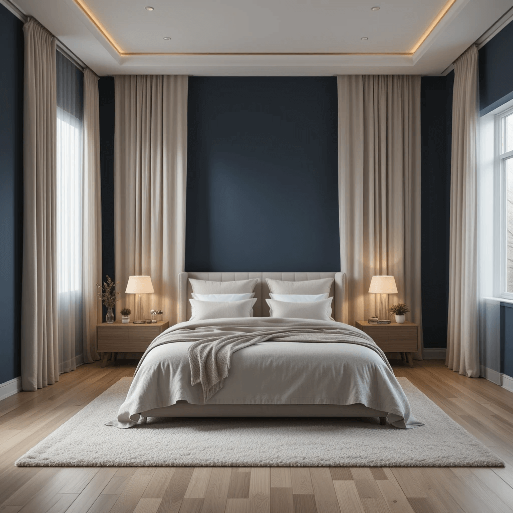
Move over, basic blue. Deep navy walls feel cocooning, not cave-like, especially when paired with soft, creamy linen textures. It’s sophisticated serenity.
How to Nail the Vibe:
- Paint walls navy (satin or eggshell finish for subtle depth).
- Layer bedding, curtains, and rugs in soft creams and oatmeals. Think texture heaven!
- Add warm brass or matte black accents for a touch of luxe.
- Keep lighting warm and ambient – harsh overhead lights are the enemy here.
Pro Tip: Test your navy shade! Some lean purple, others green. Grab samples and see it in your actual light before committing. Trust me on this.
3. Sage Green Sanctuary & Natural Rattan
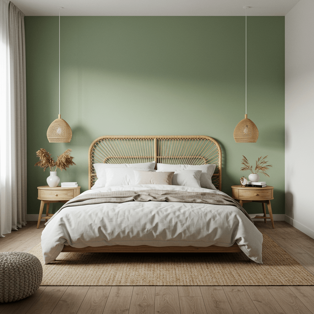
Sage green is basically nature bottled up for your walls. It’s soft, restorative, and pairs beautifully with woven rattan or light bamboo accents.
Why it’s a Must-Try:
- Green is inherently restful, linked to nature and tranquility.
- Sage is muted enough to be calming but has enough depth to feel interesting.
- Rattan adds organic texture and warmth without visual weight.
- Feels fresh yet timeless – not a fleeting trend.
Downside? Finding the perfect sage can be tricky. Some pull too grey, others too minty. Sample, sample, sample! I learned this the hard way.
4. Blushing Barely-There Pink & Grey
Forget bubblegum. We’re talking the softest whisper of pink – like the inside of a seashell – grounded by cool, soft greys. It’s ethereal and deeply soothing.
How to Make it Serene, Not Saccharine:
- Choose pink with heavy grey or beige undertones (think “mushroom pink” or “clay”).
- Pair with soft, dove grey bedding, upholstery, or rugs.
- Add natural materials: light wood, linen, stone.
- Avoid bright whites – opt for warm off-whites instead.
Personal Take: I was skeptical about pink, but this combo in a friend’s guest room? Wow. It felt instantly peaceful and luxurious, zero princess vibes. Totally converted.
5. Desert Sunset: Terracotta, Ochre & Clay
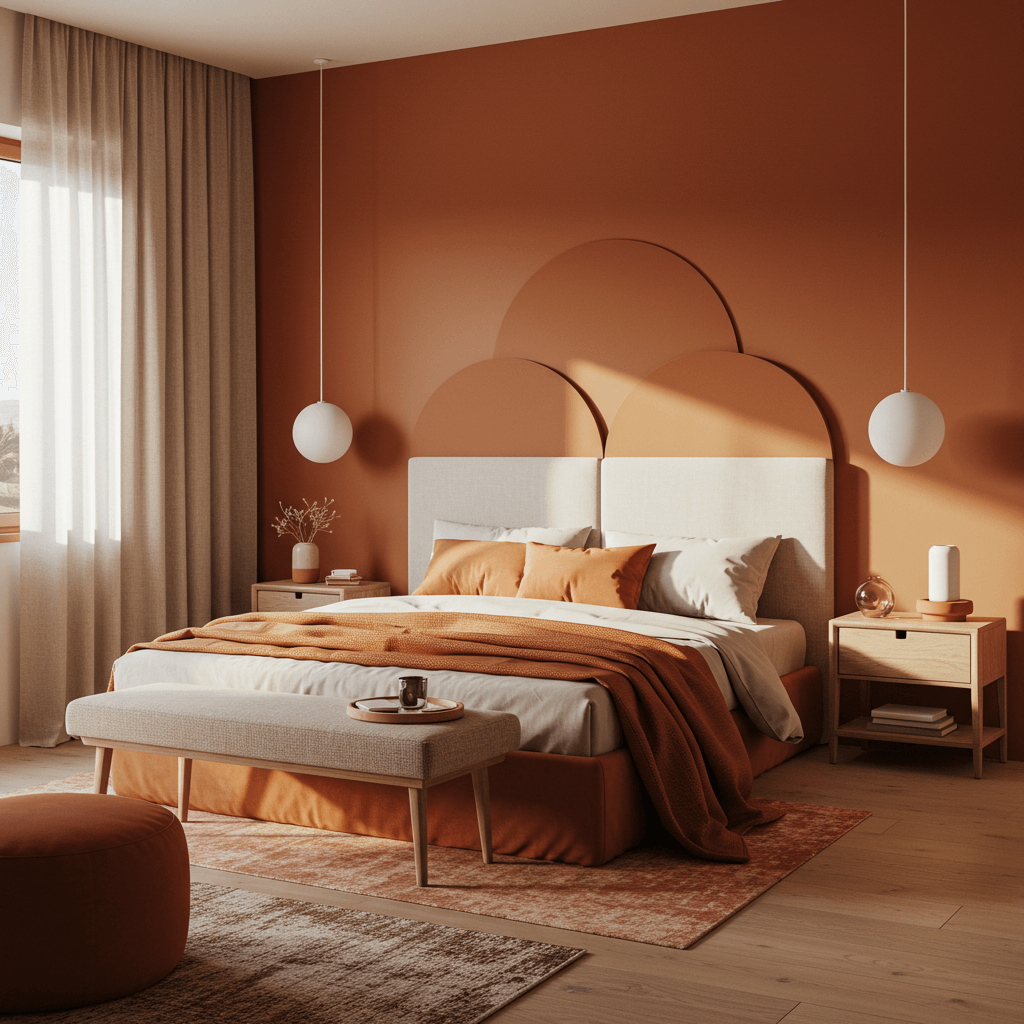
Channel warm, earthy desert tones. Rich terracotta, golden ochre, and muted clay create an incredibly grounding and inviting atmosphere. Like a permanent cozy sunset.
Why it Works:
- Earthy tones feel inherently stable and comforting.
- Creates a warm, enveloping glow, especially beautiful in natural light.
- Pairs stunningly with textured weaves, rough wood, and simple ceramics.
- Feels unique and soulful, far from generic.
Pro Move: Use terracotta as an accent wall or in textiles (rugs, throws), ochre on walls or bedding, and clay in pottery or smaller decor. Balance is key!
6. Coastal Cool: Soft Seafoam & Driftwood Grey
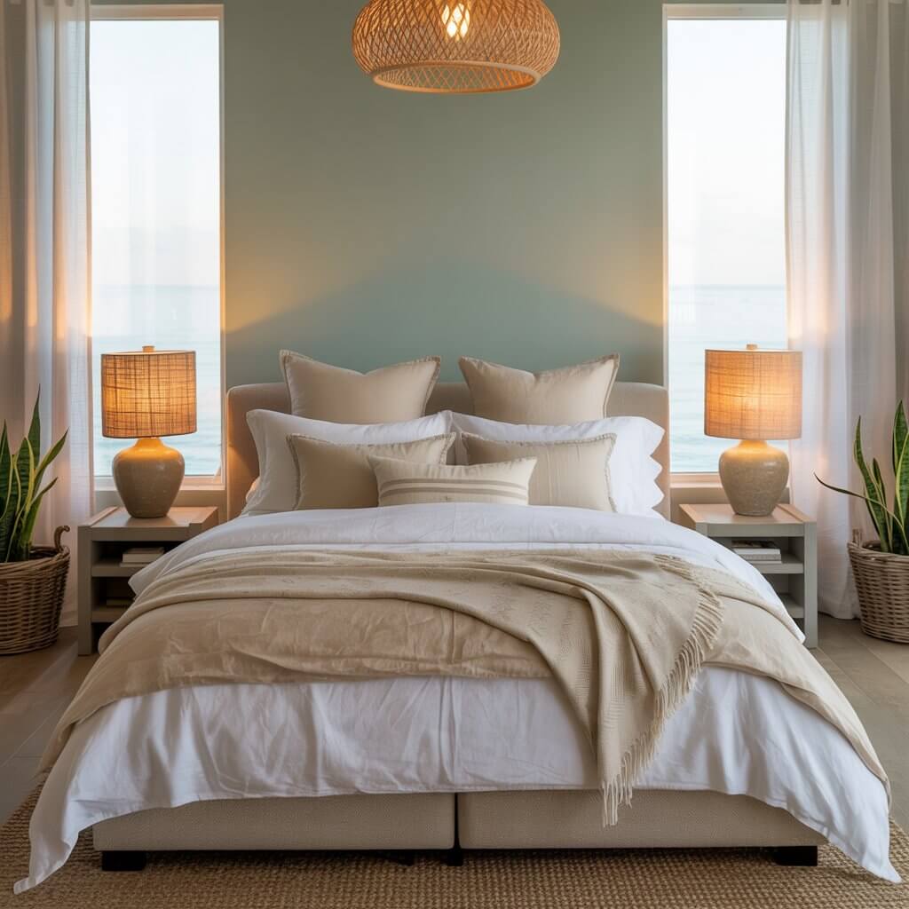
Bring the calm of the shore indoors. Soft seafoam greens/blues paired with weathered driftwood greys and lots of natural textures. Breathe in that salt air (metaphorically!).
How to Get the Look:
- Walls in a soft, greyed-out seafoam (avoid anything too turquoise or minty).
- Furniture in pale driftwood greys or light, bleached wood tones.
- Layer in jute, linen, cotton canvas – think nubby and natural.
- Add subtle shell or coral accents sparingly. Less “beach shack,” more “coastal zen.”
7. Charcoal Cocoon & Velvet Teal
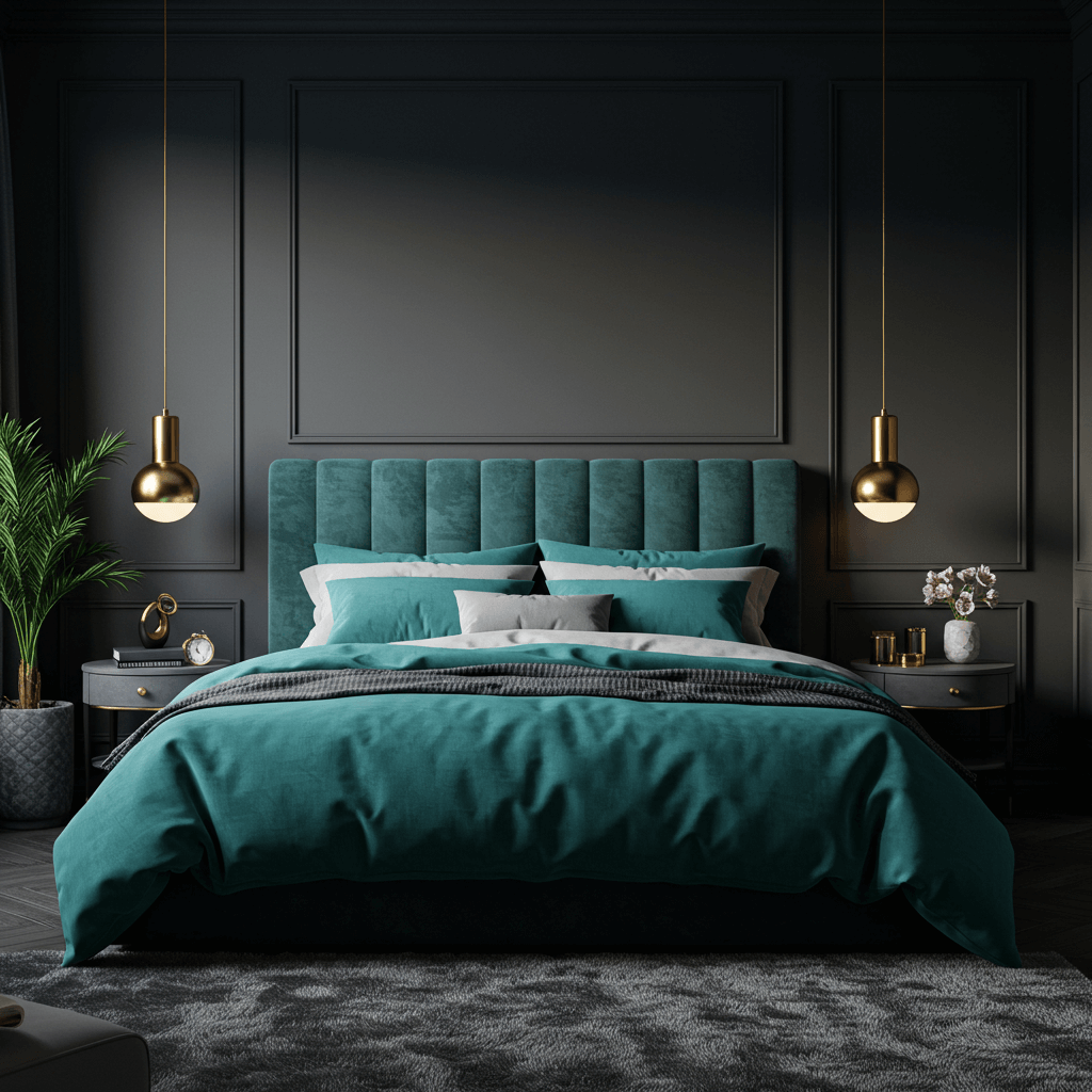
Deep, moody charcoal walls feel incredibly intimate and luxurious, especially when contrasted with rich, jewel-toned teal velvet (think bedspread, accent chair).
Why it’s Surprisingly Calming:
- Deep colors feel protective and cocooning, perfect for shutting out the world.
- The teal adds a vibrant, sophisticated pop without being jarring.
- Feels opulent and hotel-luxe, promoting a sense of indulgence and rest.
- Works wonders in larger rooms or those with high ceilings.
FYI: Lighting is CRUCIAL here. You need multiple warm light sources (lamps, sconces) to avoid a dungeon feel. Seriously, don’t skip this step.
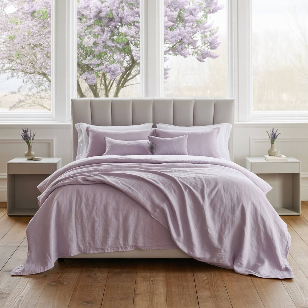
8. Lavender Mist & Dusky Plum
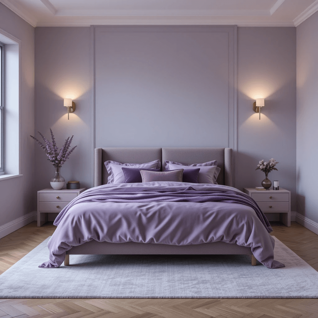
Soft, grey-lavender walls feel dreamy and light, while deeper dusky plum accents (pillows, an armchair, art) add sophisticated depth. It’s romantic serenity.
How to Avoid the Granny Aesthetic:
- Stick to muted, grey-based lavenders and plums. No electric purples!
- Balance with plenty of crisp white or cream (bed linens, trim).
- Add modern shapes and metallics (brushed brass, chrome) for edge.
- Keep patterns minimal and subtle.
Personal Fave: Used this in a master suite with high ceilings. The lavender kept it airy, the plum added drama at the bed, and it just felt… peacefully elegant. Chef’s kiss.
9. Monochromatic Mushroom Magic
All the subtle, sophisticated variations of mushroom: greige, taupe, warm stone, putty. It’s a masterclass in tonal serenity.
Why it’s a Sleeper Hit:
- Ultra-cohesive and visually restful – no jarring contrasts.
- Relies entirely on texture (boucle, linen, wool, wood grain) for interest.
- Feels incredibly sophisticated and expensive, even on a budget.
- Works with any style – modern, rustic, Scandi, you name it.
Pro Tip: Play with at least 3-4 different mushroom tones and lots of textures. Flatness is the enemy. Add one small black or dark brown accent for grounding.
10. Sun-Washed Ochre & Crisp White
Warm, muted ochre walls feel like sunshine even on grey days, beautifully balanced by bright, crisp white trim, bedding, and sheer curtains.
Why it Works:
- Ochre brings warmth and cheer without being overwhelming.
- The white keeps it feeling fresh, clean, and open.
- Feels optimistic and uplifting, yet still calm.
- Pairs perfectly with natural wood and woven textures.
Downside? Getting the ochre tone right is vital. Too yellow? Feels garish. Too brown? Feels drab. Test in your actual room light!
11. Stormy Sky: Deep Grey & Misty Blue
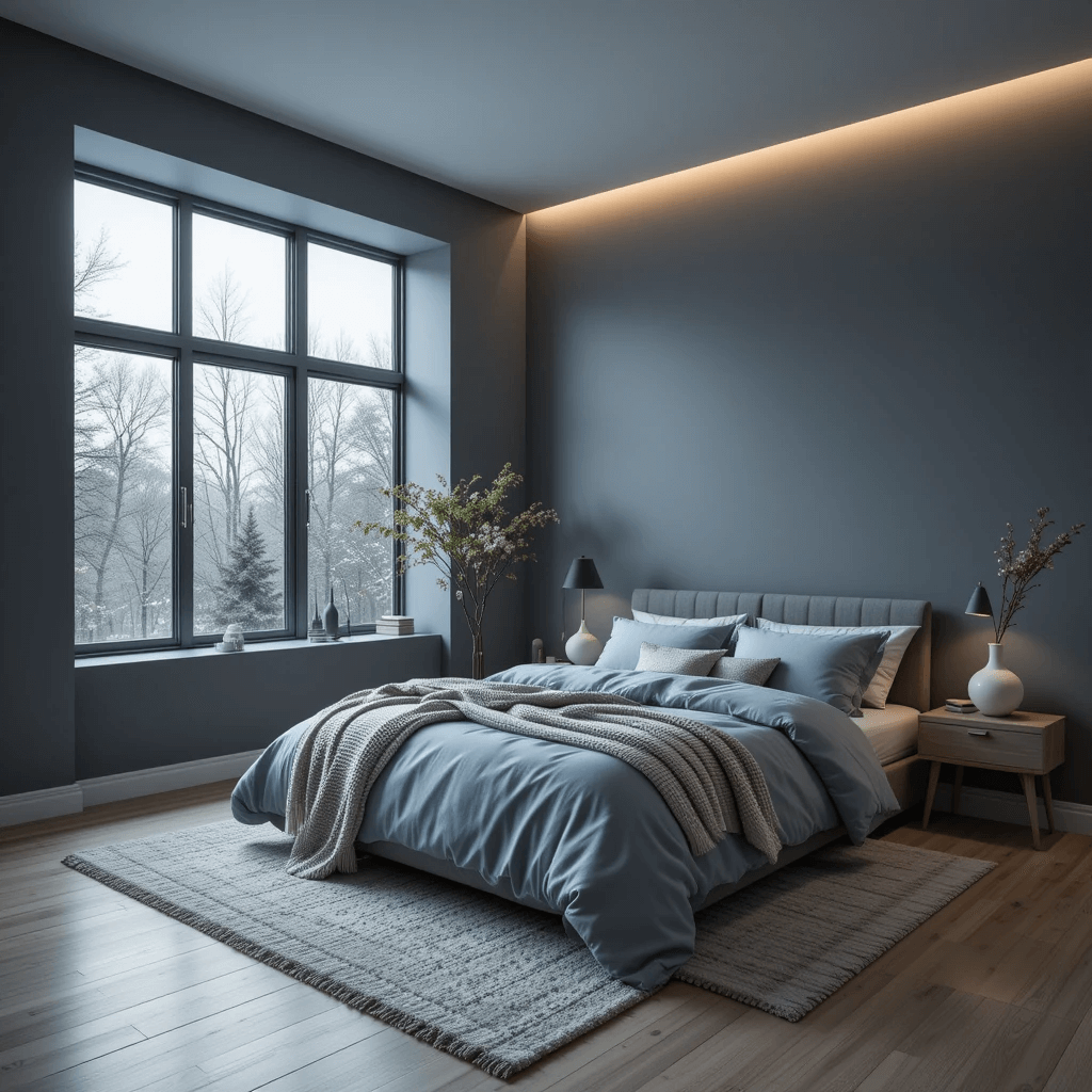
Think moody, sophisticated clouds. Deep charcoal or slate grey walls paired with soft, hazy blue bedding and accents. It’s dramatic and deeply calming – like a cozy evening storm.
Why It Works Wonders:
- Deep grey provides a cocooning, intimate base – perfect for shutting out the world.
- Misty blue softens the drama and adds that serene, airy touch.
- Feels sophisticated and modern, not at all dreary when done right.
- Pairs beautifully with silver, chrome, or cool-toned wood accents.
Pro Move: Add texture with a chunky knit throw in misty blue or a silvery grey velvet pillow. This combo needs softness to avoid feeling cold. Learned this during a particularly grey winter project!
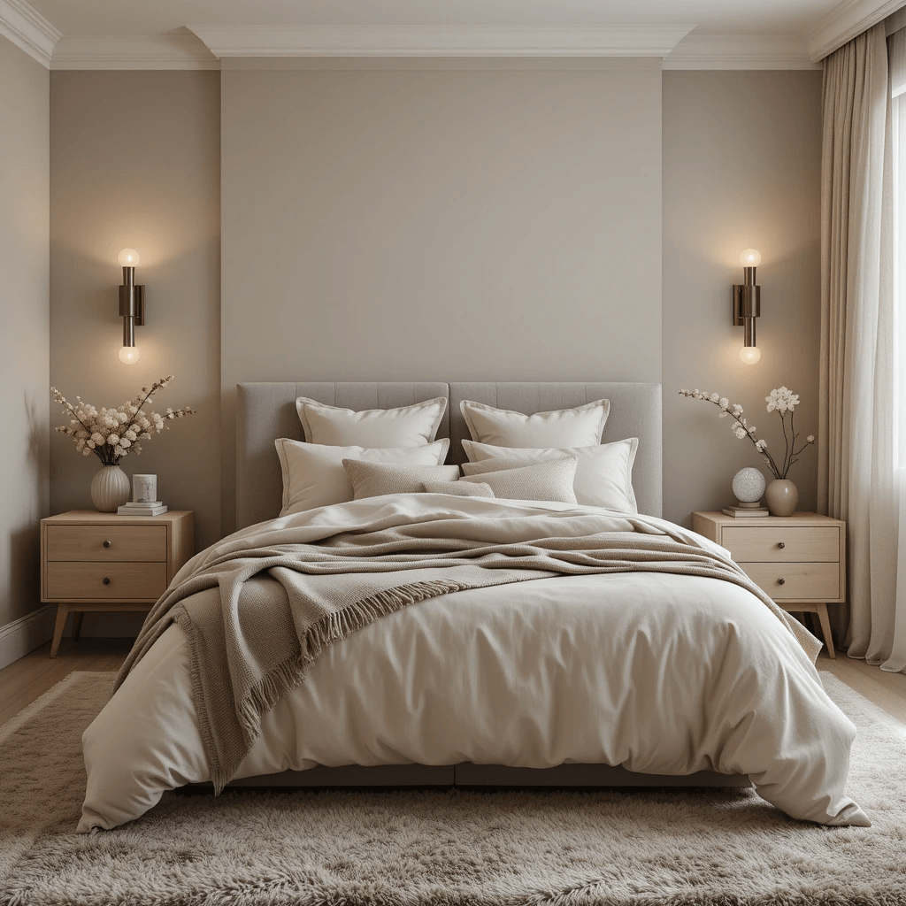
12. Earthy Neutrals: Beige, Stone & Olive
Forget boring beige! This is about rich, warm, textured neutrals. Think sandy beige walls, stone-grey linen bedding, and pops of muted olive green (a throw pillow, a plant, ceramic vase).
Why it’s a Must-Try for Serenity Seekers:
- Creates a grounded, organic, and incredibly stable atmosphere. Nature-core at its best.
- The subtle olive adds life and depth without being loud or distracting.
- Feels timeless, warm, and effortlessly inviting.
- Super flexible – easy to layer more color or keep it pure minimalism.
13. Black & White Simplicity (Yes, Really!)

Hear me out! High-contrast, but keep it soft. Think matte black or very deep charcoal on maybe one accent wall or in furniture, paired with lots of creamy off-white (not stark white!) everywhere else. Crisp, clean, and oddly peaceful.
How to Nail the Calm Contrast:
- Use deep black/charcoal SPARINGLY (accent wall, bed frame, picture frames).
- Dominate with warm, soft whites/creams on walls, bedding, rugs.
- Pile on the texture: chunky knits, boucle, linen, raw wood grain.
- Add ONE natural material accent like a rattan basket or a single wood stool.
Downside? It can feel stark or cold if you skimp on texture or use icy whites. Warm whites and texture are non-negotiable. IMO, this is high-risk, high-reward serenity.
14. Powder Blue & Burnt Sienna
Soft, airy powder blue walls meet the warm, earthy punch of burnt sienna accents (a rug, terracotta pots, a single accent chair cushion). It’s like a sunny Mediterranean courtyard.
Why This Unexpected Pairing Rocks:
- Powder blue brings instant lightness and calm.
- Burnt sienna grounds it with rich, warm earthiness, preventing it from feeling chilly or childish.
- Creates a vibrant yet balanced and welcoming feel.
- Feels fresh, unique, and full of character.
Story Time: Helped a friend do this in her north-facing room. The burnt sienna totally warmed up the cool light, making it feel intentional and cozy, not bleak. Magic!
15. Mauve & Golden Honey
Move over, basic pink! Mauve (a greyed-out, dusty purple-pink) feels grown-up and serene. Pair it with warm, golden honey tones (wood furniture, a throw, lamp bases) for pure, sophisticated warmth.
Why it Works Like a Charm:
- Mauve is inherently restful and subtly romantic without being saccharine.
- Golden honey adds sunshine and richness, creating a nurturing glow.
- Feels elegant, inviting, and slightly luxurious.
- Perfect for creating a “soft glow” ambiance, especially at sunset.
Pro Tip: Stick to muted, grey-based mauves. Avoid anything too pink or purple. The honey tones should be warm and golden, not orangey. Get samples! This combo can go grandma-chic fast if the shades are off. (No offense, grandmas!)
16. Forest Floor: Deep Green, Brown & Cream
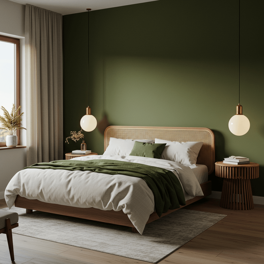
Channel a peaceful woodland walk. Deep, saturated emerald or forest green (maybe on an accent wall or in bedding), rich chocolate brown (furniture legs, a leather chair), and lots of creamy white for balance.
How to Make Deep Green Serene:
- Anchor with rich brown wood tones (floor, furniture, frames) – think walnut or espresso.
- Use cream generously on other walls, bedding, curtains to lighten and brighten.
- Add natural textures: jute, wool, stone, woven baskets.
- Incorporate real plants! They belong here more than anywhere.
Personal Fave: This is peak cozy-cocoon energy. Feels protective, grounding, and deeply connected to nature. Ideal for folks who find pale colors too quiet. My dark academia heart approves.
17. Whispering Lilac & Silver Grey
Ending on a soft, ethereal note. The palest, greyest lilac you can find (barely there!) on walls, paired with soft silver-grey accents in metallics, bedding, or a rug. It’s dreamy and light-as-air.
Why it’s the Ultimate Soft Retreat:
- Ultra-pale lilac is incredibly calming and promotes tranquility.
- Silver grey adds a cool, sophisticated shimmer without being harsh.
- Feels spacious, airy, and gently uplifting.
- Perfect for small rooms or creating a “morning mist” vibe.
Pro Move: Keep everything else light and bright. White or cream trim, sheer curtains, light wood. Add a tiny bit of brushed silver hardware or a mirror frame. Less is definitely more here. Overdo it, and the serenity evaporates. Trust me, subtlety is key!
Final Thoughts
Alright, color adventurer! We’ve journeyed from cloud-whisper whites to forest floor depths and everywhere in between. Seventeen seriously serene paths to transform your bedroom from “just a room” into your personal get away.
Remember, the best retreat palette is the one that makes you sigh with relief the moment you walk in.
Forget the rules, embrace the feels. Grab those paint samples, slap ’em on the wall, and see how they play with your light at dawn, noon, and dusk. Does it spark joy? Or, more accurately, does it spark calm? Trust that gut feeling.
Your perfect peaceful haven is literally a brushstroke away. Now go forth, paint fearlessly (or hire someone to!), and craft the dreamy escape you deserve. Sweet, serene dreams!