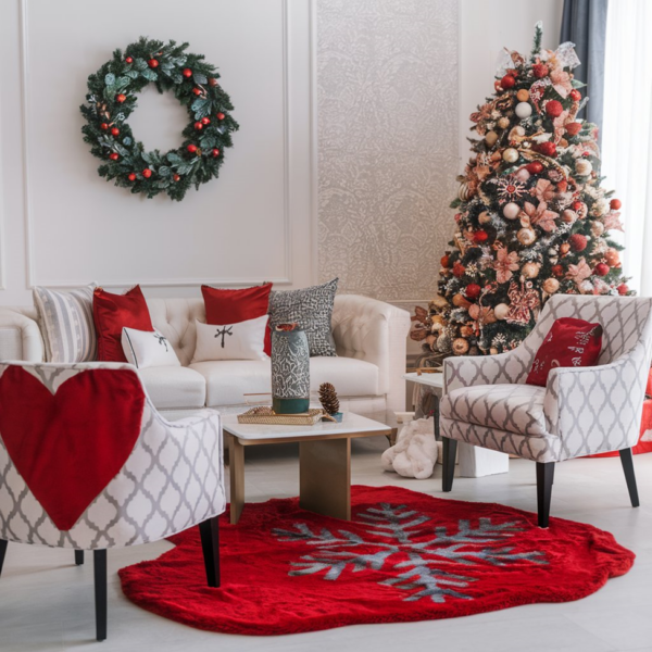
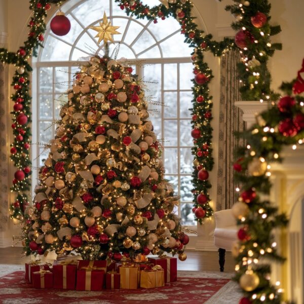
Choosing Christmas colors sounds easy until you start decorating and realize your red ornaments clash with your ribbons, your greenery looks too dark, and somehow the whole Living Room resembles a holiday aisle that got a little too excited.
The secret to beautifully coordinated Christmas decor is choosing colors that complement one another and repeating them throughout your home. The right palette can make your Christmas tree, mantel, dining table, and entryway feel connected without making every corner look exactly the same.
From timeless red and green to luxurious champagne gold, sophisticated jewel tones, and modern neutral palettes, these Christmas color combinations will help you create a festive home that feels warm, stylish, and beautifully put together.
1. Classic Red and Forest Green

Some Christmas color combinations never go out of style, and red and forest green are at the top of that list.
Deep green foliage paired with rich red ornaments, velvet ribbons, and festive cushions creates a traditional Christmas look that feels warm, nostalgic, and wonderfully inviting. The secret is choosing a rich forest green rather than a bright, artificial-looking shade, then balancing it with deeper reds that feel luxurious instead of overly loud.
Carry the colors throughout your home with red stockings, green garlands, coordinated gift wrapping, and a few seasonal touches on your dining table. You can even introduce natural wood and warm brass accents to give the palette extra depth. Suddenly, everything feels connected, from the Christmas tree to the smallest decorative detail.
Designer Tip
Use forest green as your main color and red as the accent. This keeps the combination balanced and prevents the decorations from competing for attention.
2. Champagne Gold and Ivory

If you want your Christmas decorations to look expensive without relying on bold colors, champagne gold and ivory make a beautiful starting point.
Ivory provides a soft, creamy foundation, while champagne gold introduces warmth and a gentle shimmer. Together, they create an elegant holiday look that feels polished without becoming overly formal. Think ivory stockings, champagne-colored baubles, gold candleholders, and creamy ribbons woven through the Christmas tree.
This palette also works beautifully across different rooms. Use gold accents on the dining table, ivory throws in the Living Room, and matching ornaments in an entryway arrangement. Add warm lighting to bring out the golden tones, and the entire home begins to feel cohesive and inviting.
Luxury Look for Less
You do not need expensive metallic decorations to achieve this look. Mix affordable gold ornaments with ivory ribbons, simple white candles, and natural greenery. The coordinated colors will do much of the styling work for you.
3. White and Silver Winter Wonderland

White and silver create a crisp, luminous Christmas palette that feels like a snowy winter morning.
White ornaments, silver baubles, frosted branches, and delicate metallic details give the Christmas tree a fresh, sparkling appearance. The combination looks especially beautiful against white walls, pale furniture, and glass accessories, where the reflective surfaces help distribute light throughout the room.
To keep the look from becoming too cold, introduce soft white fabrics, warm fairy lights, and a few natural textures. A fluffy throw, a creamy rug, or a white ceramic vase can soften the metallic finishes without taking away from the winter-inspired theme.
Watch Out For
Too much silver combined with cool white lighting can make the decorations feel icy rather than inviting. Warm-white lights and soft fabrics help create a more comfortable atmosphere.
4. Burgundy and Antique Gold

Burgundy and antique gold are perfect for anyone who wants a Christmas look with richness, depth, and a little old-world glamour.
Burgundy brings a deep, wine-inspired red that feels more sophisticated than bright cherry red. Antique gold adds a warm metallic finish that complements the darker shade beautifully. Together, they look stunning on Christmas trees, mantelpieces, dining tables, and decorative entryway arrangements.
Try burgundy velvet ribbons, gold ornaments with an aged finish, and a few deep red cushions near the tree. You can also bring the palette to the dining table with burgundy napkins, gold flatware, and candleholders in warm metallic finishes. It feels festive without looking like you simply emptied a box of shiny decorations onto every surface.
Why This Works
Burgundy provides visual depth, while antique gold introduces warmth and light. The contrast makes the decorations feel layered and luxurious without needing lots of different colors.
5. Sage Green and Cream

Sage green and cream are ideal if you love Christmas decor that feels natural, soft, and modern.
Sage offers a gentle green tone that feels fresh without competing with the existing colors in your home. Cream adds warmth and softness, creating a palette that works beautifully with light wood, linen fabrics, ceramic ornaments, and natural evergreen branches.
Decorate your tree with sage green baubles and ivory ribbons, then repeat the colors through stockings, cushions, table linens, and wreaths. For extra texture, introduce wooden ornaments and a few brushed gold accents. The result feels festive but understated, making it particularly appealing if traditional red and green are not your style.
Designer Tip
Choose sage shades with muted undertones rather than bright mint green. Pair them with warm cream instead of stark white to maintain a soft, coordinated appearance.
6. Navy Blue and Champagne Gold

Navy blue and champagne gold create a Christmas palette that feels dramatic, elegant, and just a little unexpected.
Deep navy provides a rich backdrop, while champagne gold brings brightness and warmth. On a Christmas tree, navy ornaments paired with gold baubles and metallic ribbons create a sophisticated display that looks particularly beautiful in the evening.
You can extend the combination through navy stockings, gold candleholders, blue-and-gold gift wrapping, and coordinated dining accessories. If your home already features navy furniture or dark blue accents, this palette can tie your Christmas decorations into the existing decor rather than making them feel like a completely separate theme.
Luxury Look for Less
Concentrate the gold accents in a few noticeable places instead of buying matching gold decorations for every surface. A coordinated tree, a gold centerpiece, and a few navy textiles can establish the entire look.
7. Black and Gold

Black and gold are a bold choice for Christmas, especially if you prefer modern interiors with a dramatic edge.
Black introduces definition and contrast, while gold adds the festive sparkle that keeps the palette from feeling too serious. The combination works particularly well with contemporary furniture, black metal details, and neutral walls.
Try black ornaments mixed with gold baubles, black velvet ribbons, and warm metallic candleholders. You can also repeat the palette through gift wrapping, decorative trays, and table settings. A little greenery will soften the contrast and keep the arrangement connected to the natural elements of Christmas.
Honestly, black Christmas decorations can look incredibly elegant when styled well. They just need a little warmth so your home feels ready for the holidays rather than ready for a very fashionable midnight meeting.
Watch Out For
Avoid using black as the dominant color in an already dark room unless you have enough lighting and lighter accents to balance it. Gold, cream, and warm-white lights can keep the palette from feeling heavy.
8. Dusty Pink and Champagne

Dusty pink and champagne create a soft, romantic Christmas palette that feels fresh without losing its festive charm.
Muted pink ornaments, champagne baubles, delicate ribbons, and warm metallic accessories give the Christmas tree a gentle glow. Unlike brighter pinks, dusty rose feels subtle enough to work with neutral furniture, cream fabrics, and natural wood finishes.
Repeat the palette in small ways around your home. Pink napkins, champagne-colored candleholders, coordinated gift wrapping, and a few blush accents on the mantel can create a consistent look without making everything feel overly sweet.
Personal Take
Dusty pink looks especially beautiful when paired with champagne rather than bright yellow gold. The softer metallic finish keeps the whole arrangement elegant and balanced.
9. Emerald Green and Gold

Emerald green and gold bring a rich, jewel-toned look to Christmas decorating.
Emerald has a depth that makes it feel luxurious, while gold creates contrast and draws attention to the decorative details. Together, they look beautiful on a Christmas tree, especially when combined with warm lighting and lush evergreen branches.
Use emerald velvet ribbons, glossy or matte green ornaments, and gold baubles in different sizes. Carry the same colors to the dining table with green napkins, gold cutlery, and simple greenery. A few cream accents can help soften the richness if the palette starts feeling too dark.
Why This Works
Emerald and gold share a naturally luxurious appearance, but their different finishes prevent the combination from looking flat. Green grounds the palette, while gold adds highlights that catch the light.
10. Terracotta and Warm Beige

For a Christmas look that feels earthy, warm, and a little different from the usual red-and-green combination, terracotta and beige are worth considering.
Terracotta brings a rich clay-inspired color, while warm beige creates a softer foundation. Together, they look beautiful with wooden ornaments, dried orange slices, natural greenery, linen ribbons, and handmade ceramic decorations.
This palette works especially well in homes with warm wood furniture, cream upholstery, and earthy interior finishes. You can use terracotta ornaments on the tree, beige stockings by the fireplace, and matching napkins on the dining table to carry the colors through your home.
Cozy Factor
The warm, earthy tones create a relaxed atmosphere that feels especially inviting when paired with soft lighting, natural wood, and textured fabrics.
11. Red and Champagne Gold

Red and champagne gold are perfect if you love traditional Christmas colors but want a slightly softer, more refined finish.
Red brings the cheerful energy of the holidays, while champagne gold introduces a warm metallic touch that feels less flashy than bright yellow gold. The result is festive, polished, and easy to coordinate throughout the home.
Use red velvet bows, champagne baubles, gold candleholders, and matching gift ribbons. You can also bring the colors to the dining table through red napkins, gold accents, and a centerpiece of fresh greenery. If your Christmas tree is already full of red ornaments, adding champagne gold is an easy way to make the display feel more layered.
Designer Tip
Choose two or three shades of red rather than mixing every possible variation. Deep crimson, burgundy, and classic red can work together when one shade dominates and the others appear in smaller accents.
12. Ice Blue and Silver

Ice blue and silver create a cool, sparkling palette inspired by frost, snowflakes, and winter mornings.
Pale blue ornaments, silver baubles, frosted branches, and delicate white ribbons give the Christmas tree a light, airy appearance. The combination looks particularly beautiful in rooms with white walls, glass accessories, and cool neutral finishes.
For a coordinated look, use icy blue napkins on the dining table, silver candleholders on the mantel, and blue-and-white wrapping paper beneath the tree. Add clear glass ornaments to create extra sparkle without introducing another strong color.
Watch Out For
This palette can feel chilly if every element has a cool undertone. Warm-white lights, soft cream fabrics, and a few natural wood details will make the room more welcoming.
13. Chocolate Brown and Cream

Chocolate brown and cream offer a warm, sophisticated alternative to more colorful Christmas palettes.
Deep brown adds richness, while cream keeps the overall look light and balanced. The combination feels especially beautiful with natural wood, velvet ribbons, ceramic ornaments, and soft knitted textures.
Try brown and cream baubles on the Christmas tree, ivory stockings near the fireplace, and warm neutral wrapping paper beneath the tree. You can also introduce a few bronze or antique gold accents for extra warmth without disrupting the palette.
The beauty of this combination is that it feels festive without relying on obvious Christmas colors. It is also easy to blend with existing furniture, particularly if your home already features wooden finishes and neutral upholstery.
Luxury Look for Less
Use different textures to make the palette interesting. Matte brown ornaments, glossy cream baubles, knitted stockings, and natural wood details create depth without requiring expensive decorations.
14. Plum and Antique Gold

Plum and antique gold are ideal for anyone who wants a Christmas palette that feels rich, distinctive, and slightly dramatic.
Deep plum introduces a sophisticated purple tone, while antique gold adds warmth and an aged metallic finish. Together, they create a beautiful combination for Christmas trees, mantel displays, and elegant holiday tables.
Use plum velvet ribbons, gold ornaments, and a few cream accents to prevent the palette from feeling too dark. You can repeat the colors through decorative cushions, table linens, and gift wrapping for a more coordinated result.
This combination is particularly effective in rooms with dark wood furniture, warm lighting, or neutral walls that allow the deeper colors to stand out.
Personal Take
Plum is a lovely alternative to burgundy when you want a traditional sense of richness without using another shade of red. Antique gold gives it that unmistakable Christmas finish.
15. Copper and Deep Green

Copper and deep green create a Christmas palette that feels warm, natural, and beautifully layered.
Deep green provides the traditional evergreen foundation, while copper introduces a reddish metallic glow that looks wonderful under warm lights. The combination works especially well with wooden furniture, natural greenery, and rustic or modern organic interiors.
Decorate the tree with copper baubles, deep green ribbons, and a few wooden ornaments. Carry the colors into the rest of the home with copper candleholders, green napkins, and simple evergreen arrangements.
Unlike bright silver or highly polished gold, copper has an earthy warmth that blends naturally with wood and other organic materials.
Why This Works
Copper’s warm undertones complement the richness of deep green, creating contrast without making the palette feel harsh. Natural textures help the two colors blend beautifully.
16. White and Natural Wood

If you prefer simple, uncluttered interiors, white and natural wood offer a beautiful way to decorate for Christmas.
White creates a bright, clean foundation, while wood introduces warmth and texture. Wooden stars, simple carved ornaments, white ceramic decorations, and natural linen ribbons give the Christmas tree a relaxed, Scandinavian-inspired appearance.
Carry the palette throughout your home with wooden serving boards, cream stockings, natural woven baskets, and white table linens. A few evergreen branches add the seasonal greenery without disrupting the understated look.
This combination is particularly lovely in smaller homes or rooms where too many colors and decorations might feel overwhelming.
Designer Tip
Mix several wood tones carefully rather than trying to make every wooden accessory identical. Light oak, natural pine, and slightly darker wood details can add depth while keeping the overall palette harmonious.
17. Teal and Silver

Teal and silver create a modern Christmas palette that feels vibrant without being overly bright.
Teal sits between blue and green, giving it enough richness to stand out while still working beautifully with silver’s cool metallic finish. The combination looks striking on a Christmas tree, particularly when you mix matte teal ornaments with reflective silver baubles.
Repeat the palette with teal cushions, silver candleholders, coordinated gift wrapping, and a few white accents. If you want a more luxurious appearance, choose deep jewel-toned teal rather than a bright turquoise shade.
The result feels fresh and contemporary while still carrying plenty of festive sparkle.
Watch Out For
Too many competing blue and green shades can make teal look inconsistent. Choose one main teal tone and repeat it throughout your decorations, using silver and white to provide contrast.
18. Burgundy, Cream, and Forest Green

If you love traditional Christmas decorating but want a palette with extra depth, burgundy, cream, and forest green make a beautiful trio.
Forest green provides the natural evergreen foundation, burgundy introduces a rich festive accent, and cream softens the combination. Together, the colors feel timeless, warm, and sophisticated without relying on shiny metallic decorations everywhere.
Use green foliage as the base for your Christmas tree and mantel, then add burgundy velvet ribbons and cream ornaments. Repeat the palette with coordinated stockings, table linens, and gift wrapping to make the decorations feel connected throughout your home.
You can introduce a little antique gold if you want extra warmth, but the three main colors are already strong enough to create a complete holiday look.
Why This Works
Each color has a clear role: green anchors the arrangement, burgundy adds richness, and cream provides contrast. This balance creates a layered, coordinated look that works beautifully in both traditional and modern homes.
Before You Go
Beautifully coordinated Christmas decorations begin with a color palette that suits your home and the atmosphere you want to create. You can choose classic red and green for a nostalgic holiday look, champagne gold and ivory for understated luxury, or earthy combinations that bring warmth and natural texture into your rooms.
The trick is to choose two or three main colors and repeat them thoughtfully throughout your Christmas tree, mantel, dining table, entryway, and other decorative areas. You do not need identical ornaments in every room; a few shared colors and complementary textures are enough to make everything feel connected.
Most importantly, choose a combination you genuinely love. Christmas decorating should feel joyful, not like an impossible color-matching assignment.
When your colors work together, even simple decorations can create a home that feels festive, welcoming, and beautifully prepared for the holiday season.