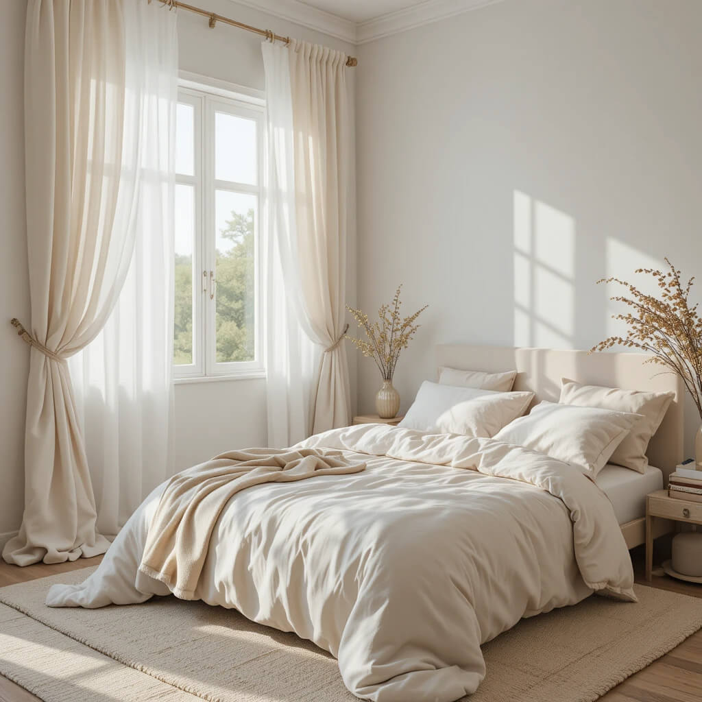
Summer bedrooms have a very specific kind of magic when they’re done right. They feel lighter, calmer, and somehow more breathable, like the entire room is exhaling after a long season of heaviness.
But getting that “dreamy summer” balance isn’t just about choosing light colors. It’s about pairing tones that feel soft, sunlit, and emotionally relaxing without turning the space into something flat or unfinished.
The best summer bedrooms tend to lean into layered neutrals, muted pastels, and warm natural accents that quietly work together instead of competing for attention.
If your bedroom needs that seasonal refresh that actually feels intentional, these color combinations are a great place to start.
1. Soft White and Warm Beige

This is the definition of effortless summer calm.
Soft white walls paired with warm beige bedding create a bedroom that feels airy, clean, and softly inviting. It’s minimal, but never cold, because beige brings warmth back into the space.
Add linen bedding and natural textures, and the room starts feeling like a slow morning in a luxury retreat.
Why This Works
The warmth of beige prevents white from feeling stark, creating a balanced and soothing palette.
2. Sage Green and Cream

Sage green continues to dominate summer interiors for a reason.
When paired with creamy neutrals, it creates a bedroom that feels fresh, organic, and naturally calming. The green adds life to the space without overwhelming it.
It works beautifully through bedding, curtains, or a soft accent wall.
Designer Tip
Stick to muted sage tones for a more elevated and timeless feel.
3. Dusty Blue and Soft White

This combination feels like a quiet coastal morning.
Dusty blue paired with soft white creates a bedroom that feels airy, peaceful, and visually light. It brings in a subtle color shift without disrupting the calm atmosphere.
Perfect for rooms with plenty of natural light.
Why This Works
Blue naturally cools the visual temperature of a room, enhancing the feeling of freshness.
4. Cream and Natural Wood

This is summer simplicity at its most beautiful.
Cream tones combined with natural wood create a bedroom that feels grounded, warm, and softly textured. It’s a palette that relies on material richness rather than bold color.
The result feels relaxed and timeless.
Cozy Factor
The mix of soft neutrals and wood grain creates an effortlessly warm atmosphere.
5. Blush Pink and Warm White

Soft blush tones bring a gentle romantic energy into summer bedrooms.
Paired with warm white, the result feels elegant, airy, and subtly feminine without becoming overpowering. It’s best used in soft layers rather than large blocks of color.
Think bedding, cushions, or artwork.
Designer Tip
Choose dusty blush tones instead of bright pink for a more refined finish.
6. Olive Green and Beige

This combination feels earthy, grounded, and quietly sophisticated.
Olive green paired with beige creates a bedroom that feels connected to nature without being rustic. It adds depth while keeping everything soft and livable.
It works especially well with linen and wood textures.
Why This Works
Olive adds richness while beige keeps the palette balanced and calm.
7. Ivory and Soft Sand

This is the closest thing to “sunlight in color form.”
Ivory and soft sand tones create a bedroom that feels warm, airy, and naturally glowing. The palette is subtle but incredibly effective in creating a restful environment.
It’s especially beautiful in bright, sun-filled spaces.
Watch Out For
Too much uniformity can feel flat without layered textures.
8. Lavender and Cream

Lavender brings a soft, dreamy quality into summer interiors.
When paired with cream, it creates a bedroom that feels gentle, fresh, and slightly unexpected. The key is keeping lavender muted rather than saturated.
It adds personality without overwhelming the space.
Designer Tip
Use lavender as an accent color through textiles for best results.
9. Warm Gray and White Linen

This palette feels clean, modern, and quietly refined.
Warm gray paired with white linen creates a bedroom that feels soft and structured at the same time. It avoids harsh contrast while still feeling intentional.
Perfect for minimalist summer styling.
Why This Works
Warm undertones in gray prevent the space from feeling cold or clinical.
10. Peach and Cream

Peach brings a soft glow into summer bedrooms.
Paired with cream, it creates a space that feels warm, uplifting, and gently playful without being loud. It’s a subtle way to introduce color into neutral spaces.
Best used in bedding and decor accents.
Cozy Factor
The warm tones create a naturally comforting and inviting atmosphere.
11. Charcoal and Warm Beige

This combination adds depth without sacrificing softness.
Charcoal creates structure, while warm beige softens the overall look, resulting in a bedroom that feels balanced and modern. It’s a great way to add contrast in a controlled way.
It works especially well in contemporary spaces.
Watch Out For
Too much charcoal without light balancing tones can feel heavy.
12. Soft Green and Ivory

This is a fresh, nature-inspired summer palette.
Soft green paired with ivory creates a bedroom that feels calm, breathable, and naturally relaxing. It brings subtle color without overpowering the space.
It’s ideal for a peaceful, restorative atmosphere.
Luxury Look for Less
Even small green accents can elevate simple ivory bedding.
13. Taupe and Warm White

This combination is understated elegance at its best.
Taupe and warm white create a bedroom that feels soft, layered, and timeless. It avoids sharp contrast while still feeling visually rich.
It’s one of those palettes that always looks more expensive than it is.
Why This Works
Taupe adds depth while warm white keeps the space bright and open.
14. Soft Blue and Beige

This is a calming, grounded summer pairing.
Soft blue adds freshness, while beige keeps everything warm and balanced. The combination feels both airy and cozy at the same time.
Perfect for bedrooms that need a gentle seasonal reset.
Designer Tip
Keep blue tones muted for a more sophisticated look.
15. Caramel and Cream

This palette feels warm, rich, and quietly luxurious.
Caramel tones bring depth, while cream keeps the space soft and airy. The contrast feels natural and comforting rather than dramatic.
It’s especially beautiful in textured, layered bedrooms.
Cozy Factor
The warm tones create a naturally soothing and grounded environment.
16. Soft Gray and Dusty Rose

This combination feels modern with a hint of softness.
Soft gray creates a calm base, while dusty rose adds warmth and subtle charm. The result is balanced, gentle, and visually soothing.
It works beautifully in layered bedding setups.
Designer Tip
Stick to muted rose tones for a more elevated finish.
17. White and Light Oak

This is Scandinavian summer minimalism done right.
White paired with light oak creates a bedroom that feels bright, clean, and naturally relaxed. The wood adds warmth that keeps the space from feeling too sterile.
It’s simple, but very intentional.
Why This Works
Light oak brings natural warmth and texture into a clean white palette.
18. Deep Teal and Warm Neutrals

This is the boldest summer bedroom option in the list.
Deep teal adds richness and depth, while warm neutrals keep everything grounded and soft. The contrast feels luxurious without being overwhelming.
It works especially well in accent walls or statement bedding.
Personal Take
Teal instantly makes a bedroom feel more styled and visually interesting.
Final Thoughts
Summer bedroom color palettes are less about trend chasing and more about creating a space that feels calm, breathable, and visually soft.
The most inviting rooms always balance light tones with gentle warmth, allowing color to support the atmosphere instead of dominating it.
From airy neutrals to soft pastels and grounded earthy tones, the right pairing can completely change how a bedroom feels the moment you walk in.
A well-chosen palette doesn’t just decorate a space, it shapes how it feels to live in it every single day.